
Imagine for a moment a conductor without their instruments. Impossible to create a symphony, right? Well, for your website, the color palette is that orchestra. It sets the tone, creates the atmosphere, and silently communicates with your visitors. It’s not just about “looking pretty.” It influences user experience, strengthens your brand image, and ultimately contributes to your project’s success. So, ready to compose your own chromatic masterpiece?
Why the Color Palette is Fundamental for Your Website
Far more than just an aesthetic choice, your color palette is a strategic tool. It has the power to:
- Strengthen your visual identity: The colors you choose must be consistent with your brand, your values, and your target audience. It’s like a uniform for your website, recognizable at first glance.
- Improve user experience: A well-thought-out palette facilitates navigation, guides visitors’ attention, and makes information more accessible. Think about text readability on backgrounds, contrasts that highlight important elements…
- Increase conversion: Did you know that certain colors can encourage action? By using the right shades for your call-to-action buttons, you can subtly (but effectively!) encourage visitors to move to the next step.
A successful palette is much more than an assembly of pleasing colors. It’s a visual language that communicates your message and achieves your goals.
The Psychological Impact of Colors on Visitors
Colors also have a direct influence on our emotions and perceptions. It’s no coincidence that certain brands use red to signal urgency or blue to inspire trust.
Understanding this psychological impact is like having a secret code to positively influence your visitors.
Here are some examples:
- Blue: Associated with trust, serenity, and professionalism. Ideal for financial, medical, or institutional websites.
- Green: Symbolizes nature, growth, and harmony. Perfect for eco-responsible companies or wellness sites.
- Red: Evokes passion, energy, and excitement. Use sparingly to attract attention and create a sense of urgency.
- Yellow: Represents joy, optimism, and creativity. Suitable for playful websites or those aimed at children.
Warning: The impact of colors can vary depending on cultures and contexts. It’s therefore important to consider your target audience when making your choice.
Guiding You Step-by-Step in Creating an Effective Palette
In this article, we’ll break down together the key steps to create a color palette that will propel your website to success. Our objective: give you the tools and knowledge necessary to:
- Define your brand’s visual identity: What are your values? What message do you want to convey?
- Choose colors that match your target audience: Who are your visitors? What are their expectations?
- Create a harmonious and balanced palette: How to combine colors for a visually pleasing result?
- Use available tools and resources: What are popular color palettes and how to use them?
By the end of this article, you’ll have all the cards in hand to create a color palette that will make your website a true visitor magnet!

Color Theory Basics: Become a Chromatic Artist
Before diving into choosing your colors, it’s crucial to understand the basics of color theory. Don’t panic, it’s less complicated than it seems!
The Color Wheel: A Fundamental Tool
The color wheel is like a designer’s compass. It represents all colors visible to the human eye, organized in a circular manner. Imagine a rainbow wheel that guides you toward the most harmonious combinations.
Primary, Secondary, and Tertiary Colors
We distinguish three types of colors on this wheel:
-
Primary Colors: These are the mother colors, those that can’t be obtained by mixing other colors: red, yellow, and blue. Think of them as the foundations of your colored house.
-
Secondary Colors: They’re obtained by mixing two primary colors:
- Red + Yellow = Orange
- Yellow + Blue = Green
- Blue + Red = Purple
These colors already bring more richness and nuance to your palette.
- Tertiary Colors: We obtain them by mixing a primary color and an adjacent secondary color. For example, red-orange, yellow-green, blue-purple… They offer even more subtlety and complexity to your palette.
Color Harmonies: Creating Visually Pleasing Combinations
The color wheel doesn’t just present colors; it also helps us combine them harmoniously. Several harmony schemes exist:
-
Monochromatic: A single color, declined in different shades and intensities. It’s the elegance of simplicity, the assurance of a clean and sophisticated result.
-
Complementary: Two opposite colors on the color wheel (for example, red and green, blue and orange). A striking contrast that attracts attention, but to be used in moderation to avoid a garish effect.
-
Analogous: Three consecutive colors on the color wheel (for example, yellow, yellow-orange, and orange). A soft and soothing harmony, perfect for creating a relaxing atmosphere.
-
Triadic: Three equidistant colors on the color wheel. A bolder option that creates a dynamic and stimulating visual balance.
Color Temperature: Warm, Cool, and Neutral
Colors are divided into two major families:
-
Warm Colors: Red, orange, yellow… They evoke heat, energy, and optimism. They attract attention and create a friendly atmosphere. Be careful not to overuse them, as they can also be perceived as aggressive.
-
Cool Colors: Blue, green, purple… They inspire serenity, trust, and professionalism. They’re ideal for creating a calm and restful atmosphere. But beware, used alone, they can sometimes seem a bit distant.
-
Neutral Colors: White, black, gray, beige… These are the chameleons of the palette. They adapt to everything and allow highlighting other colors. They’re essential for creating balance and avoiding an overloaded effect.
Value and Saturation: Defining Intensity and Brightness
Value and saturation are two crucial aspects of color:
-
Value: It’s the lightness or darkness of a color. A high value means a light color, while a low value means a dark color. Playing with value allows creating subtle contrasts and adding depth to your design.
-
Saturation: It’s the intensity or purity of a color. High saturation means a vivid and bright color, while low saturation means a dull and muted color. Saturation can influence your palette’s emotional impact. A highly saturated color will be more energetic and stimulating, while a desaturated color will be softer and more discreet.

In any case, be careful not to over-saturate your visual or page! High values or saturations attract the eye: so use them sparingly!
Create Your Custom Palette: A Step-by-Step Guide
Now that you have the theoretical basics in hand, let’s move to practice! Creating your color palette is like choosing the ingredients for your signature dish. You need to find the right balance, flavors that harmonize and reflect your identity.
No need to be a confirmed artist, follow these steps and you’ll see, it’s within everyone’s reach! So, ready to get your hands (chromatically) dirty?
Know Your Target Audience: Their Preferences and Expectations
Never forget: your website isn’t made for you, but for your visitors. Knowing their tastes and expectations is therefore paramount to creating a color palette that speaks to them.
Their Preferences and Expectations
- Analyze your audience: How old are they? What are their interests? Where do they live? Their cultural preferences can influence their color perception.
- Study their behaviors: What websites do they visit? What colors are used on these sites? This can give you indications about their design tastes.
- Ask yourself the right questions: What type of emotions do you want to evoke in your visitors? What message do you want to convey to them? The answers to these questions will guide you in your color choice.
Define Your Brand’s Personality: Professional, Creative, Playful…
Your color palette must reflect your brand identity. It must tell your story, convey your values, and differentiate you from competitors. Imagine your colors are your voice, the one that speaks to your customers before they’ve even read a single word.
Professional, Creative, Playful…
- Identify your values: Are you serious and reliable? Or rather innovative and bold? Your colors must reflect these values.
- Define your positioning: What’s your competitive advantage? What makes you unique? Your colors can help you stand out from the crowd.
- Choose a style: Do you prefer a minimalist and clean style? Or rather a colorful and dynamic style? Your palette must be consistent with your style.
Analyze Your Industry: Common Color Codes and How to Stand Out
It’s also important to know your industry’s color codes. This will allow you to understand what works and what doesn’t, and decide whether you want to conform to these codes or transgress them.
Common Color Codes and How to Stand Out
- Study your competitors: What colors do they use on their websites? What are recurring themes?
- Identify trends: What colors are trending in your industry? Staying on top of trends can give you a competitive advantage.
- Dare to be different: If you want to stand out, don’t hesitate to use unexpected colors or explore original combinations.
Don’t stray too far from beaten paths! You have the right to stand out and be original, but never forget that if you deviate too much from your niche’s graphic practices, it could backfire.
Neutral Colors: The Key to Balance and Readability
Imagine a painting overflowing with vivid and bright colors. Magnificent, certainly, but quickly tiring for the eyes, right? This is where neutral colors come into play. They’re the discreet background, the essential support that allows vivid colors to shine without saturating the whole. They offer visual rest, a necessary breathing space for a pleasant and effective user experience. They’re the pillars of your design. Without them, your palette collapses.

The Importance of Neutral Colors: Creating Balance and Readability
Neutral colors are often underestimated, relegated to the background. Yet, they play a crucial role in your website’s balance and readability. They allow:
- Creating a neutral background: A neutral background highlights content and facilitates reading. Imagine a book with colorful pages: difficult to concentrate on the text!
- Defining spaces: Neutral colors can be used to separate different sections of your website, thus creating a clear and intuitive structure.
- Softening vivid colors: If your color palette is dominated by vivid shades, neutral colors can bring balance and avoid a garish effect.
They’re your design’s silent architects, those who ensure the whole’s consistency and fluidity. Don’t neglect them!
How to Choose Appropriate Neutral Colors
Choosing the right neutral colors isn’t as simple as it seems. It’s not about picking a random “gray” or “beige.” You need to consider your website’s general atmosphere and your palette’s dominant colors.
-
Consider color temperature: If your palette is dominated by warm colors, opt for warm neutral colors (beige, cream…). If your palette is dominated by cool colors, choose cool neutral colors (gray, off-white…).
-
Vary shades: Don’t hesitate to use different shades of gray, beige, or white to create depth and visual richness. A simple gray gradient can bring much sophistication to your design.
-
Think about texture: Some neutral colors have a more marked texture than others. A sandy beige will bring a feeling of warmth and naturalness, while an anthracite gray will give a more modern and industrial look.
-
Adapt to your audience: Neutral colors can have different connotations depending on cultures. For example, white is often associated with purity and innocence in Western cultures, while it can symbolize mourning in some Asian cultures.
The perfect neutral color is one that blends into the decor while sublimating your palette’s other colors. A subtle balance to find, but one that makes all the difference.
Using White and Black: Emphasize or Soften
White and black are the two extremes of the neutral color spectrum. They’re both powerful and versatile, capable of transforming your website’s general atmosphere.
-
White: Symbol of purity, clarity, and simplicity, white is ideal for creating a clean and minimalist design. It highlights content and offers visual rest. Used as a background color, it gives an impression of space and lightness.
- White to emphasize: White can be used to create empty spaces around important elements, thus attracting visitor attention.
- White to soften: Combined with vivid colors, white softens them and makes them more pleasant to look at.
-
Black: Associated with elegance, luxury, and mystery, black is perfect for creating a sophisticated and timeless design. It brings contrast and depth. Warning, used excessively, it can make a website oppressive and difficult to read.
- Black to emphasize: Black can be used to highlight light colors and create striking contrast.
- Black to soften: In small touches, black can bring a touch of sophistication and mystery to your design.

White and black are the yin and yang of your color palette. Use them wisely to create perfect balance and sublimate your website.
Tools and Resources to Create Your Color Palette
Now that you have theory and practical basics in hand, let’s talk about tools! Like a good craftsman needs their tools, a palette designer needs software and platforms to bring their vision to life. And good news, there’s a multitude, free or paid, for all levels and all budgets. So, take out your digital pencils, let’s explore the palette creator’s toolbox!
Free and Paid Online Tools
The web abounds with tools to help you create your palette, from the simplest to the most sophisticated. The choice will depend on your needs, your expertise level, and your budget. Here’s a small overview to help you navigate.
-
Free Tools:
- Coolors: An ultra-fast and intuitive palette generator. Press the space bar to generate a new random palette, which you can then adjust to your liking. Ideal for finding inspiration and experimenting quickly.
- Adobe Color: Adobe Color’s free version (accessible online) already offers many features to explore color harmonies, extract colors from an image, and create custom palettes.
- Paletton: A tool based on color theory, which allows you to create harmonious palettes by choosing a base color and exploring different harmony schemes. Perfect for those who want to understand the rules of art.
- Canva: Much more than just a design tool, Canva also offers a color palette generator. You can choose an image and Canva will automatically extract dominant colors to create a consistent palette. Ideal for beginners.
-
Paid Tools:
-
Adobe Color (full version via Creative Cloud): The paid version offers complete integration with Adobe software (Photoshop, Illustrator, etc.), as well as advanced features like theme creation and trend exploration.
-
Khroma: A tool that uses artificial intelligence to learn your preferences and generate personalized palettes. You choose a few colors you like, and Khroma proposes combinations adapted to your style.
-
Dribbble and Behance: Although not palette creation tools per se, these platforms are true gold mines of inspiration. You can find color palettes used by professional designers and adapt them to your own project.
Pro tip: Start by exploring free tools to familiarize yourself with basic concepts. If you need more advanced features, you can always switch to a paid version later.
-
Graphic Design Software: Photoshop, Illustrator, Figma
Graphic design software like Photoshop, Illustrator, and Figma are essential tools for professionals and enlightened amateurs. They offer precise control over colors and allow creating complex and sophisticated palettes.
-
Photoshop: The master of photo editing, but also an excellent tool for creating palettes. You can use the color picker, swatches, and adjustment tools to precisely adjust colors. Photoshop is ideal for working with images and creating palettes based on photos.
-
Illustrator: The reference software for vector design. Illustrator offers great flexibility for creating palettes and applying them to illustrations, logos, and website mockups. You can use global swatches to easily modify colors throughout your design.
-
Figma: A cloud-based collaborative design tool, increasingly popular among web designers. Figma offers similar features to Illustrator, but with an emphasis on collaboration and prototyping. It’s an excellent choice for teams working remotely.
Little tip: These software allow you to save your custom palettes and easily reuse them in your different projects. A precious time saver!
Browser Extensions for Color Palette Extraction
You’ve fallen for a color palette while browsing a website? No problem, there are browser extensions that allow you to extract colors from a web page in one click! It’s like having a little chromatic spy that tracks colors for you.
-
ColorZilla: One of the most popular extensions, ColorZilla allows you to retrieve the hexadecimal code of any color on a web page. You can also create palettes and save them for later use.
-
Eye Dropper: Similar to ColorZilla, Eye Dropper allows you to select a color on a web page and get its hexadecimal code. The extension is simple to use and very practical for quickly retrieving a color you like.
-
Palette for Chrome: This extension extracts all colors used on a web page and creates a palette that you can download in .ASE format (compatible with Photoshop and Illustrator). Ideal for analyzing and being inspired by palettes used by other designers.
Good reflex: Use these extensions sparingly and respect other designers’ work. Be inspired, yes, copy, no!
Test and Validate Your Palette: The Trial by Fire
Your color palette is ready? Great! But before deploying it on your website, it’s crucial to test and validate it. It’s like a driving test for your palette: you need to ensure it’s performant, pleasant to use, and fulfills its role well. Don’t neglect this step, it can save you many disappointments.
Simulate Your Website with the Chosen Palette
Before diving into integrating your palette on your website, take time to simulate it. This will allow you to visualize the final result and identify potential problems.
- Use mockups: Create mockups of your main pages (home, content pages, etc.) using your new color palette. This will give you a precise idea of your website’s general atmosphere.
- Test different scenarios: Visualize how your palette works in different contexts: navigation, content reading, form interaction, etc.
- Adapt images: Ensure your images integrate harmoniously with your color palette. You can adjust your images’ colors or use filters to create visual consistency.
- Try simulation tools: Some online tools allow you to simulate your website’s appearance with different color palettes. It’s a quick and easy way to test different options.
Pro tip: Don’t hesitate to ask for your entourage’s opinion. An outside perspective can help you identify problems you wouldn’t have noticed.
Check Accessibility: Contrast and Readability
Accessibility is a crucial aspect of web design. Your website must be accessible to all, including people with visual impairments. Checking your color palette’s accessibility is therefore essential.
- Test contrast: Ensure the contrast between text and background is sufficient to facilitate reading. You can use online tools to measure contrast and ensure it meets accessibility standards (WCAG).
- Use alternative colors: Offer alternative colors for interactive elements (links, buttons, etc.) so they’re easily identifiable.
- Avoid problematic color combinations: Some color combinations can be difficult to distinguish for people with color blindness. Avoid these combinations or offer alternatives.
Don’t forget: An accessible website is a website that addresses everyone. Accessibility is an investment that benefits everyone.

Get User Feedback: The Importance of User Testing
User testing is a valuable way to get feedback on your color palette. Ask real users to navigate your website and evaluate the visual experience.
- Recruit testers: Find people who represent your target audience and invite them to test your website.
- Define tasks: Ask testers to accomplish specific tasks on your website (find information, fill out a form, etc.).
- Observe and listen: Observe how testers interact with your website and listen to their comments.
- Ask questions: Ask specific questions about their visual experience: “Which colors did you like most?”, “Which colors did you like least?”, “Did you have difficulty reading content?”, etc.
- Analyze results: Analyze testers’ feedback and identify your color palette’s strengths and weaknesses.
The secret of a successful palette: A good palette is one that pleases your users and helps them achieve their goals on your website.
Current Color Trends: Be Inspired Without Getting Lost
Like fashion, color trends constantly evolve. Staying informed of the latest trends can help you create a modern and attractive website. But beware, it’s not about blindly following fashions! The important thing is to be inspired by trends while staying true to your brand identity.
Popular Color Palettes of the Moment
Here are some popular color palettes of the moment:
- Natural colors: Earthy tones, forest greens, and ocean blues are very trendy. These colors evoke nature, sustainability, and well-being. They’re perfect for websites highlighting natural products, ecological services, or travel destinations.
- Pastel colors: Pastel colors (powder pink, sky blue, sea green) bring a touch of softness and romance. They’re ideal for websites aimed at women, wedding boutiques, or cosmetics brands.
- Vivid and bold colors: Mustard yellow, fuchsia pink, and electric blue are back in force. These dynamic and energetic colors are perfect for websites that want to stand out and attract attention.
- Monochrome palettes: Monochrome palettes (based on a single color declined in different shades) are always a safe bet. They bring a touch of elegance and sophistication. They’re ideal for minimalist websites or luxury brands.
Warning: Color trends are ephemeral. Don’t base your entire brand strategy on a passing trend! The more “fashionable” it is, the faster it will pass!
How to Integrate Color Trends into Your Visual Identity
The objective isn’t to copy trends, but to adapt them to your own universe. Here are some tips:
- Use trends as a starting point: Trends can give you ideas and help you explore new palettes.
- Adapt colors to your brand: Choose colors that match your visual identity and your values.
- Don’t blindly follow fashions: Choose colors you like and that seem relevant to your project.
- Use trends sparingly: Integrate trends in small touches, for example by using a trendy color as an accent color.
The secret of a successful palette: A good palette is one that’s both trendy and timeless, that reflects your brand identity and pleases your target audience.

Mistakes to Avoid When Choosing Colors
To finish, here are some mistakes to avoid when choosing colors:
- Choosing colors randomly: Don’t choose colors simply because you like them. Take time to think about colors’ psychological impact and your palette’s consistency.
- Overloading your palette: Too many colors kill color! Limit yourself to 3 or 4 colors maximum to avoid a disorganized and tiring visual effect.
- Neglecting contrast: Ensure the contrast between text and background is sufficient to facilitate reading.
- Ignoring accessibility: Check your color palette’s accessibility to ensure your website is accessible to all.
- Not testing your palette: Test your palette on different media (computer screen, smartphone, tablet…) and ask your entourage’s opinion before validating it.
I particularly insist on this point: if you have a particular relationship with a color, that doesn’t make it a must-have! You’re not making your site “for you,” but for your clients. Any argument like “I like/dislike” shouldn’t weigh in the balance.
By avoiding these mistakes, you’ll maximize your chances of creating a successful color palette that will propel your website to success! So, your turn to play!
Accessibility: A Site for All
Imagine for a moment a silent movie for a deaf person, or a braille book for a sighted person. Absurd, right? Yet, too many websites remain inaccessible to part of their audience. Accessibility is much more than just a legal obligation, it’s a question of ethics and inclusion. An accessible site is a site that opens to all, regardless of users’ limitations. It’s a site that respects human diversity and contributes to a more inclusive world. So, shall we open the web’s doors to all?
Web Accessibility Standards (WCAG): An Essential Guide
The Web Content Accessibility Guidelines (WCAG) are international standards for web accessibility. They define a set of rules and recommendations to make web content more accessible to people with disabilities. WCAG are like a highway code for the web: they show you how to design a safe, easy-to-use site accessible to all.
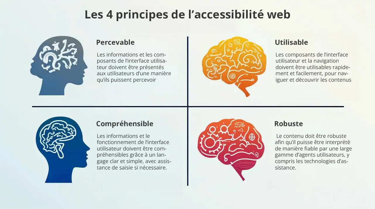
WCAG’s Four Key Principles: Perceivable, Operable, Understandable, Robust
- Perceivable: Information and user interface components must be presented to users in a way they can perceive (for example, by providing text alternatives for images, using contrasting colors, making content audible, etc.).
- Operable: User interface components and navigation must be operable (for example, by providing clear and consistent navigation, allowing users to use the keyboard to navigate, avoiding navigation traps, etc.).
- Understandable: Information and user interface operation must be understandable (for example, by using clear and simple language, providing input assistance, avoiding errors, etc.).
- Robust: Content must be robust so it can be reliably interpreted by a wide range of user agents, including assistive technologies (for example, by using valid HTML code, respecting web standards, etc.).
The Importance of Color Contrast: A Key Criterion
Color contrast is an essential element of web accessibility. Insufficient contrast between text and background can make reading difficult, even impossible, for people with visual impairments. It’s therefore imperative to check your color palette’s contrast and ensure it meets accessibility standards.
Tools to Check Contrast and Recommendations
- Online tools: There are many free online tools that allow you to check color contrast (for example, WebAIM Contrast Checker, Accessible Colors, etc.). These tools tell you if the contrast is sufficient to meet WCAG requirements.
- Recommendations: WCAG recommend a contrast ratio of at least 4.5:1 for normal text and 3:1 for large text. For logos and graphic elements, a contrast ratio of 3:1 is also recommended.
- Exceptions: There are some exceptions to these rules, for example for texts that aren’t essential (for example, logos, brand names, etc.). However, it’s always better to opt for sufficient contrast, even in these cases.
Text Alternatives: A Precious Help
Text alternatives are textual descriptions that accompany non-textual elements (for example, images, videos, animations, etc.). They allow people who can’t see or hear these elements to understand their content. Text alternatives are an essential element of web accessibility and must be provided for all non-textual elements.
How to Write Relevant and Concise Text Alternatives
- Be precise: Describe the image or non-textual element precisely and concisely. Avoid vague or ambiguous descriptions.
- Consider context: Adapt the description to the context in which the image or non-textual element is used.
- Be concise: Avoid overly long or detailed descriptions. Focus on essential information.
- Use the right attribute: Use the
altattribute for images, thetitleattribute for links, and thearia-labelattribute for other non-textual elements.
Conclusion: Color, a Powerful Ally
Congratulations! You’ve traveled the entire journey, from color theory to accessibility, including tools and trends. You’re now armed with all the necessary knowledge to create a color palette that will make your website a true masterpiece. But never forget that color is much more than just an aesthetic tool.
It’s a powerful ally that can help you achieve your goals, strengthen your brand image, improve user experience, and make your website accessible to all. So, use color with wisdom, creativity, and passion, and you’ll see, your website will shine!
Key Points to Remember
- Color is a language: Colors have meaning and psychological impact. Use them wisely to communicate the desired message.
- Consistency is essential: Use a consistent color palette throughout your website to strengthen your brand image.
- Accessibility is a priority: Check color contrast and provide text alternatives to make your website accessible to all.
- Trends are a source of inspiration: Be inspired by current color trends, but stay true to your visual identity.
- Testing is essential: Test your color palette on different media and ask your entourage’s opinion before validating it.