Have you ever been trapped on a website you couldn’t escape?
You click “back”. The page reloads. You click again. You land somewhere else. You’re stuck in a navigation loop you never chose. Frustrating, right?
It’s not a bug. It’s a deliberate technique. And Google just announced it’s going to crackdown on it.
Back button hijacking is a practice that manipulates your browser’s navigation history to prevent users from leaving a site easily. Some use it to inflate time-on-page statistics. Others to force a retention pop-up. All hope the user will abandon their intention to leave.
Google has decided that ends now. And for your site, this decision has concrete implications you need to understand immediately.
What back button hijacking really is
Let’s be precise. Your browser’s back button relies on a simple mechanism: the browser’s history API. Developers can legitimately use it to create fluid web applications — tabbed navigation, multi-step forms, interactive photo galleries. That’s normal usage.
Hijacking is when this mechanism is used to deceive. In concrete terms, it looks like this:
- You click “back” → the site injects a new entry into history and redirects you to another page on the same site
- You click again → a pop-up appears with a retention message (“Wait! Here’s an exclusive offer…”)
- You insist → the site loops you back on itself, making exit impossible without closing the tab
That’s a dark pattern. Pure. Simple. And until now, tolerated by search engines.
What Google is changing is that it will now integrate this behavior into its quality signals. A site that traps users will be treated as a site harming user experience. With all the SEO consequences that implies.

Why Google is tackling this now
The short answer: because Core Web Vitals aren’t enough.
Google has been measuring page speed, visual stability, and responsiveness for years. These technical metrics are necessary, but they don’t capture everything that makes user experience good or bad.
Back button hijacking doesn’t slow your site. It doesn’t shift your visual elements. It doesn’t block interactivity. Yet it destroys navigation experience radically.
This move fits a larger Google trend: going beyond technical metrics to evaluate actual user-perceived quality. After penalizing intrusive pop-ups since 2017, after aggressive mobile interstitials, it’s now the turn of history manipulation.
“Google’s objective has always been to connect users with the most useful and reliable pages. A site that prevents visitors from leaving freely goes against this fundamental objective.”
This isn’t a surprise. It’s the logical continuation of a policy that rewards sites respecting their visitors.
Information architecture: the real issue behind the announcement
The back button is the symptom. Information architecture is the disease — or health — of your site.
Information architecture (IA) is how you organize, structure, and name your site’s content so visitors find what they’re looking for. It’s your page hierarchy, menu naming, user journey logic.
A well-architected site doesn’t need to trap visitors. Why? Because visitors want to stay. Because navigation is intuitive. Because each click moves them closer to their goal.
A poorly-architected site looks for workarounds. Back button hijacking is one. Aggressive pop-ups are another. Forced redirects too.
Here’s what we see concretely when we audit our clients’ sites:
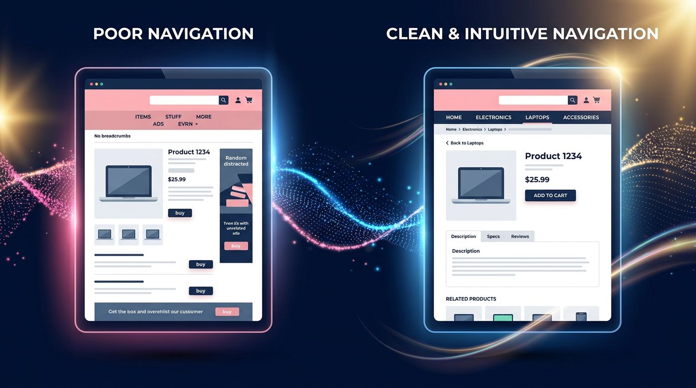
Incoherent navigation. Section names don’t match what customers call them. Result: they search, don’t find, they leave.
Excessive depth. Important information buried 4 or 5 navigation levels deep. Users abandon before arriving.
Broken paths. A user landing on a product page has no way to go back to the parent category without using the back button. When that button is hijacked, they’re lost.
Missing breadcrumbs. On e-commerce sites especially, not showing where you are in the hierarchy is a basic design fault that forces users to rely on the back button as their only orientation tool.

What Google will actually look at
Don’t panic. Google won’t penalize legitimate uses of the history API. A multi-step form that manages its own history to allow returning to the previous step isn’t hijacking. It’s good design.
What will be scrutinized is deceptive intent. The signals Google will analyze include:
Repeated back button click rate. If Chrome data shows users repeatedly clicking back without success on your domain, that’s a strong negative signal.
Artificial history entries. Scripts injecting fake URLs into window.history to create loops will be detectable.
Post-back behavior. If after clicking back, users immediately close the tab or search Google again, that’s a clear frustration signal.
Reports through Google tools. Users can report abusive navigation experiences. These signals feed into quality evaluations.
Our advice for a small business with limited budget: before even thinking about tools, do a basic user test. Give your site to someone unfamiliar with it and watch them navigate. Where they hesitate, where they make mistakes, where they hunt for the back button — that’s where your architecture is broken.
3 concrete actions to implement now
No point waiting for Google to roll out penalties. What’s good for your users is good for your SEO. That simple.
Audit your navigation through your customer’s eyes
Navigate your site like it’s your first time. Ask yourself: Do I always know where I am? Can I go back easily without using the browser button? Do section names match what I’m actually looking for?
If the answer to any of these is no, you have an architecture problem to fix.
Review your code with your developer
If you have a developer or agency managing your site, ask them explicitly: “Are we using history.pushState() or history.replaceState() on the site, and why?” Any use of these functions must have legitimate UX justification and be documented.
On PrestaShop and WooCommerce sites especially, some marketing modules — retention pop-ups, exit intent overlays — sometimes play with navigation history. Clean it up.
Implement standard orientation signals
Breadcrumbs on every page of your store or site. Explicit “back to category” links on product pages. Main navigation always visible and consistent. These basic elements reduce visitor dependence on the back button — and thus the risk they get caught in a loop if something’s coded wrong.
“The best navigation architecture is one users don’t notice. They arrive, they find, they act. No friction, no confusion.”
What this reveals about where Google is headed
Step back for a moment. This back button decision isn’t isolated.
Since 2021, Google has multiplied signals showing one thing: real user experience quality trumps superficial technical optimization. Core Web Vitals are the symbol. But evaluating dark patterns — design practices that manipulate users against their interests — is the logical follow-up.
The ARCEP and European Commission are pushing in the same direction with the Digital Services Act, explicitly regulating interface manipulation practices. Google aligns with a broader regulatory and ethical trend.
For you as a business leader or site manager, the message is clear: aggressive retention tactics sacrificing user experience for short-term metrics will backfire. Not in 5 years. Now.
After 15 years building websites, we’ve seen many “techniques” promising conversion boosts. Some worked short-term. Almost all eventually faced penalties or were abandoned because they destroyed trust.
Trust isn’t coded. It’s built with every interaction.
What you should take away
Three key points from this article:
A site respecting visitor navigation doesn’t need to trap them to retain them. If your bounce rate is high, the solution isn’t blocking the back button — it’s making your content more relevant.
Information architecture isn’t a technical detail reserved for big companies. It’s the backbone of your online presence. A small business with a well-structured site converts better than a large group with a labyrinthine one.
Google has been following the same direction for years: reward what helps users, penalize what manipulates them. Aligning your strategy with this isn’t a constraint — it’s a durable competitive advantage.
Does your site pass the navigation test?
If you’re not sure your site meets these standards — clear navigation, no history manipulation, coherent architecture — that’s exactly what we audit at GDM-Pixel.
Not to sell you a redesign if it’s not needed. To tell you precisely what works, what doesn’t, and what could cost you rankings in coming weeks.
Honest diagnosis. Actionable recommendations. No bullshit.