
The Abandoned Cart That Costs More Than You Think
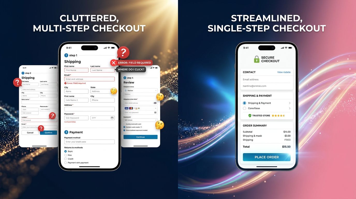
A client called us a few months ago. Their conversion rate was stuck at 1.2% despite a solid catalog, competitive prices, and decent traffic. We audited their checkout funnel in 45 minutes. Result: 7 steps between adding to cart and order confirmation. Mandatory account creation. Address form to fill out completely on each visit. No quick re-login mechanism.
Their problem wasn’t price. Not the product. Not SEO.
It was friction.
According to data from the Baymard Institute, the average cart abandonment rate in e-commerce exceeds 70% globally. And among the most cited causes by shoppers: the obligation to create an account, login processes that are too long, repetitive forms. Problems that have been known for years — and yet still omnipresent in 2025 on dozens of Normandy shops we audit every quarter.
In 2026, this will no longer be forgivable.
What E-commerce Trends for 2026 Really Tell Us
Predictions for 2026 converge on one central point: the differentiator will no longer be the product, but the buying experience. The FEVAD publishes its annual figures on buying behaviors in France every year. The underlying trend is clear: online shoppers are increasingly demanding, increasingly impatient, and increasingly volatile.
What we observe on the agency side confirms this reading. The shops performing well in 2025 are not necessarily those with the best catalog or the most aggressive margins. They’re the ones that have eliminated friction points at each stage of the journey.
A few on-the-ground realities:
- A mobile shopper abandons if loading exceeds 3 seconds
- A failed login form in the evening = a lost sale, often permanently
- A customer who has to re-enter their information with each purchase buys less often
These figures aren’t abstract. They’re euros that evaporate, order after order.

One-Click Authentication: From Anecdote to Strategic Lever
Let’s talk concretely about what “reducing friction” means in an authentication context.
One-click authentication is the ability for a visitor to recognize themselves on your store — and access their account, addresses, payment methods — in a single action. No password to remember. No form to refill. No SMS code that never arrives.
This isn’t futuristic technology. It’s a reality deployed today by players who understood the stakes.
What This Changes Concretely for a Store
Take a customer who orders from you every two months. Each time they visit, they have to remember their password, or click “forgot password,” wait for the email, create a new password… How many times do they abandon before they get there? In our experience auditing PrestaShop and WooCommerce stores, this scenario is responsible for a significant share of abandoned carts on mobile — particularly among 35-55 year-olds who often make up the core customer base of SMEs.
Simplified authentication can take several forms depending on your stack:
- Magic link via email: a clickable link sent to the known address, valid for 15 minutes
- Login via third-party account (Google, Apple): delegation of authentication to a trusted service
- Recognition by persistent token: the browser “remembers” the user without a password
- OTP SMS: one-time code, less fluid but more secure for certain purchase profiles
The right solution depends on your target audience, your average cart value, and your technical stack. There’s no universal answer — but there’s one certainty: leaving your authentication process as it was in 2019 is a measurable mistake.
Why Most Stores Still Aren’t Doing This Work
Here’s what you’re never told at an agency: simplified authentication is a technical project that scares people.
Not because it’s insurmountable. Because it touches the core of the system — customer account management, sessions, data security. And many service providers prefer to sell a visual redesign rather than open that hood.
Result? Stores with a beautiful new design but the same broken checkout funnel as before.
“We redesigned our site 18 months ago, but our conversions haven’t changed.” That’s the sentence we hear most often during our first conversations with a new e-commerce client.
Design has never saved a broken checkout. UX has.

User Experience: An Investment, Not a Cost
If I were in the shoes of an online store manager with a limited budget for 2026, here’s how I’d prioritize:
1. Audit the checkout funnel before touching the design Count the steps between “add to cart” and “order confirmed.” If you exceed 4 steps on mobile, you’re losing sales. This is measurable with Google Analytics 4 and funnel reports.
2. Identify where users drop off Heatmap tools (Hotjar, Microsoft Clarity — the latter is free) show you exactly where visitors abandon. It’s not a matter of intuition: the data tells you.
3. Treat authentication as a priority, not a detail On PrestaShop and WooCommerce, there are modules and plugins that allow you to implement simplified logins without rewriting the entire architecture. It’s often a 2-3 day project, not 3 months.
4. Measure impact before moving on A conversion rate that goes from 1.2% to 2.1% on 10,000 monthly visitors with an average cart of €60, that’s €540 in additional revenue per month. Annualized: €6,480. For a 2-3 day project. Do the math for your store.
This isn’t theory. It’s the kind of result we document on the projects we run.
Other UX Levers Not to Neglect in 2026
Authentication is a particularly telling example, but it’s not the only friction point to address.
Mobile performance remains underestimated
In France, over 60% of online purchases are initiated on mobile according to the latest FEVAD data. Yet we still regularly audit stores with loading times exceeding 5 seconds on 4G. Each additional second costs conversion points — Google has documented this for years.
The return journey is often overlooked
The post-purchase experience matters as much as the purchase itself. A customer who comes back for an exchange or return and faces an opaque process won’t come back to buy. Retention begins after delivery.
Micro-interactions make the difference
Visual confirmation when adding to cart. Progress indicator in the funnel. Clear message if a form error occurs. These details seem minor — but combined, they create the feeling of a store “that works well” versus a store “where you struggle.”
What “Preparing for 2026” Means Concretely Today
E-commerce trends for 2026 don’t fall out of the sky in January 2026. They’re built on the technical and UX decisions you make now.
Here are the three initiatives I recommend addressing starting today:
Initiative 1 — Conversion Audit
Not a SEO audit. A conversion audit. Look at your funnel data, identify your exit pages in the checkout process, measure your cart abandonment rate by device. If you don’t have this data, start by putting it in place.
Initiative 2 — Simplify Authentication
Evaluate what your current CMS (PrestaShop, WooCommerce, Shopify) offers natively. In our experience with PrestaShop in particular, simplified authentication options often require a third-party module or custom development — but it’s a worthwhile investment over 6 months.
Initiative 3 — Mobile Performance
Run a test on PageSpeed Insights on your most visited product page. If your mobile score is below 70, you have a problem that’s costing conversions every day.
These three initiatives don’t require a complete redesign. They require an honest diagnosis and targeted interventions.
“Performing e-commerce in 2026 won’t be the one with the most beautiful site. It will be the one that has eliminated the most friction between purchase intent and order confirmation.”
What This Changes for Your Strategy
The classic mistake in e-commerce is treating UX as a cosmetic matter — something you address during a redesign, every 3-4 years, with a big budget.
The reality of performing stores is continuous attention to friction points. Not a redesign every 4 years. Regular, measured adjustments based on data.
In Normandy as everywhere in France, SMEs selling online face the same competition: marketplaces with UX refined by teams of 50 product designers. You won’t win on volume. You can win on relationship, on specialization — and on a buying experience that doesn’t force your customer to fight your site.
Your store must work for your customer, not the other way around.
Want an Honest Audit of Your Checkout Funnel?
At GDM-Pixel, we don’t sell a redesign if a 3-day audit is enough. If your e-commerce store generates traffic without generating the expected conversions, the first step is a diagnosis — not a quote to start over.
We’ve been working on PrestaShop and WooCommerce for 15 years. We know where to look. And we tell you what we find, even if it’s not what you wanted to hear.
Contact us for an e-commerce audit — we start by looking at your data before proposing anything.