A few months ago, a client proudly shows us their new website. Complete redesign, substantial budget, an “AI-specialized” agency in charge. The result? A contact form that disappears after submission without any confirmation message. A navigation menu that changes behavior from page to page. Auto-generated alt texts that describe… the wrong image. And at the bottom of the page, prominently displayed: an “accessible site” badge provided by an overlay.
Accessible. Really.
What we see more and more in our daily work as an agency is a dangerous equation: powerful AI tools, used by teams that don’t have the fundamentals. AI accelerates. But it also accelerates mistakes — and sometimes, it invents them out of thin air.
The good news? The principles that allow you to detect these mistakes have existed for 30 years. They won’t go out of style.
Why AI “Hallucinates” in Your Interfaces — and What It Really Costs
The term “hallucination” is borrowed from the world of LLMs (language models like ChatGPT or Claude). A model hallucinates when it confidently generates a false answer. In UX, the phenomenon takes a different form, but equally problematic.
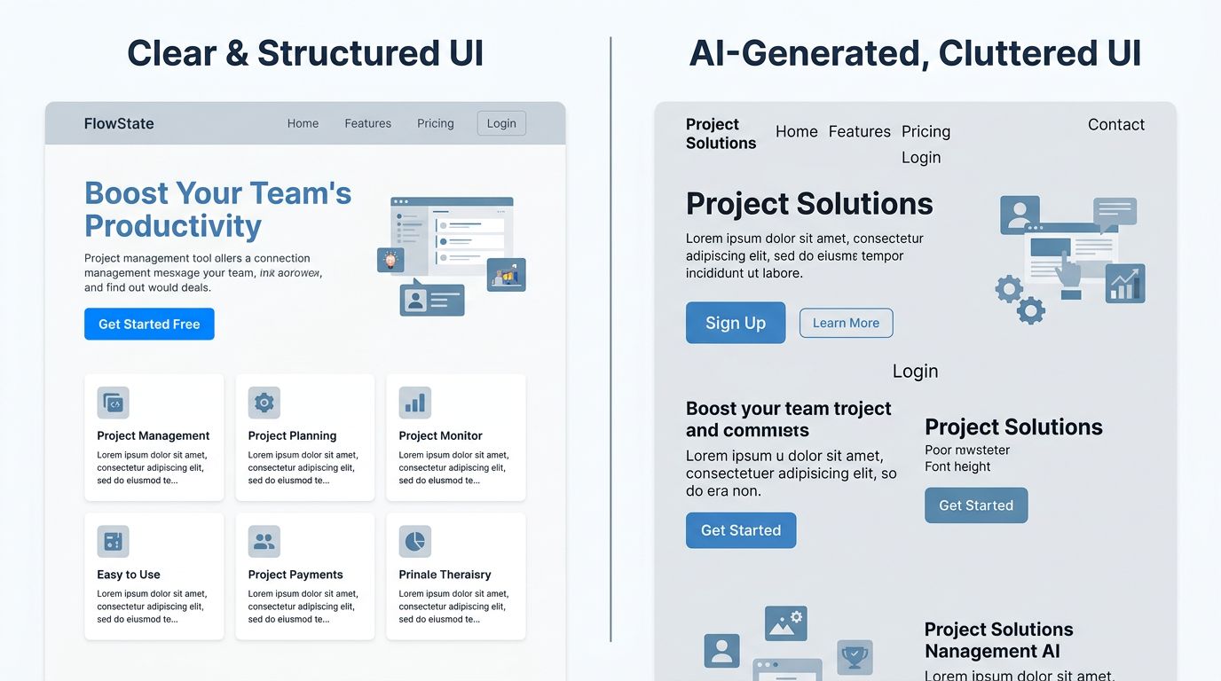
An AI interface generation tool can produce a button that looks like a link, a carousel that hides critical content, a typographic hierarchy that suggests importance where there is none. This isn’t malicious — it’s statistical. The AI has learned from thousands of sites, including the bad ones.
Concrete result: your visitor doesn’t understand what they need to do. They hesitate. They leave.
The figures from our audits show that an ambiguous user journey costs between 20% and 40% of potential conversion rate. Not a technical bug. Not a speed issue. Just an interface that doesn’t clearly tell the user where to look and what to do.
The question isn’t “is your AI tool good?”. The question is: can the person using it recognize the difference between a working interface and an interface that looks like it works?
The Fundamental Principles AI Cannot Replace
This is where it gets interesting. The design principles that allow you to detect these problems aren’t new. They’re also not particularly complex. But they require something AI doesn’t have: contextual judgment.
Visual hierarchy, first safeguard
A user arriving on your page spends roughly 50 milliseconds deciding whether it deserves their attention. Eye-tracking studies conducted by Nielsen Norman Group have confirmed this for years: the eye follows predictable patterns, in F or Z shapes, and looks for visual anchors.
Clear hierarchy means: a dominant title, a subtitle that provides context, an obvious call to action. In that order. With enough difference in size and weight that the eye doesn’t hesitate.
An AI tool that generates content can respect this structure. But if it was trained on sites that don’t follow it — or if the initial prompt doesn’t specify it — it will produce something that “looks like” a web page without having its readability.
Consistency, foundation of trust
Here’s something they never tell you at agencies: visual consistency is an unconscious trust signal.
A blue button on the homepage, green on the contact page, gray on the services page. Technically, it works. Psychologically, it tells your visitor something is wrong. Their brain detects the inconsistency before they’re consciously aware of it. They associate it with a lack of seriousness.
AI tools often generate components in isolation. Each section is correct on its own. The whole lacks unity. It’s a system problem — and it’s solved with a design system, not with a better prompt.
User feedback, invisible but critical
Fill out a form. Click “send”. And… nothing. Or worse: the page reloads.
The feedback principle is simple: every user action must provoke a visible, immediate, and understandable reaction. A spinner during loading. A confirmation message. An error that explains what’s missing, in human terms.
It’s basic. And it’s systematically overlooked in AI-generated interfaces, because these states — success, error, loading, empty — need to be explicitly specified. AI doesn’t invent them spontaneously.
Accessibility: Between False Compliance and Real Practice
Let’s talk about the touchy subject. Web accessibility has become a market. Dozens of tools promise to make your site “WCAG compliant” in a few lines of JavaScript. These accessibility overlays sell themselves as turnkey solutions.
They’re not.
WebAIM, the reference organization for digital accessibility, publishes its analysis of the million most-visited homepages every year. In 2024, 95.9% of them had automatically detectable WCAG errors — including sites using overlays. Automatic compliance is an oxymoron.

Here’s what an overlay cannot do:
It cannot restructure a poorly constructed heading hierarchy. If your page jumps from H1 to H4 without intermediate steps, a screen reader loses the thread. No JavaScript can fix that in real time without breaking something else.
It cannot guess the intent of an image. AI-generated alt text describes what it “sees” in the image. It doesn’t know why this image is there, what it contributes to the context, what a visually impaired user needs to understand.
It cannot make keyboard-navigable an interface that wasn’t designed for it. Keyboard navigation is thought through from design. It’s coded in DOM order, focus management, ARIA landmarks. It’s not a patch — it’s an architecture.
What real accessibility requires
My advice for a small business with limited budget: don’t chase total compliance from the start. Look for the most impactful gains.
Minimum text/background contrast ratio of 4.5:1 for normal text. Explicit labels on all form fields. Alt text written by a human who understands the context. Navigation possible without a mouse on critical user journeys (contact, purchase, sign-up).
These four points cover most real situations. They’re verifiable in less than an hour with free tools like Lighthouse or WAVE. And they require no overlay.
How to Use AI Without Falling Into Its Traps
It would be dishonest of me to criticize AI in design without clarifying the context. At my agency, I use Claude Code daily. Nova Mind, our SaaS, is built on it. AI allowed me to deliver 21 pages in 10 hours on a recent project.
But I know exactly where it’s reliable and where it’s not.
AI excels at: generating component variants, proposing page structures from a brief, automating the writing of error and success states in forms, verifying color token consistency in an existing design system.
AI struggles with: judging whether a visual hierarchy effectively communicates the essentials, evaluating whether a user journey is intuitive for your specific audience, writing alt texts that make sense in their context, testing the robustness of an interface with real users.
Let’s flip the situation: AI is an extraordinary executor. It needs an architect who knows what they want.

The workflow that works for us: we define principles and constraints upfront (hierarchy, consistency, basic accessibility), we let AI generate within that framework, we audit the result against human criteria. AI works within the guardrails we build for it.
Without these guardrails, it does what it knows how to do: produce something that resembles what you asked for. Not necessarily something that works.
Three Questions to Audit Your Site Today
No budget needed, no premium tools. These three checks take 20 minutes and reveal the essentials.
1. Test your site without a mouse. Navigate using only the Tab key. Can you reach the contact form? Is focus visible at each step? If you get lost, so will your users.
2. Disable CSS styles. Most browsers allow this via developer tools. Is your content still readable and structured? Do titles have a real hierarchy H1 > H2 > H3? If the page becomes incomprehensible without CSS, your semantic structure needs work.
3. Submit your main form while leaving a field empty. Does the error message indicate which field is problematic? In understandable terms? Or just “error” in red? This test reveals the quality of user feedback in 30 seconds.
What This Changes Concretely for Your Site
AI will continue to integrate into web production. It’s inevitable, and it’s a good thing for teams that know how to use it.
But “knowing how to use it” means mastering what it cannot do. The fundamental principles — hierarchy, consistency, feedback, real accessibility — aren’t academic constraints. They’re the minimum conditions for a visitor to understand your site, trust it, and take action.
Across the United States and beyond, businesses investing in a website want measurable results. Not a $49/month accessibility badge. Not a 5-minute AI-generated interface that looks like a site but doesn’t convert.
“Good design isn’t what impresses. It’s what guides without you noticing.” — this phrase sums up 15 years of web projects better than any methodological framework.
Tools change. User behaviors remain remarkably stable. People want to understand where they are, what you’re offering them, and what they should do next. That was true in 2010. It’s true today. It will be true when AI generates entire interfaces in real time.
Want to Know Where Your Site Stands on These Criteria?
On projects we’ve run in recent months, a 3-hour audit is usually enough to identify the 5-6 points blocking conversion or degrading user experience. No systematic redesign. No unnecessary service sales.
If your site was built or redesigned with AI tools without serious technical oversight, or if you installed an “accessibility” overlay thinking you’d checked the box — it’s worth checking.
Contact GDM-Pixel for an honest audit. We tell you what’s wrong, why, and what it costs to fix. Straight up.