+33-9-7266-3068
 contact@gdm-pixel.fr







 TL;DR - Key Takeaways at a Glance
What nobody sees — and what makes all the difference
A client called us a few months ago. His site was “beautiful”. Polished design, professional photos, a consistent colour palette. The performance results: 4 seconds to load, an accessibility score of 58/100, and a contact form that broke on mobile Safari.
Nobody had noticed. Not him, not the agency that had delivered the project.
That is the paradox of the modern web: what determines whether a site converts or not is almost entirely invisible to the naked eye. Code that loads in 900ms instead of 4 seconds. Keyboard navigation that works. Contrast that meets WCAG thresholds. Protection against bulk form submissions.
Nobody applauds these details. But their absence costs you dearly.
After 15 years building websites — first by hand, then industrialised with AI — I have one conviction: technical excellence is not optional. It is the foundation. Everything else — design, content, SEO — rests on it.
Why code quality has become a business issue
For a long time, the web was sold as a design matter. “Build a beautiful site, customers will come.” That is false. It always was, but today it is measurable.
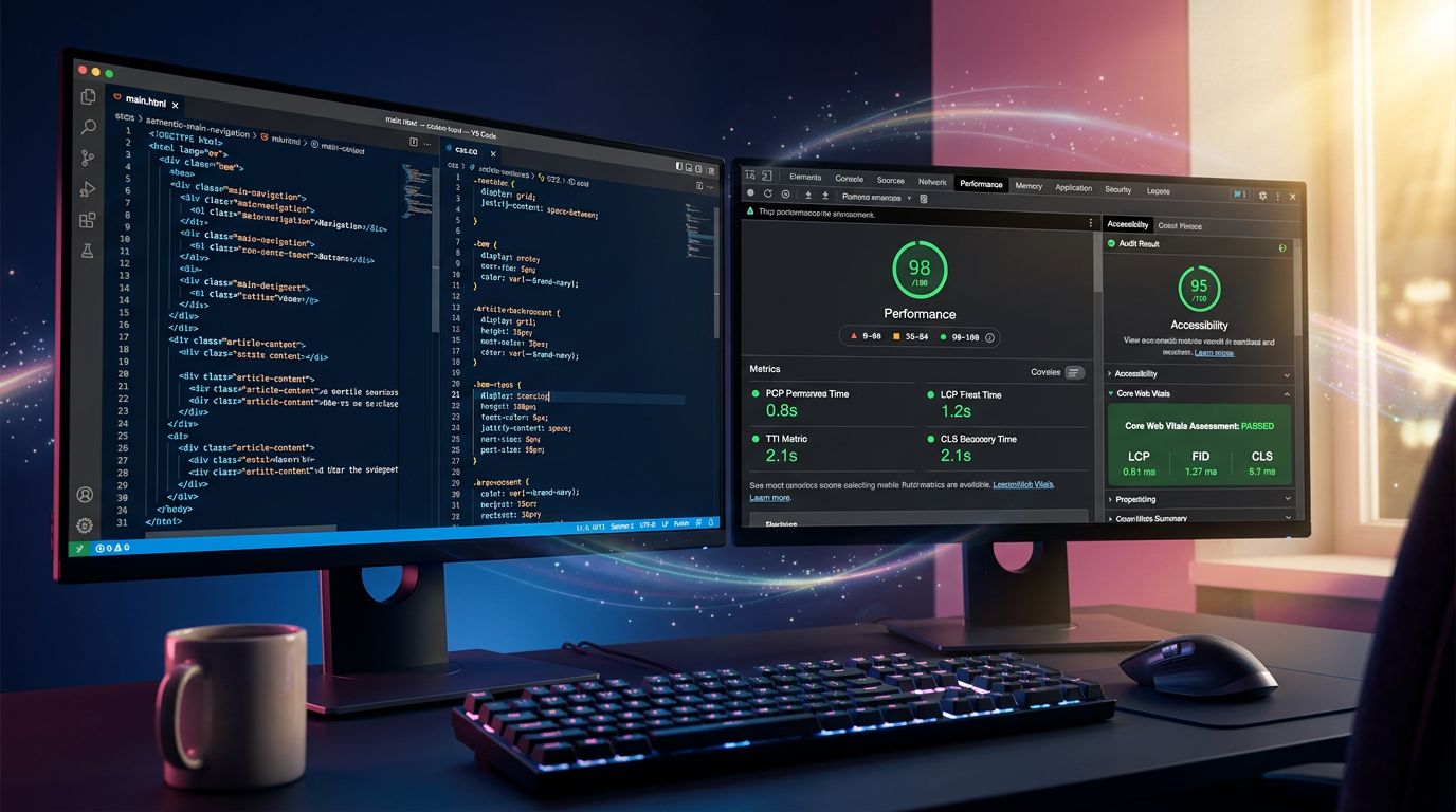
Google has integrated Core Web Vitals into its algorithm since 2021. These are purely technical metrics: speed at which the largest visible element displays (LCP), visual stability during loading (CLS), responsiveness to interactions (INP). A slow or visually unstable site is penalised in search results, regardless of content quality.
What we see concretely with our clients: a 1.5-second gain on LCP can represent 15 to 20% less bounce rate. This is not theory — it is what our before/after audits show.
But raw performance is just one aspect. The other, often neglected, is the quality of interactions.
What is clean code, concretely?
Let’s talk technical. Not to intimidate — but to be precise.
Quality code starts with semantic code. HTML tags have meaning. A button is a <button>, not a clickable <div>. A section heading is an <h2>, not bold text. This sounds basic. Yet the majority of sites delivered by no-code builders or cheap WordPress themes violate these rules systematically.
Why does this matter? Because search engines read semantic structure to understand your content. Because assistive technologies (screen readers) rely on it to make the site usable by people with disabilities. Because it also determines how your site behaves on atypical devices.
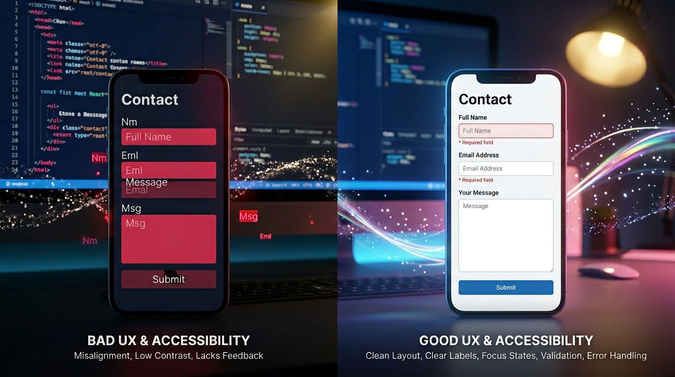
Then there is state management. A form that does not show a clear error when the email field is incorrectly filled is a form that generates frustration and drop-offs. A button that gives no visual feedback when clicked creates uncertainty for the user.
These micro-interactions — the colour change on hover, the contextual error message, the loading animation during submission — cannot be seen in a Figma mockup. They are coded. And they are tested.
“Software quality is like kitchen cleanliness: you can’t see it when it’s done right. You see it immediately when it’s done wrong.” — a principle we often repeat internally.
Ergonomic security: the topic nobody talks about
Here is where it gets interesting.
There is a category of problems that sits at the intersection of technical security and user experience. We could call it ergonomic security: protecting the site and its users without degrading the experience.
The most common example: captchas. For years, the standard solution to protect forms from spambots was the visual captcha. The result: tens of thousands of frustrated legitimate users deciphering illegible images, while automated bots bypassed them in seconds with dedicated tools.
Today, approaches have evolved. Honeypots (hidden fields that only bots fill in), server-side validation, CSRF tokens, rate limiting — all techniques that protect effectively without demanding any effort from the legitimate user.
That is invisible craftsmanship: solving a real security problem without creating a user experience problem in return.
On projects we have run, removing visual captchas in favour of invisible protections has consistently improved form conversion rates. In one specific case: +23% complete submissions on a quote form after migrating to honeypot + rate limiting protection.
The mistakes we see most often in audits
After 15 years of technical audits, certain problems recur with unsettling regularity. Here they are, without sugarcoating.
Unoptimised images
The absolute classic. JPEG images 3000px wide served on mobile. 2.5 MB photos loaded without lazy loading. Converting to WebP with adaptive resizing can divide page weight by 3 or 4 — with no perceptible visual impact for the user.
Blocking JavaScript
Scripts loaded in <head> without defer or async, blocking the page from rendering while they execute. The result: a blank screen for 2–3 seconds before anything appears. A simple HTML attribute fixes this.
No error handling on forms
Forms that submit silently even when required fields are empty. Or worse: that display a generic “An error occurred” message with no indication of what went wrong. The frustration generated here is directly correlated with contact drop-offs.
Insufficient contrast
Light grey text on a white background. A pastel green CTA button. Aesthetically this can look “modern” and “minimal”. Technically, it fails WCAG AA criteria (minimum contrast ratio of 4.5:1 for body text). And it penalises users with visual impairments — who represent a non-negligible portion of your prospects.
Industrialisation does not sacrifice quality — it standardises it
A question comes up often when I talk about our workflow: “If you deliver 5 times faster with AI, doesn’t quality suffer?”
The short answer: no. And here is why.
Industrialisation at GDM-Pixel does not consist of generating code in bulk and shipping it. It consists of encoding best practices into the workflow itself.
Our stack (Astro + Tailwind + standardised components) integrates by default: WebP images with loading="lazy", strict HTML semantics, form state management, contrast validated in the design system. When Claude Code generates a component, it generates a component that meets these standards — because the prompt engineering and base templates enforce them.
What we have eliminated is the risk of human oversight. Not the requirements. The requirements have actually been raised a notch.
On Nova Mind — our own in-house SaaS — we delivered 21 pages in 10 hours. Accessibility, performance, form security: all were in the base specs. No checklist to tick at project end. Standards integrated from the design phase.
According to the HTTP Archive Web Almanac 2023, fewer than 40% of websites pass basic accessibility audits. This is not a budget problem — it is a methodology problem.
What you should check on your site today
Three concrete actions, without needing to call us.
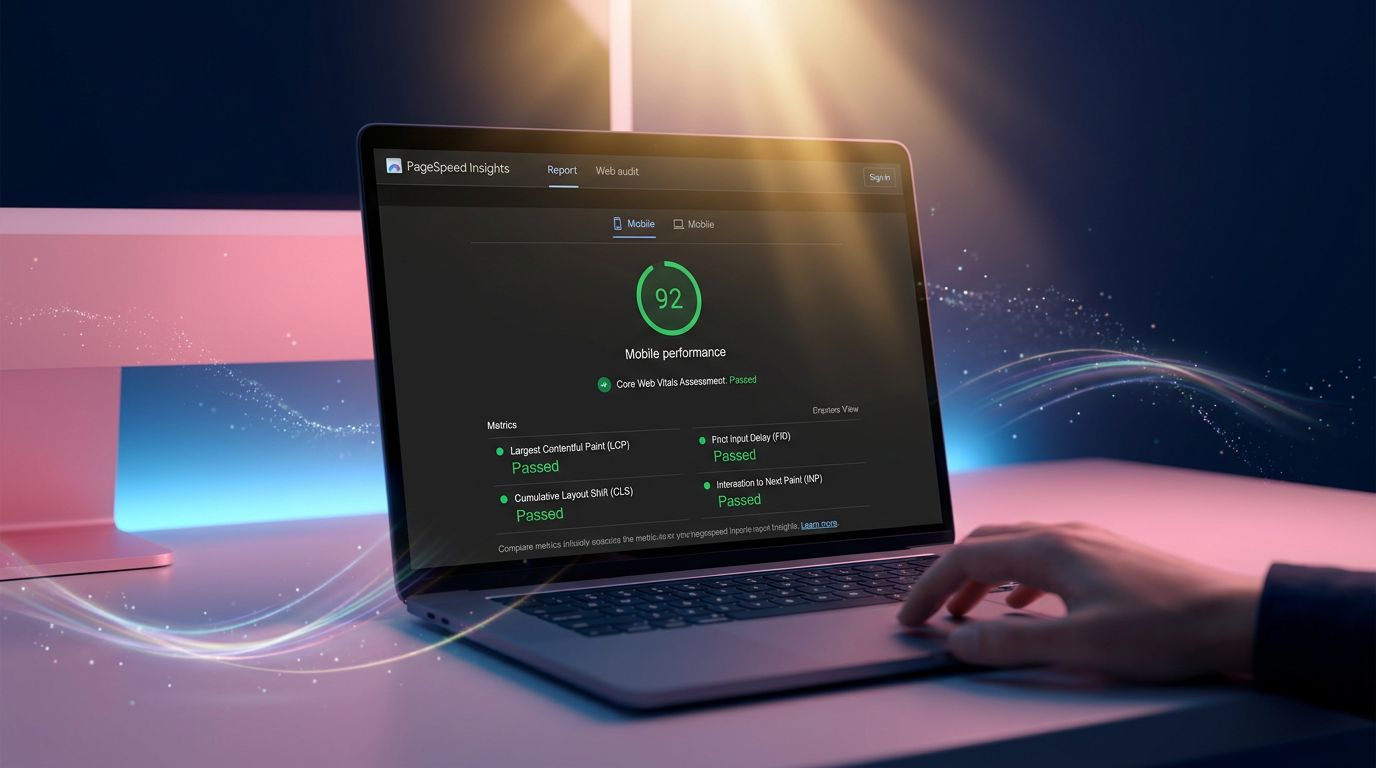
Run PageSpeed Insights. Google’s free tool (pagespeed.web.dev) gives you a score and a prioritised list of issues. If your mobile score is below 70, you have a performance problem affecting your SEO.
Test your contact form on iPhone Safari. Not on Chrome desktop. Not on the emulator. On a real iPhone, with Safari. That is where bugs hide. If your form doesn’t work, how many prospects have you lost without knowing?
Check your contrasts. The Colour Contrast Analyser browser extension, or the built-in tool in Chrome DevTools (Accessibility > Color Contrast), tells you in 30 seconds whether your text is readable to standard.
Digital craftsmanship is measurable
People talk a lot about craftsmanship in web development. Often to justify long timelines and high prices. That is not my definition.
Digital craftsmanship, for me, is the ability to produce quality reproducibly. A master cabinet-maker does not recalculate wood resistance for every piece of furniture. He has templates, proven methods, standards that he applies systematically.
That is exactly what we have built at GDM-Pixel. Templates. Methods. Standards. And tools that apply them without fail. It is this invisible rigour that distinguishes our approach to website creation from simply assembling templates.
The result: sites that load fast, that are accessible, that protect users, that convert. Not by luck. By design.
Does your current website hold up technically? Not just visually — technically. PageSpeed score, accessibility, form security, code quality.
If you are not sure, we offer a comprehensive technical audit. An honest diagnosis, with no obligation to rebuild if it is not necessary. Because we do not sell pointless projects.
Contact GDM-Pixel for a technical audit — we will tell you exactly what works, what doesn’t, and what it costs to fix.
 Social networks
 Analyze with AI