How much does a beautiful but unusable website really cost?
A client called us a few months ago. Their website had been redesigned by a competing agency six months earlier. Substantial budget. 3D animations, parallax effects, cinematic transitions. A visually impressive piece of work.
Conversion rate: in freefall. Bounce rate: +40%. And their main client — visually impaired, using a screen reader — simply could no longer place an order.
This is the problem nobody wants to name bluntly: visual innovation without an accessible foundation is just decoration. It impresses in demos. It hurts in the numbers.
In our day-to-day work as an agency, we see both extremes. Sites so “safe” they put users to sleep. And sites so technically ambitious they exclude a significant portion of their audience. True performance lies between the two — or rather, it combines them both without compromise.
Interactive storytelling and 3D: why it works (and how not to get it wrong)
Immersion is not a gimmick. It’s a response to a real problem: capturing the attention of a user who has 47 tabs open.
Interactive storytelling techniques — scroll-driven animation, WebGL 3D scenes, contextual transitions — have a concrete virtue: they create a journey. The user no longer “browses” a page, they move through it. And when the journey is well designed, they naturally arrive at the action you want them to take.
On projects we’ve run with this kind of approach, time spent on the page increases significantly. Not because the user is lost — because they are engaged.
But here’s where it gets interesting, and where most teams go wrong.

Classic mistakes in poorly managed immersion
Sacrificed performance. An unoptimised 3D scene on mobile means 8 seconds of loading time. Google penalises you. The user leaves. The beautiful becomes counter-productive. The rule we apply systematically: if the Core Web Vital LCP exceeds 2.5 seconds, we cut effects, not performance.
Animations that block navigation. Scroll-jacking — the technique that “hijacks” natural scrolling to control it — is one of the main causes of abandonment on mobile. The user wants to scroll fast; you impose a narrative pace. Bad deal.
Content inaccessible to crawlers. A beautiful animated WebGL canvas intro where your value proposition is drawn pixel by pixel? Google doesn’t read that. Your key message must exist in HTML, even if visually hidden behind the animation.
“The best visual effect is the one the user doesn’t consciously notice — but which guides them exactly where you want them to go.”
The right approach: progressive enhancement. Start with a site that works perfectly without JavaScript, without WebGL, without animations. Then enrich it layer by layer. If the immersion layer fails, the site remains usable. That is what robustness means.
Accessibility is not a regulatory constraint. It’s UX.
Let’s talk numbers. In France, according to INSEE, around 12 million people live with a disability. Among them, the majority use the web — with specific tools or particular configurations. Add temporary disability situations (broken arm, screen in bright sunlight, poor connection) and you realise that accessibility potentially concerns 40 to 50% of your visitors at one point or another.
What agencies never tell you: most accessibility problems are also classic UX problems. Fixing them improves the experience for everyone.
Session management: the detail that breaks everything
Let’s take a specific example that few agencies handle correctly: session and timeout management.
On an e-commerce site or client portal, here is what often happens. The user fills in a long form — quote request, complex order, registration. The session expires after 15 minutes of inactivity. No alert. No warning. When they click to confirm: everything is lost, back to square one.
For a standard user, it’s frustrating. For a user with cognitive or motor difficulties — who takes longer to enter information — it’s an absolute barrier.
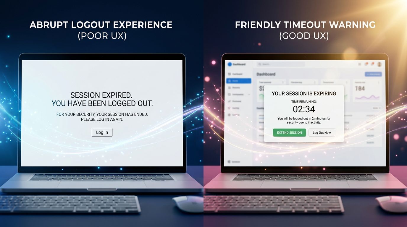
WCAG 2.1 criteria (level AA, mandatory for public-facing sites in France since the 2005 law strengthened in 2023) are clear on this point: the user must be warned before expiry, be able to extend their session, and if entered data is lost, they must be explicitly informed.
In concrete terms, what this means technically:
Configurable preventive alert
A modal that appears 2 minutes before expiry. Clear message: “Your session expires in 2 minutes. Would you like to continue?” Two buttons: continue / log out. Keyboard-accessible, readable by screen readers (correct ARIA attributes).
Automatic data saving
For long forms, local saving (localStorage or sessionStorage) of filled fields. If the session expires regardless, the data is restored on reconnection. Development cost: a few hours. User impact: major.
Context-dependent timeout
A static reading page does not have the same needs as a checkout funnel. We adapt session duration to the context of use. This is not over-engineering — it’s logic.
“Accessibility is not a checklist of boxes to tick. It’s the discipline of never forgetting that someone other than yourself is using what you build.”
How we reconcile the two in a real project
The practical question every project manager (and every client) asks: can we have both? Visual immersion AND robust accessibility?
Yes. But it requires an architecture planned from the outset, not bolted on at the end.
Here is how we structure this on our projects.
Phase 1: accessible foundation. We start with semantic HTML, heading hierarchy, colour contrast, keyboard navigation. It takes time. It is non-negotiable. This foundation will be what remains when animations fail to load.
Phase 2: progressive enrichment. We add animations, 3D effects, advanced interactions. Each layer is tested: disable JavaScript → does the site still work? Disable CSS → is the content readable? Simulate a 3G connection → does loading time remain acceptable?
Phase 3: testing with real users. Not personas. Real people. We regularly test our interfaces with users who use screen readers, users on low-end mobile devices, and older users who are less comfortable with digital technology. These tests systematically reveal issues that no automated audit detects.

What we concretely see with our clients: projects where accessibility is integrated from the design phase cost 20 to 30% less than those where it is added after delivery. And SEO performance is systematically better — because accessibility criteria and Google’s technical quality criteria overlap significantly.
The three mistakes to avoid at all costs
1. Treating accessibility as an end-of-project audit. This is the most costly mistake. Adding ARIA attributes to a design that was not built for them is like putting a plaster on a fracture. Accessibility is designed in, not corrected afterwards.
2. Believing that “mobile-friendly” means accessible. A responsive site is not automatically accessible. Click area size, contrast in bright sunlight, navigation without a mouse — these are different dimensions that require specific attention.
3. Sacrificing performance for visual effect. An animation that causes lag on 60% of smartphones in circulation is not a feature — it’s a bug. Core Web Vitals have become a Google ranking factor. A slow site loses on two fronts: user experience and search rankings.
What this means for your project
Three things to keep in mind if you’re launching or redesigning a site in the coming months.
Request an accessibility audit before the design phase, not after. It costs less and structures visual choices more effectively.
Require performance metrics in your technical specifications. LCP < 2.5s, CLS < 0.1, FID < 100ms. These figures must be contractual, not optional.
Test your order or contact journey with timeout scenarios. Fill in your main form, wait 20 minutes without submitting, then come back. What you experience, your users experience every day.
Conclusion: digital excellence is not a compromise
Visual immersion and accessibility are not two opposing sliders adjusted against each other. They are two quality requirements that, when handled well, reinforce each other.
An accessible site is a structured, performant, comprehensible site. A well-built immersive site is one that engages without excluding. Together, they are what makes the difference between a project you show in your portfolio and a project that generates measurable results for its owner.
After 15 years of building websites, the conclusion is simple: the projects that age best are those where we refused to choose between beauty and robustness.
Do you have a website project or redesign underway? We offer a free 30-minute technical audit — architecture, accessibility, performance. No commercial pitch. Just an honest look at what can be improved and what deserves to be kept. Contact GDM-Pixel directly.