What your users won’t tell you — but what your bounce rate reveals
A client contacted us a few weeks ago. His website proudly displays an AI chatbot in the bottom right corner. He invested. He’s proud. Problem: nobody uses it, and those who try abandon after two exchanges.
Why? Nobody understands what it does, what questions it can answer, or whether they’re talking to a real person or a bot. No indication. No context. A black box dressed up as an assistant.
This case isn’t isolated. It illustrates a tension that every serious web creator faces today: integrating AI into interfaces without betraying user trust. While continuing to address problems that existed before AI — and that AI doesn’t magically solve.
Broken accessibility. Design tools that generate unusable code. UX designed for the portfolio rather than for the actual end user. These problems persist. AI amplifies them if you’re not careful.
Here’s what we’ve learned in the field.
AI Transparency: the baseline rule that 80% of sites ignore
AI generates mistrust by default. It’s a documented fact. Users who interact with an automated system without knowing it feel manipulated when they discover the truth. And they always discover it.
Transparency isn’t a nice-to-have. It’s the minimum condition for your AI interface to actually be used.
Concretely, what does that mean?
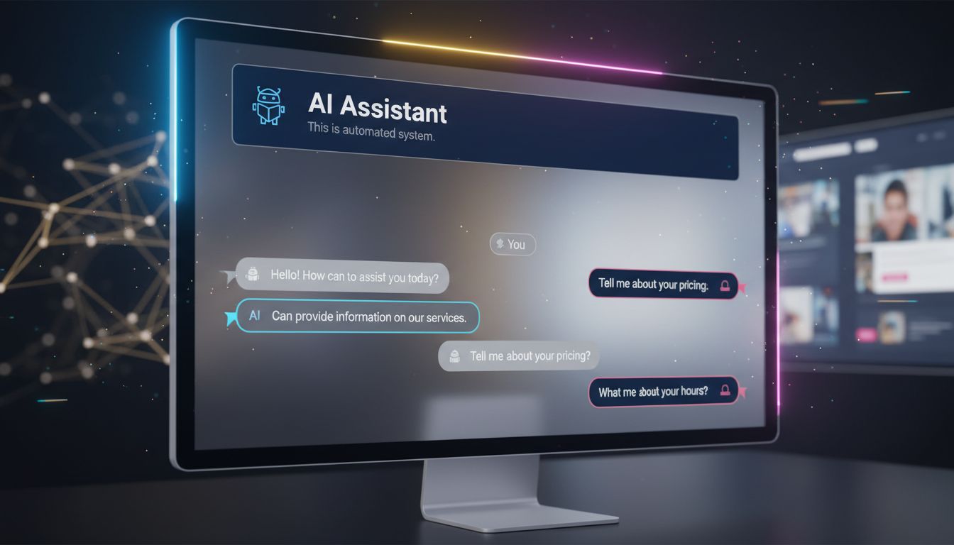
Clearly identify what is AI-generated
Not a discreet logo in 8pt font. A readable mention, placed before interaction. “This assistant is powered by AI — it can make mistakes.” Seven words. It changes everything.
On sites we build with integrated AI components, we apply a simple rule: if the user has to search to understand they’re talking to a machine, we’ve failed.
Define the AI’s scope before interaction
Your chatbot only answers questions about your hours and catalog? Say so when the widget opens. “I can answer your questions about our products and delivery times.” No false promises. No frustration.
What we see with clients: AI assistants that define their scope upfront have satisfaction rates two to three times higher than those claiming to “do everything.”
Provide a visible human escape route
AI doesn’t replace human contact — it prepares it. A “Talk to an advisor” button accessible at any time isn’t an admission of AI failure. It’s proof of respect for the user.
Web Accessibility: the challenge that AI doesn’t solve for you
This is where it gets interesting.
Many marketing managers believe that AI code-generation tools will mechanically produce accessible sites. Because AI “knows” WCAG standards. Because modern tools “include accessibility.”
This is false in practice.
According to the WebAIM Million 2024 report, 98.1% of analyzed homepages have automatically detectable WCAG errors. AI generates code. Not necessarily accessible code.
On projects we’ve led with automated stacks — Astro, Tailwind, components generated via Claude Code — we systematically audit accessibility post-production. The most frequent errors we fix:
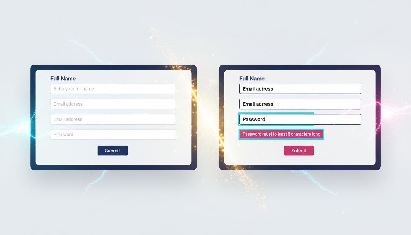
Insufficient contrast. Auto-generated color palettes rarely respect the 4.5:1 ratios required for standard text. An AI tool will give you a design that “looks good” — not necessarily readable for someone with vision impairment.
Images without meaningful alt text. AI can generate alt-text. It often generates “background image” or a generic description useless for screen reader users.
Forms without associated labels. Placeholder is not a label. This is a basic mistake that code generators reproduce regularly.
Keyboard navigation impossible. On custom interactive components — menus, modals, accordions — focus management is rarely correct in automatic generation.
What no agency tells you: accessibility takes time. It costs money. And it’s not optional — not just for ethical reasons, but because the European EAA (European Accessibility Act) progressively applies to commercial websites since June 2025.
If your agency doesn’t mention accessibility in the quote, ask. Directly.
The UX pitfalls that modern tools don’t fix
Tooling has improved. Real-world UX results: not always.
Three pitfalls we regularly fix on projects taken over from other agencies:
Design conceived for the demo, not for daily use
Design tools generate interfaces that impress in client presentations. Smooth animations, elaborate micro-interactions, parallax effects. In production, on a 4G phone in rural Normandy, it lags. The user leaves.
Our rule: we systematically test on simulated 3G network before any delivery. If it lags, we cut it. The ROI of an animation has never compensated for an extra second of load time.
Native HTML underused — and custom components over-built
It’s a paradox developers know well. We rebuild in JavaScript behaviors that HTML handles natively — and better. A native <select> is accessible by default. A custom React select requires 200 lines of code to reproduce what the browser does for free.
Same logic for forms, buttons, modals. Before building a custom component, the question must be: doesn’t native HTML already do this?
After 15 years building sites, I’ve learned that technical complexity is not a sign of quality. Often the opposite.
Generative AI in the interface without editorial guardrails
You integrate a component that generates content dynamically — product descriptions, summaries, recommendations. AI produces text. That text can be inaccurate, out of context, or simply poorly suited to your audience.
Without human review or automated validation, you publish anything in your name.
What we see concretely: AI content generation pipelines without validation have significant factual error rates. On Nova Mind, our own tool, we integrated a validation step before any automatic publication. Not because AI is bad — because reader trust is worth more than publishing speed.
Three principles for building AI interfaces that actually work
No theory. What we apply on our projects.
1. Transparency first, functionality second. Before coding an AI feature, ask: does the user know they’re interacting with AI? If not, fix that before anything else. Trust is built upstream, not in cleanup.
2. Accessibility integrated from the Figma phase, not at the end of the project. Check contrast, labels, keyboard navigation during design — not after development. Post-production fixes cost three to five times more than anticipating in conception. This figure comes from our own experience on audit projects.
3. Test with real users, not your colleagues. Your colleagues know the product. They don’t represent your target client — a 52-year-old SME manager consulting your site on their phone between meetings. User testing doesn’t need to be sophisticated. Five people using your interface under real conditions reveal 80% of critical issues.

What this concretely means for your site
If you have an existing site, here are the questions to ask yourself now:
Are your AI components clearly identified as such? Not in the legal terms — in the interface, at the moment of interaction.
Does your site pass a WAVE or Axe audit with no critical errors? These tools are free and take ten minutes. Results are often brutal.
Do your forms work entirely by keyboard? Test now. Tab, Enter, Escape. If you’re blocked anywhere, a user with motor disability is blocked too.
Has your mobile interface been tested on a real phone, not Chrome’s simulator? The difference is real.
Building for trust, not for effect
AI in web interfaces is no longer a futuristic option. It’s production reality in 2025. The question is no longer “should we integrate AI?” but “how do we integrate it without betraying our users?”
The answer comes down to three words: transparency, accessibility, pragmatism.
No animation that impresses in the demo and slows down production. No AI chatbot pretending to be a human advisor. No inaccessible form because nobody bothered to check contrast ratios.
What we build at GDM-Pixel is sites that work for real people, under real usage conditions. With or without integrated AI.
If you want us to audit your site — accessibility, UX, AI integrations — we offer honest diagnosis. No unnecessary overhauls. If three fixes suffice, we tell you three fixes suffice.
Contact us for a technical audit. We tell you what’s wrong — and what’s working too.
Key takeaways:
- AI transparency is not optional — it conditions trust and actual use of your interfaces.
- Accessibility costs 3 to 5 times less integrated from conception than fixed post-development.
- Native HTML often solves what custom components complicate — technical simplicity is a quality, not lack of ambition.