What most agencies won’t tell you about web design
A client called us a few months ago. His website had been redesigned two years earlier by a “creative” agency. Budget: 12 000€. Outcome: zero incoming leads since going live. Zero calls. Zero filled forms.
The site was beautiful. Genuinely beautiful. Smooth animations, a coherent colour palette, polished typography. And yet nobody understood what this company actually sold in the first five seconds.
That’s the fundamental problem no one dares state clearly: a website can be visually flawless and commercially useless.
Where’s the fault? Two specific issues we systematically spot in our audits: poorly chosen design tools that slow down production and pull you away from the end result, and communication so drowned in corporate jargon that it no longer speaks to anyone.
Here’s what we’ve learnt after 15 years building sites for SMEs in Normandy.
Design tools: stop paying for things you don’t use
The first question to ask isn’t “what is the best design software?” but “which tool lets me go from concept to code as fast as possible, with no friction?”
For years, the industry’s answer was: Adobe. Creative Suite, annual licences at 600–800€, a vertical learning curve, proprietary files you can’t open without re-subscribing.
Then Figma turned it all upside down. Collaborative, browser-based, free up to a certain point. We use it daily at GDM-Pixel — it’s our go-to tool for moving from mockup to code through our Claude Code + MCP servers workflow.
But there’s a whole open-source ecosystem that corporate agencies ignore, and it deserves your serious attention.
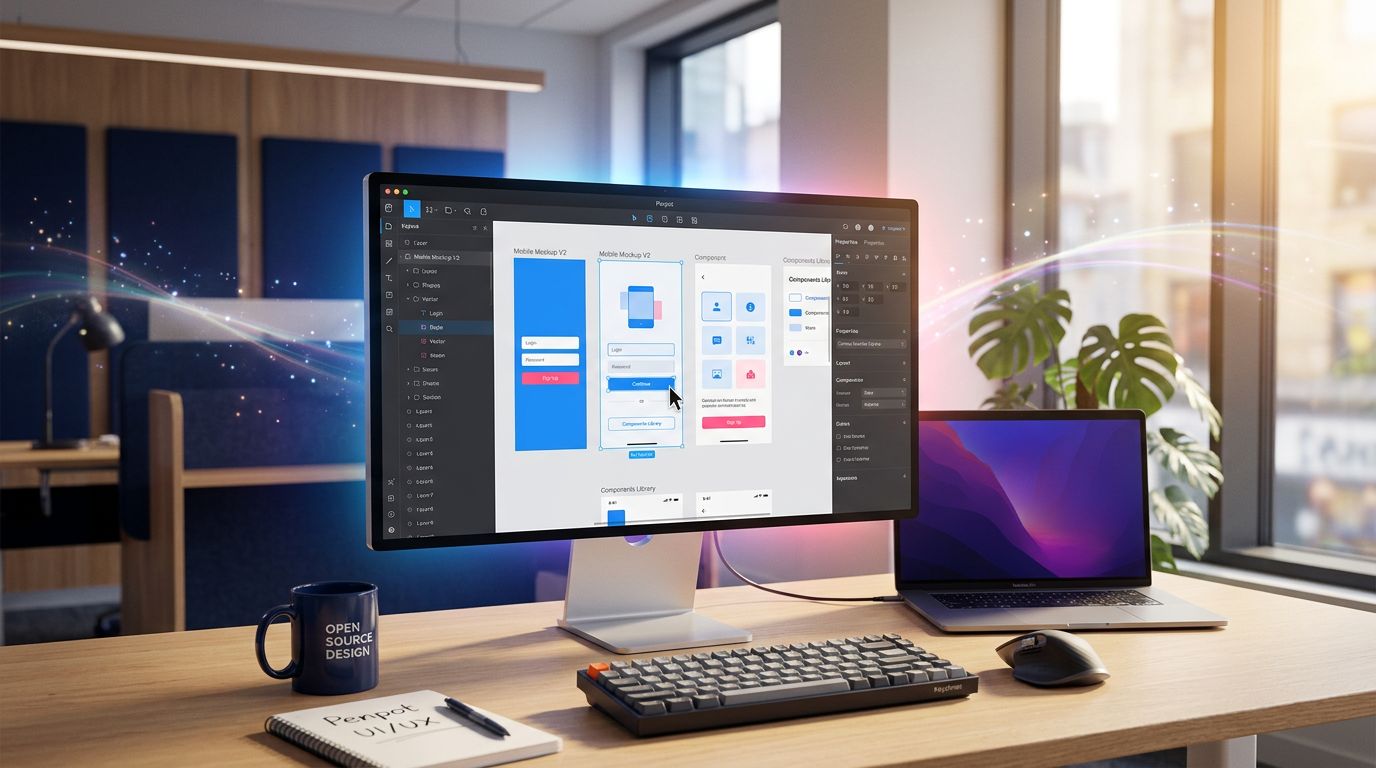
Penpot: the open-source alternative to Figma that actually delivers
Penpot is probably the most underrated tool out there right now. Open-source, self-hostable, compatible with open SVG standards. That last point is crucial: your files are not held hostage by a platform.
In practical terms, here’s what it changes for an SME or an agency:
No licence cost. For a small structure, the difference between 0€ and 600€/year on design tools is tangible. That budget can go elsewhere — into content, into advertising, into automation.
Total independence. If Figma decides to triple its prices tomorrow (as Adobe did with Photoshop), you’re not stuck. Your files stay your files.
Native collaboration. Like Figma, Penpot works in real time with multiple users. Perfect for teams working with developers or clients who want to follow progress.
It’s not perfect. The plugin ecosystem is still limited compared to Figma. Performance on very heavy files can falter. But for 90% of the showcase or e-commerce site projects we handle, it’s more than enough.
Inkscape and GIMP: the old soldiers that refuse to die
Inkscape for vector work, GIMP for bitmap. These two tools have a bad reputation because they are “old” and “complex”. But that reputation is unfair.
What we see on the ground: a craftsman who wants to tweak his logo for his new website doesn’t need Illustrator at 300€/year. He needs Inkscape, a 20-minute YouTube tutorial, and 45 minutes of his time.
Our advice for a small business on a tight budget: start with these tools. Master the basics. If you hit their limits — and that moment may come —, then consider Figma or a paid alternative. Not before.
The real problem: your website is talking to itself
Back to that client with his 12 000€ site. We ran the audit in three hours. The diagnosis was simple and brutal: not a single sentence on that site answered the question a visitor asks when they arrive.
That question is universal and takes three seconds to form in your prospect’s head: “Can this site help me solve my problem?”
Not: “What a lovely visual identity.” Not: “Impressive, they have a holistic approach to digital transformation.” Just: “Can these people help me, personally, right now?”
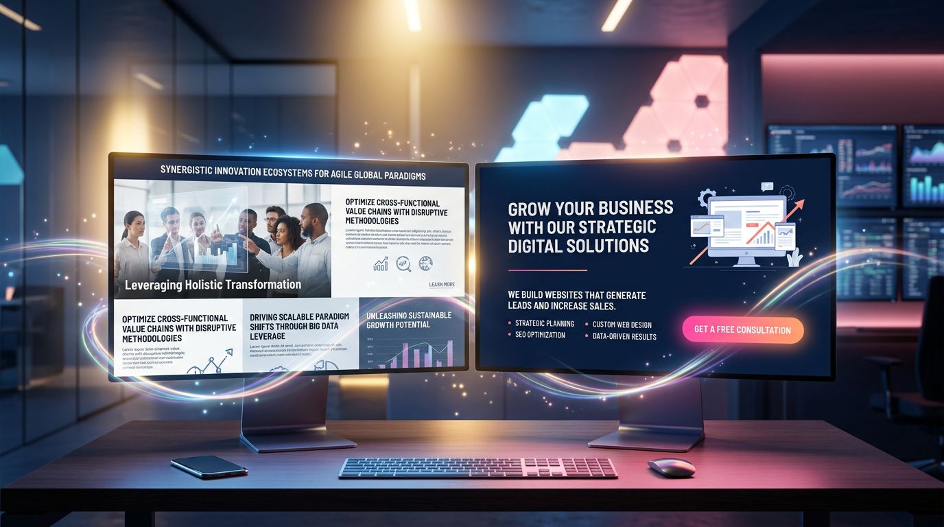
Corporate jargon kills that answer before it can even form.
“If you need two sentences to explain what you do, you’ve already lost half your visitors.”
That’s not an opinion. It’s what user behaviour data shows: according to Nielsen Norman Group studies on web attention, users decide in under 10 seconds whether to stay or leave. That window only keeps shrinking.
The 5 phrases to ban from your website immediately
Here’s what we find on almost every SME site we audit:
“We support you in your digital transformation.” What does that actually mean? Nothing. Replace with: “We build your website and optimise it so Google can find you.”
“A holistic, synergistic approach to your challenges.” Delete. Immediately. Replace with what you actually do.
“Excellence, agility, innovation.” These three words appear on thousands of sites. They no longer differentiate anything. If you must use them, back them up with numbers: “Delivery in 7 days, not 4 weeks.”
“Tailor-made solutions adapted to your needs.” Everyone says that. Nobody says “standard solutions that don’t fit your needs.” This sentence is useless.
“Leader in our field.” Leader according to whom? Since when? With what figures? Either you prove it, or you delete it.
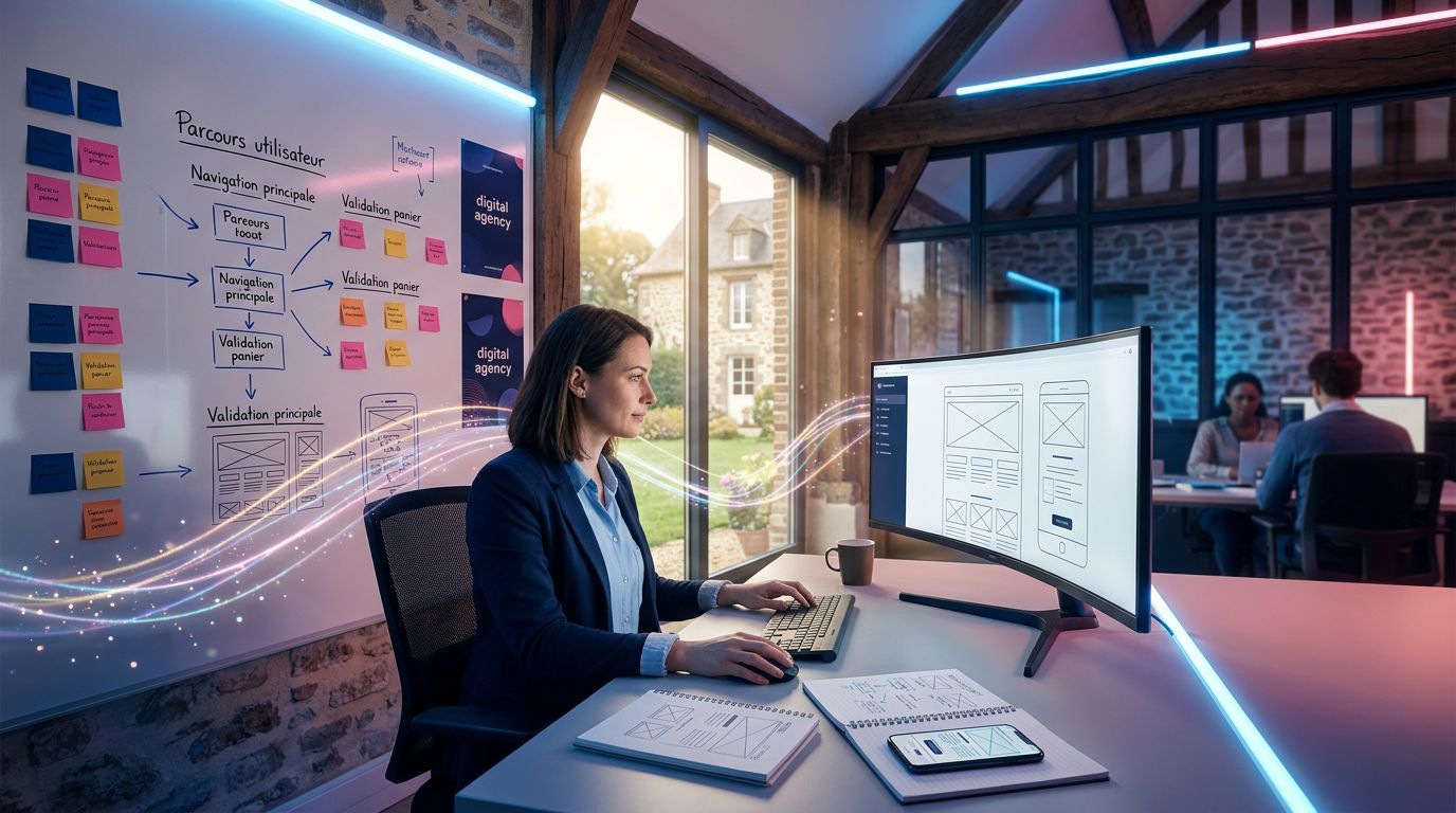
Clear communication: the concrete method to rewrite your content
Here’s the test we systematically apply in our projects. We call it the “café test”.
Imagine you’re explaining your business to someone you’ve just met in a café. Not an investor, not a journalist — just a normal person. What do you say?
“I build websites for craftsmen and shop owners in Normandy. They usually contact me because they don’t have a website, or because their current site brings in nothing. I deliver something clean and effective within a week.”
That’s it. That’s your homepage. Not “We create immersive digital experiences for local actors of the regional economy.”
Clarity isn’t a lack of sophistication. It’s the sign that you truly master your subject.
The structure of a page that converts
Here’s what we’ve validated across dozens of projects at GDM-Pixel:
What you do (in one sentence)
From the very first screen, visible without scrolling. Maximum 15 words. Example: “Websites for craftsmen and SMEs — delivered in 7 days.”
Who you do it for
Name your target. “For plumbers, electricians and building craftsmen in Normandy.” The visitor who doesn’t see themselves leaves. The one who does, stays — and they’re qualified.
Why you rather than someone else
Not your values. Not your philosophy. A measurable result or concrete proof. “47 craftsmen in Normandy have trusted us since 2018.” Or: “Quote within 24h, site live within 7 days.”
What to do right now
One single call to action. Not five. One. “Request your free quote.” Or “Call us.” Pick one and stick to it.
The link between tools and communication: what nobody connects
Here’s a field truth I took a long time to phrase clearly.
Teams who use overly complex design tools spend more time mastering the tool than thinking about the message. Result: sites that are visually refined but empty of meaning.
Conversely, when you simplify the technical stack — an accessible design tool, an industrialised development workflow like ours (Astro + Tailwind + Claude Code) — you free up mental bandwidth. And that bandwidth goes where it should: into content strategy, messaging, and what will actually make the visitor pick up the phone.
That’s why, at GDM-Pixel, we’ve industrialised the technical side. Not for the sake of technology, but to have more time for what matters: understanding the client’s business and translating their expertise into sentences that resonate with their prospects.
“Technology should disappear behind the result. If your visitor notices the design before understanding what you sell, something is wrong.”
According to a Stanford Web Credibility Research study, 75% of users judge a company’s credibility partly on the quality of its text content — not solely on the design. Substance before style. Always.
What you can do this week
Three concrete actions, in order of priority:
1. Audit your homepage with the 5-second test. Show your site to someone who doesn’t know your business. After 5 seconds, ask them what you do. If the answer is vague or wrong, your messaging needs reworking.
2. Delete the first three sentences of your homepage. In 80% of cases, those sentences are corporate filler. What comes after is often more useful and clearer. Try it.
3. If you use paid design tools that you only master at 20%, explore Penpot or Figma Free. Not to save money at all costs, but to check whether the cost matches real usage. If yes, keep what you have. If not, reallocate that budget to content or automation.
Conclusion: clarity is a competitive advantage
In a market where everyone says “leader”, “innovative” and “tailor-made”, being clear and direct has become rare. And what is rare is valuable.
A site that simply explains what it sells, to whom, and why choose this company rather than another — that site converts. Not because of its design. Because of its honesty.
Open-source tools are a lever for structures that want to keep control of their production without blowing their budget. Jargon-free communication is a lever for capturing the attention of prospects who only give you 10 seconds.
Both together: that’s a site that works for you, not against you.
Does your current site answer your visitor’s question in under 5 seconds? If you’re not sure, contact us for an audit — we’ll tell you what works and what doesn’t, straight up, no corporate waffle.