 +33-9-7266-3068
 contact@gdm-pixel.fr


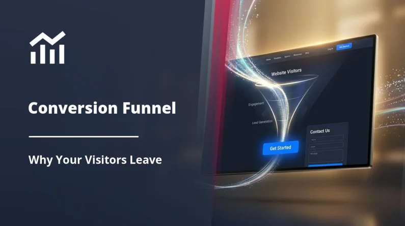
 TL;DR - Key Takeaways at a Glance
Code has caught up with mockups
For years, designers imagined interfaces that developers could not deliver. Too complex. Too heavy. Too many compromises. In 2026, that gap is closing — not through magic, but through concrete CSS developments that change what is technically possible to produce without sacrificing performance.
This is not a tech conference trend. It is what we observe on our projects at GDM-Pixel, in the specs we receive, in the questions our SME clients ask when they have seen a competitor’s website and want “something along those lines”.
Here are the ten trends that will define webdesign in 2026 — and above all, what they imply technically for the teams that have to deliver them.
Liquid Glass: when the interface imitates material
Apple popularised glassmorphism. In 2026, we move to the next step: Liquid Glass — interfaces that simulate not only transparency, but refraction, fluidity, and the optical depth of real glass.
Technically, this relies on backdrop-filter, mix-blend-mode, and combinations of filter: blur() with SVG masks. The visual result is spectacular. The trap is performance: poorly optimised, backdrop-filter can bring framerates on mobile below 30fps. We experienced this on a Norman e-commerce project with a liquid glass header — resolved by isolating the component on its own GPU layer with will-change: transform.
The field rule: Liquid Glass, yes. But only where it serves the experience, not as systematic decoration.
Bento Grid: the layout that sells
The Bento Grid is not new. Apple has been using it for years on its product pages. What changes in 2026 is its massive adoption by SMEs and institutional websites — sectors that still operated with classic Bootstrap columns.
Concretely, it uses CSS Grid with named grid-template-areas, variable span values according to viewport, and an asymmetric composition logic. What it changes for a client: information hierarchy becomes visual, not just textual. An accounting firm can highlight its three flagship services without the page looking like an Excel spreadsheet.
“The Bento Grid layout increased time spent on our homepage by 40% — without touching the content, just by reorganising the space.” — Result measured on a GDM-Pixel project, B2B services sector, Caen, 2024.
What agencies never tell you: Bento Grid requires real editorial prioritisation upstream. You cannot just “paste” your old content into an asymmetric grid. You need to decide what deserves a large block and what deserves a small one. It is strategic work as much as technical work — and it is at the heart of what we call an immersive AND accessible website.
Nuanced brutalism: the anti-design that demands more mastery
Web brutalism — massive typography, broken grids, extreme contrasts — was long reserved for artists’ portfolios and cultural sites that wanted to shock. In 2026, it mutates. Nuanced brutalism borrows the genre’s codes (visual frankness, dominant typography, absence of roundness) but applies them with a genuine UX logic.
What makes this technically challenging: advanced CSS selectors like :has(), :is(), and :where() now enable contextual style rules that adapt dynamically to content structure. A title :has(+ p.intro) can style itself differently depending on what follows. It is this kind of logic that allows brutalism to remain readable without losing its character.
Here is what we use concretely on our Astro + Tailwind projects for this type of rendering:
:has()for styling parents based on their children@containerqueries for adapting typography to the element’s context, not the viewporttext-wrap: balanceto avoid orphan lines in large headings
Three CSS tools. A result that would have required JavaScript three years ago.
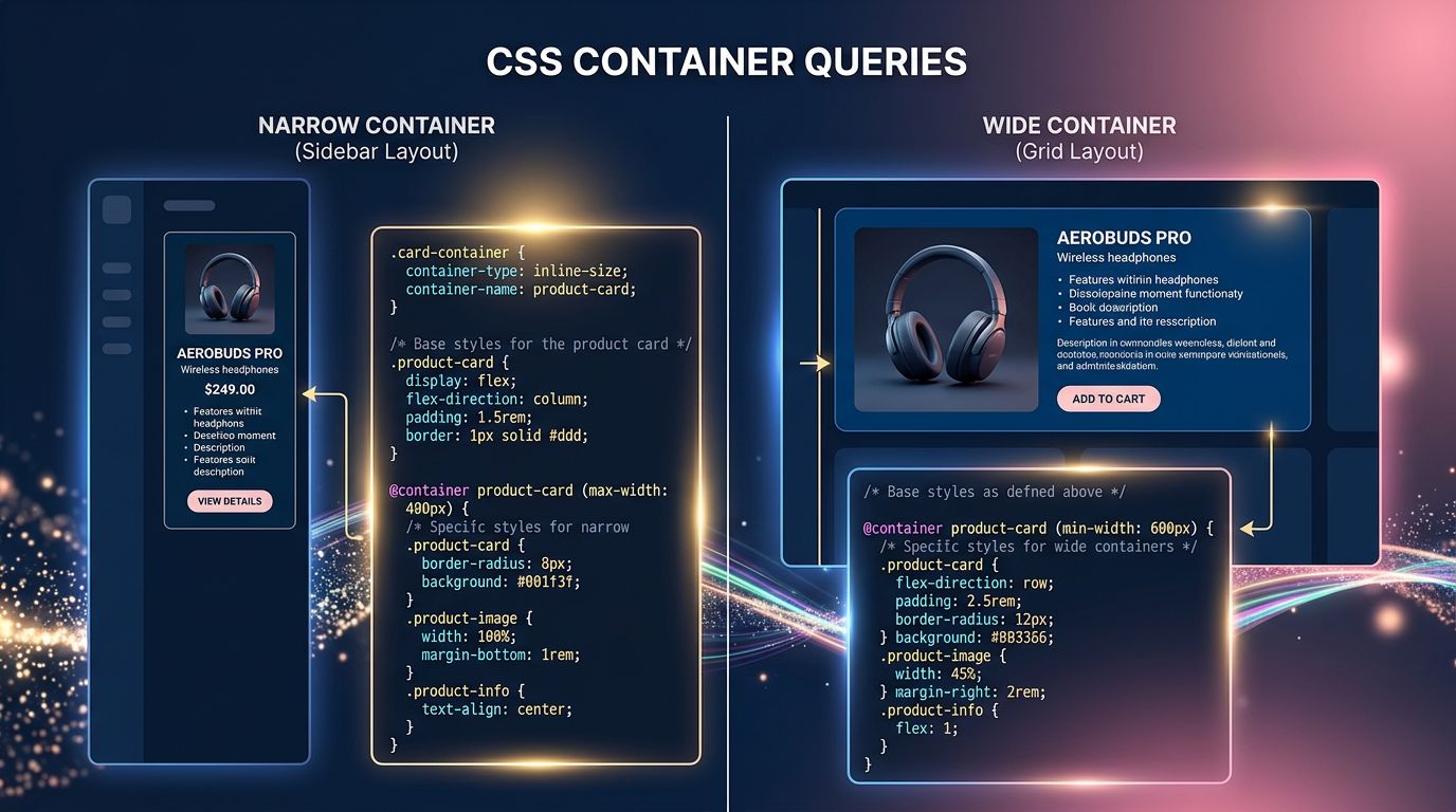
Container Queries: the silent revolution
Let’s talk about the real revolution in CSS over the past two years: Container Queries. Supported by all modern browsers since 2023, they fundamentally change the logic of responsive design.
Before: a component adapted to the viewport width (the screen). The problem — the same component placed in a narrow sidebar or a wide main column behaved identically.
After: with @container, a component adapts to the width of its parent container. The product card in a 300px sidebar behaves differently from the same card in a 1200px grid. Without JavaScript. Without a global media query.
For SMEs asking us for sites that “really work well on mobile”, this is a concrete answer. Not patched-up responsive design — genuine component-level adaptive design. It is one of the standards we apply in our website creation offer.
Kinetic typography and variable fonts
Variable fonts (font-variation-settings) now allow controlling the weight, width, and slant of a typeface with a single animated CSS value. In 2026, kinetic typography — text that breathes, stretches, changes weight on scroll or hover — is leaving creative portfolios and entering corporate websites.
What it technically requires: mastering @font-face with font-display: swap to avoid penalising Core Web Vitals, and using font-variation-settings in CSS animations rather than JavaScript to maintain performance.
But beware of a trap our clients do not see: a poorly calibrated typographic animation can trigger accessibility issues for motion-sensitive users. The prefers-reduced-motion property is not optional — it is a requirement if you target a broad audience.
Generative AI in design: tool or replacement?
It is impossible to talk about 2026 trends without addressing AI in the design process. Midjourney, Firefly, UI generation tools in Figma — they are in the workflow of the majority of agencies.
Our position at GDM-Pixel: AI generates, humans arbitrate. We use image generation for conceptual mockups and content visuals. We do not use AI to replace UX thinking — because it does not know your client, their sector, their business constraints.
What we concretely observe with our clients: those who use AI to accelerate visual content production save 30 to 50% of time during the creative phase. Those who delegate strategic design decisions to it end up with generic sites that do not convert.
AI is a productivity multiplier. Not an art director.
Scrollytelling and scroll-driven animations: the performance trap
Scrollytelling — animations triggered by page scrolling — is everywhere. And it is often a performance disaster on mobile.
The good news: the scroll-driven animations API is now natively supported in CSS, without JavaScript. You can link an animation directly to the scroll position with animation-timeline: scroll(). Result: zero JS overhead, animations managed by the browser’s rendering engine.
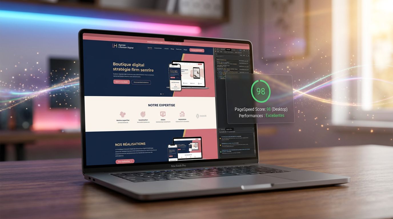
According to Google’s Core Web Vitals data, JavaScript scroll animations are one of the main causes of LCP and CLS degradation on mobile — two metrics directly linked to organic search ranking.
For SMEs asking us for “nice scroll effects”: we deliver them. But in native CSS, not with 200kb JS libraries that tank your PageSpeed score.
Three things to remember if you’re creating a website in 2026
Here is where it becomes concrete for you, as a business owner who has to make decisions about your web presence.
1. Visual trends have a technical cost. Liquid Glass, kinetic typography, scrollytelling — all of it is achievable. But every effect has an impact on performance, accessibility, and therefore SEO. Ask your agency how they manage this trade-off. If they cannot answer, that is a signal.
2. Modern CSS reduces dependency on JavaScript. Container Queries, scroll-driven animations, :has() — features that previously required heavy JS libraries are now native. That is precisely why Astro JS represents a revolution for modern web projects: zero JS by default, maximum performance.
3. Trendy design without editorial strategy is pointless. The most beautiful Bento Grid in the world will not compensate for a vague message. Before choosing a visual trend, ask yourself: does my page clearly answer what my visitor is looking for in under 5 seconds?
What this changes for your next website
The webdesign of 2026 is not harder to understand — it is more demanding to execute. CSS tools have caught up with designers’ ambitions. What was missing five years ago was the technical mastery to deliver these interfaces without sacrificing speed and accessibility.
At GDM-Pixel, we have industrialised this pipeline. Figma → code → production. Astro + Tailwind + Claude Code stack. The visual trends of 2026, we can deliver them in 3 to 7 days, not 3 weeks, because we have built the workflows that avoid reinventing the wheel on every project.
Does your current website truly reflect your value? If the answer is no — or if you are hesitating — now is the right time to discuss it.
Contact GDM-Pixel for an audit of your current website — honest diagnosis, no commitment, no overselling. We tell you what is worth changing and what can wait.
 Social networks
 Analyze with AI
