What most websites don’t do
A client called us a few months ago. Their previous agency had delivered a “modern” website. Beautiful on the mockups. But as soon as dynamic content was added — a real-time data stream, an ambitious portfolio section — everything shook. Elements jumped around. Text rearranged itself during loading. The user experience fell apart.
The problem wasn’t aesthetic. It was technical. And it’s far more common than people think.
Designing a web interface that holds up against real complexity — data streaming, rich narrative content, multiple interaction layers — is a discipline in its own right. Not a question of templates or page builders. A question of engineering.
Here’s what we’ve learned on the subject, building interfaces that truly stand out.
The streaming content problem: when the interface shakes
Streaming content has become commonplace. News feeds, AI-generated responses word by word, real-time financial data, push notifications. Your interface receives content in chunks, asynchronously, and must display it smoothly.
In theory, it’s simple. In practice, it’s a visual stability nightmare.
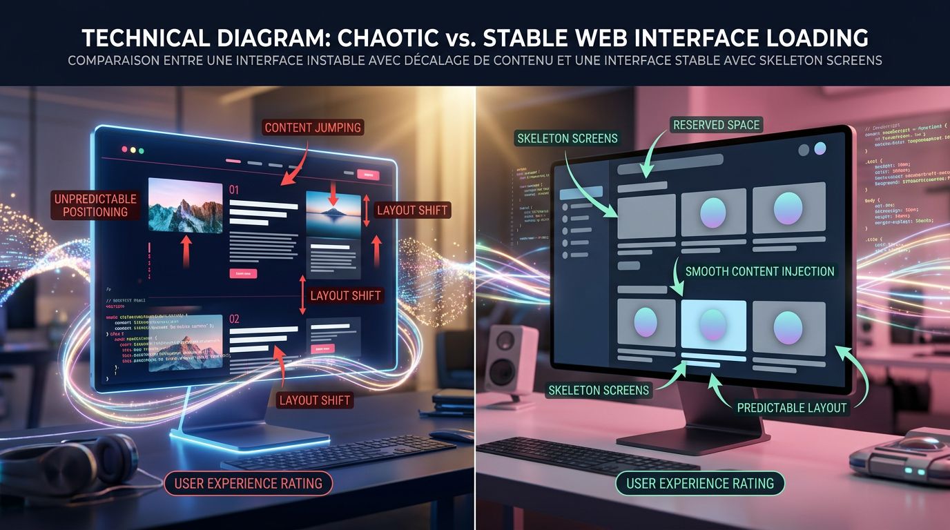
The core problem: CLS. Cumulative Layout Shift measures how much your interface “jumps” during loading. Google made it a ranking criterion in its Core Web Vitals since 2021. But beyond SEO, it’s primarily a user experience issue. A user who sees content moving beneath their eyes loses trust. They leave.
What we concretely see with clients who manage dynamic content: developers rarely reserve the necessary space before content arrives. The result? The interface visually rebuilds itself with every new chunk of data. It’s unstable, uncomfortable, and hurts search rankings. This is exactly the type of failure that occurs when you neglect code quality and the invisible craftsmanship behind UX.
The solution comes down to three principles we apply systematically.
Reserve space before content
Before the first piece of data even arrives, the interface must know how much space it will occupy. This involves precisely dimensioned skeleton screens, containers with a fixed or minimum defined height, and explicit loading state management. It’s not glamorous to code. It’s essential.
Anchor critical elements
Action buttons, headings, navigation elements — they must never move, regardless of how the surrounding content evolves. We isolate them in independent layout zones, outside the dynamic content flow.
Control the display rhythm
Rather than displaying each data fragment as soon as it arrives, we can introduce micro-buffering: accumulating a few elements before injecting them in a single DOM operation. The interface appears more stable, the rendering is cleaner. The trade-off between responsiveness and stability is managed at the component level.
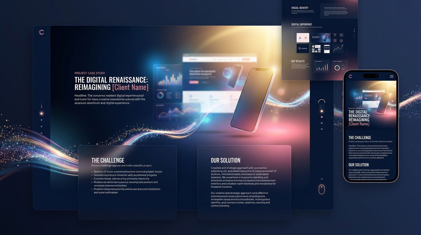
Why classic portfolios are no longer enough
Let’s now talk about another challenge: online portfolios.
The project gallery is the default format. A grid of images, title, description, link. It does the job. It impresses no one.
The problem is that a portfolio is supposed to sell a skill, a vision, a world. Yet a grid of thumbnails looks like everyone else. It tells nothing. It creates no emotion.
“A portfolio is not a catalogue. It’s a sales argument put on stage.”
After 15 years building sites for creatives, agencies, studios, and freelancers, we have a deeply held conviction: the portfolios that truly convert are those that transform each project into a narrative experience.
What does that mean concretely?
From static project to interactive story
Instead of displaying an image and text, we guide the visitor through a progression. The client’s context. The problem to solve. The technical or creative constraints. The decisions made. The measurable result.
Each project becomes a mini case study with a narrative structure: initial situation → tension → resolution → impact.
This approach requires more editorial content, yes. But it justifies the rates, builds trust, and differentiates. A visitor who understands why you made a particular technical or creative choice is infinitely more likely to contact you than one who just saw a beautiful image.
Visual layering as a language
Distinctive portfolios use depth. Not just decorative parallax effects — a real visual hierarchy that guides the eye and creates narrative tension.
We’re talking about overlapping layers: typography in the foreground over background media, transitions between projects that maintain a visual thread, micro-animations that punctuate moments of discovery without ever disrupting readability.
The rule we impose on ourselves: every visual effect must serve comprehension or emotion. If it only decorates, it adds weight. We remove it.
Performance is non-negotiable
A heavy portfolio is a dead portfolio. Creatives tend to load their showcases with 4K videos, heavy JavaScript animations, unoptimised images. The result: 8 seconds of loading, 60% bounce rate on mobile.
On the projects we’ve led, we impose a strict performance budget from conception. Images in WebP, lazy-loaded videos, CSS animations rather than JavaScript where possible, static or hybrid rendering depending on the case. A beautiful slow portfolio serves no purpose. A beautiful fast portfolio converts. It’s the trade-off we detail in our analysis of immersive and accessible websites.
The invisible engineering that makes everything possible
What we’ve just described — streaming stability, portfolio narrativity, systematic performance — all of this rests on architectural choices made upstream. Not visible choices. Invisible ones. The ones that make the difference between a site that holds up over time and one that needs a complete rebuild in 18 months.
Here’s what agencies never tell you.
The choice of framework determines everything. There’s no universally right or wrong answer, but there are answers suited to specific contexts. For a static portfolio with strong visual impact, Astro with targeted interactivity islands. For an interface with lots of real-time data, React or SvelteKit with controlled state management. For an SME showcase site that must be maintainable without a developer, WordPress with a custom theme and clean component architecture.
What we see too often: agencies applying the same stack to every project. Either because it’s what they know, or because it’s what they sell. The client pays for a solution ill-suited to their actual situation.
Separation of concerns is an investment. A component that does too many things — display, business logic, API calls, state management — is a component impossible to maintain and evolve. We see it on projects we take over: code that “works” but that no one dares touch because no one truly understands what it does.
Best practice is to separate from the start: display components on one side, data logic on the other, side effects isolated. It takes more time to design. It saves enormous amounts of time to maintain.
The design system is a technical decision. Not just an aesthetic one. A well-designed design system — with consistent colour, typography, and spacing tokens — allows you to evolve the interface globally by changing a single variable. Changing the primary colour of a 40-page site in 30 seconds rather than 3 hours is possible. Provided you’ve built the right foundation from the start.
What this means for your project
Let’s flip the situation. You’re not a developer. You’re a business owner, a creative, an entrepreneur. Why does any of this concern you?
Because these technical choices have direct consequences on your ROI.
An unstable site that jumps during loading: Core Web Vitals penalty, less organic traffic, high bounce rate. Fewer leads.
A portfolio that tells nothing: visitors who leave without understanding what you actually do. Fewer conversions.
Poorly architected code: every modification costs 3x more than expected because the developer has to untangle everything before touching anything. Higher maintenance costs.
Conversely, a site technically well-designed from the start is an asset that appreciates in value. It supports the addition of features without starting from scratch. It maintains its performance over time. It adapts to the evolution of your business. This is precisely the logic that guides our approach to custom website creation.
“The technical quality of a site is not a cost. It’s an insurance policy on the lifespan of your investment.”
Does your current workflow allow you to deliver this level of quality systematically? Or does each project start from scratch, with the same mistakes each time?
Three principles to remember for your next project
Whatever the complexity of your project, these three guidelines apply.
1. Stability first. Before thinking about visual effects, define how your interface handles dynamic content. Skeleton screens, reserved spaces, explicit transition states. This is what differentiates a professional site from one that “feels amateur” without anyone quite knowing why.
2. Narrative over presentation. Whether it’s a portfolio, a service page, or a landing page, tell a story. Context → tension → resolution → result. A visitor who understands your added value is a visitor who contacts you.
3. Architecture for the long term. Ask your agency or developer how they separate responsibilities in the code. How they manage design tokens. What their 18-month maintenance strategy is. These aren’t technical questions — they’re business questions.
Building interfaces that last: our approach at GDM-Pixel
After 15 years building websites, then industrialising this production with AI, we have one certainty: technical sophistication is not reserved for large companies. It’s accessible to any organisation that makes the right choices from the start.
What we’ve industrialised at GDM-Pixel is precisely this ability to deliver complex interfaces — stable, narrative, performant — within timelines that weren’t possible three years ago. Our Astro + Tailwind + Claude Code stack allows us to manage technical complexity without letting it explode budgets and deadlines.
If you have a web project that demands more than a template — interface with dynamic data, narrative portfolio, custom business application — we can look at it together.
No vague promises. An honest diagnosis, a proposed architecture, clear timelines and budget.
Get in touch with our team — we’ll tell you in 30 minutes whether your project matches what we know how to do, and how we’d approach it.