+33-9-7266-3068
 contact@gdm-pixel.fr








 TL;DR - Key Takeaways at a Glance
What a Poor User Experience Really Costs
One of our clients called us last year, frustrated. His site had been running for three years, he had invested €4,000 in a visual redesign, and online sales were stagnating. He wanted to change the colours. Maybe the logo. “Maybe the site just doesn’t look good.”
We looked at his Analytics data together. The problem wasn’t aesthetic. His order funnel was losing 74% of visitors between the basket and checkout. Not a colour problem — a measurable, quantified, fixable user experience problem.
That’s the real issue. Not “does my site look good?” but “does my site convert, retain, and generate revenue?” The difference between those two questions is thousands of euros in income.
Here are ten UX truths backed by concrete data. Not to frighten — but to give you the arguments that turn a web budget into a justifiable investment.
1. Load Time Destroys Your Revenue Before the User Reads a Single Line
3 seconds. That’s the threshold beyond which 53% of mobile visitors abandon a site, according to Google data. Not 10 seconds. Not 8. Three.
For an online shop generating €10,000 in monthly sales, a site that loads in 5 seconds instead of 2 can represent €2,000 to €3,000 in lost sales every month. This is not an estimate — it’s a direct extrapolation of performance benchmarks documented by Google and Portent.
What we see concretely with our clients: sites built without performance optimisation lose between 20% and 40% of their potential traffic before the first interaction. We address this with Core Web Vitals audits, lazy loading, and an appropriate technical stack. The ROI is measurable in weeks.
Speed is not a technical detail. It’s a business decision. It’s also why rising traffic doesn’t always translate into revenue: without a healthy technical foundation, visitors leave before converting.
2. Mobile Is No Longer the Future — It’s the Present Many Businesses Still Ignore
In France, over 60% of local searches are conducted on a smartphone, according to Google France data. For a bakery, a craftsman, a medical practice — the majority of your visitors discover you on a 6-inch screen.
And yet, how many SME sites are still designed “desktop-first” with responsive added as an afterthought?
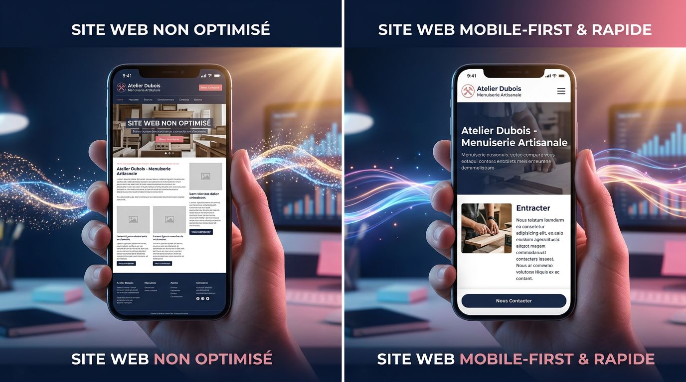
This isn’t just a question of appearance. A site not adapted for mobile penalises your organic search ranking since 2018 (Google Mobile-First Indexing), reduces time spent on the site, and mechanically increases your bounce rate. Three simultaneous negative impacts on your visibility and conversions.
“Mobile is not a secondary channel. For most local small businesses, it is the primary channel.” — Feedback from our audits in Normandy
3. Every Moment of Hesitation on Your Site Costs Money — Visual Hierarchy Is Not Decoration
The human eye makes a decision in 50 milliseconds on “should I stay or should I go?”. Visual hierarchy — how you organise headings, subheadings, call-to-action buttons, and white space — determines whether your visitor instantly understands what you do and how to contact you.
A/B tests documented by Nielsen Norman Group show that pages with clear visual hierarchy increase conversion rates by 20 to 35% compared to cluttered pages, even with identical content.
Concretely: is your “Request a Quote” button visible without scrolling? Does your main value proposition read in under 5 seconds? If the answer is no, you are losing qualified prospects every day.
4. Trust Is Built (or Destroyed) by a Few Precise Elements
First visual impression: 0.05 seconds. That’s how long a visitor takes to form an opinion about your credibility, according to a study from Carleton University published in Behaviour & Information Technology.
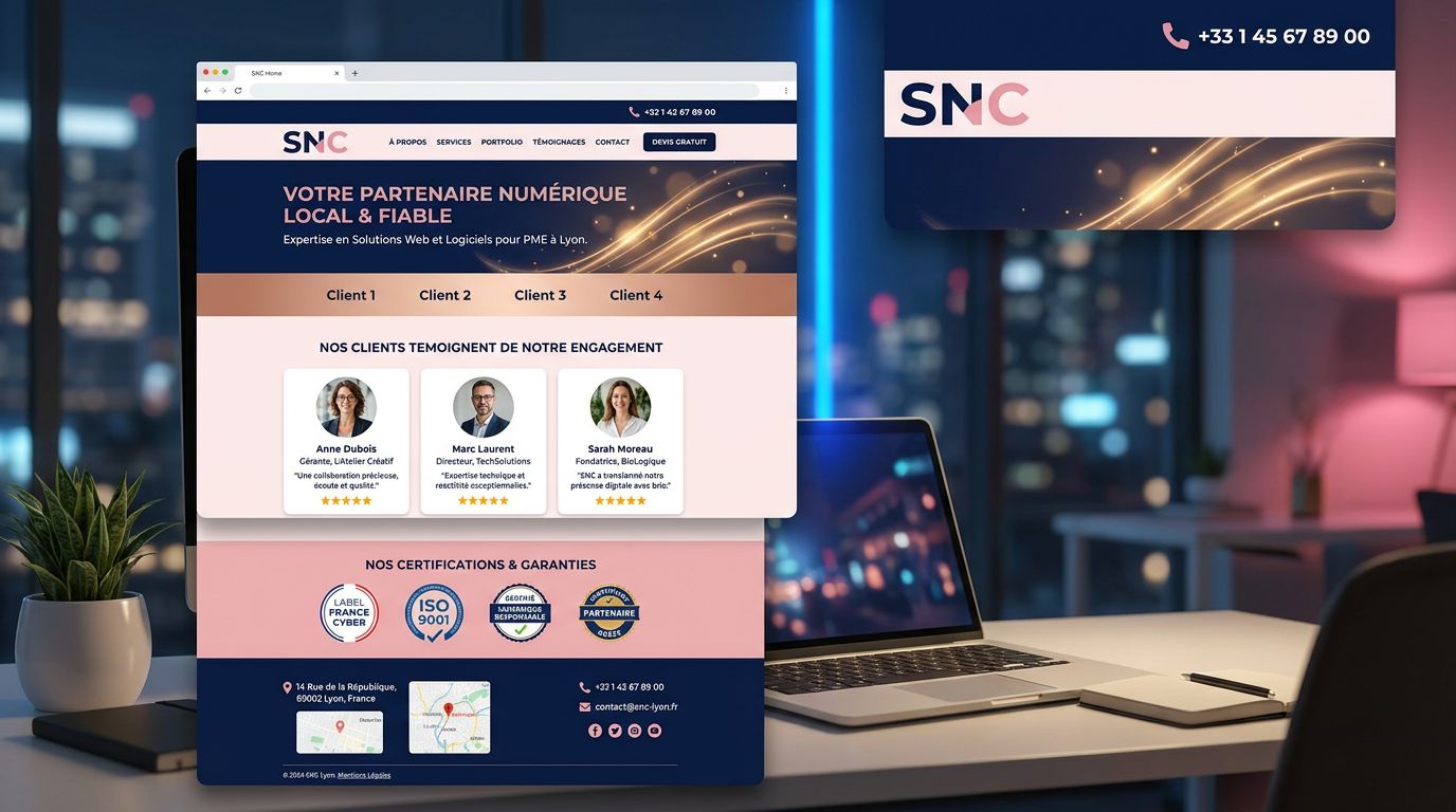
For an SME, this translates into very concrete elements: professional photos vs. generic stock photos, visible and dated customer reviews, displayed certifications, accessible legal notices. These trust signals are not optional — they are the difference between a prospect who stays and one who leaves to find a competitor.
What no agency ever tells you: a complete redesign is not always necessary. Sometimes, adding three client testimonials with real photos and a “They trust us” section is enough to increase the contact rate by 15 to 25%. We’ve measured it.
5. Overly Long Forms Kill Your Conversions — The Numbers Are Clear
Your contact form asks for: first name, last name, email, phone, company, industry, project type, budget, desired timeline, free message?
Each additional field beyond the strict minimum reduces your completion rate. Hubspot data from thousands of B2B forms shows that a 3-field form converts on average 25% better than a 6-field form.
Let’s flip this: you think you’re collecting more information, but in reality you’re collecting fewer leads. The “complete” form is often the empty form. This is one of the classic leaks we analyse in our breakdown of the conversion funnel and why your visitors never contact you.
Our advice for a small business with a limited budget: test a minimalist version of your form (name + email + message) for 30 days. Compare. The data will speak for itself.
6. Accessibility Is Not a Luxury — It’s 12 Million French People You May Be Excluding
In France, according to INSEE, around 12 million people live with a disability that can affect their web browsing: visual, motor, cognitive impairments. An inaccessible site mechanically excludes a portion of your potential market.
Beyond the ethical and legal aspects (RGAA imposes growing obligations, particularly for public companies and soon for SMEs with more than 50 employees), accessibility improves SEO. Good accessibility practices — semantic structure, alt text on images, sufficient contrast — are also positive signals for Google.
Accessibility = inclusion + SEO + legal compliance. Three reasons to act, one single action.
7. Bounce Rate Is Not an Abstract Number — It’s Money Walking Out the Door
A bounce rate of 80% on your homepage means 8 out of 10 visitors leave without interacting. If your site receives 500 visits per month and you convert 2% of those who stay, you understand the impact of even a marginal reduction in bounce rate.
Here’s where it gets interesting: the causes of a high bounce rate are almost always identifiable and fixable. Load time too long, content that doesn’t match search intent, lack of a clear call to action, design that inspires little confidence.
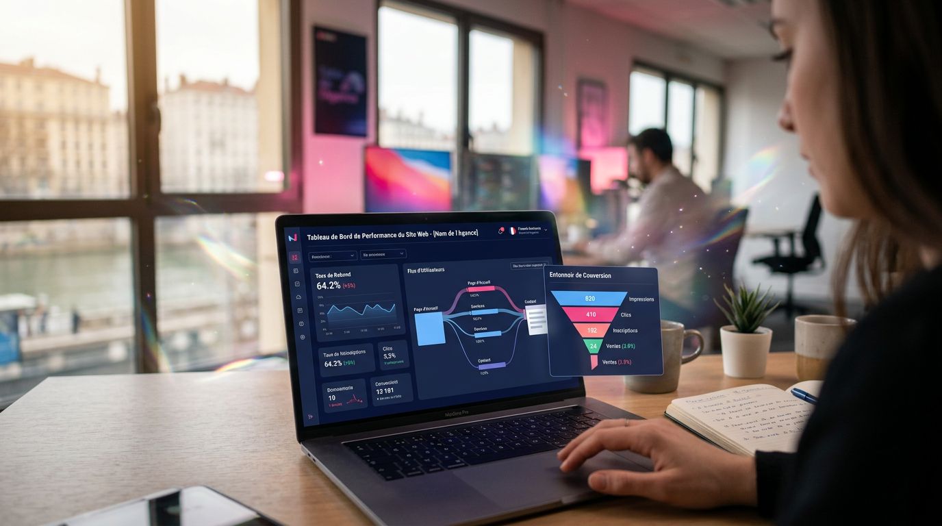
On the projects we’ve carried out, identifying and correcting the 2-3 main causes of a high bounce rate generally takes a 2-3 day audit. The average gain on conversions: between 15% and 40% depending on the case. It’s measurable, documented, repeatable.
8. The UX Return on Investment Is Calculable — Stop Treating Design as a Cost
“For every euro invested in UX, the average return is 100 euros.” — Forrester Research
This figure gets quoted a lot. It deserves context: it applies primarily to large organisations with significant traffic volumes. For an SME, the ratio is more conservative — but it remains substantially positive.
What we calculate concretely with our clients before any intervention: current traffic × current conversion rate × average order value = monthly revenue. Then: same traffic × target conversion rate (based on industry benchmarks) × same average order value = projected revenue. The difference is the potential ROI of the UX investment.
If your site receives 1,000 visits per month, converts at 0.5% with an average order of €500, you generate €2,500/month. Moving to 1.5% conversion (an achievable target in most sectors) = €7,500/month. In how many weeks does the optimisation investment pay for itself?
9. Consistency Across Your Channels Determines Whether Clients Trust You — or Forget You
You’ve polished your site, but your Google Business profile shows photos from 2018, your LinkedIn profile has a different address, and your email signature points to an outdated URL?
Studies on brand consistency (Lucidpress, 2019) show that a consistent presence across all channels increases revenue by an average of 23%. Consistency is not an aesthetic detail — it’s a signal of professionalism that your prospects evaluate unconsciously.
For businesses in our region, this is often the first work to do even before talking about redesign: auditing and harmonising all digital touchpoints. This is precisely the purpose of a consistent visual identity work, which aligns logo, colours and tone across all your materials. It takes less time than you think, and the impact on the perception of your business is immediate.
10. Continuous Iteration Beats Complete Redesign — Almost Every Time
The temptation of the “big redesign” is understandable. Start from scratch, rethink everything, rebuild everything. In theory, appealing. In practice: costly, time-consuming, and often disappointing if not guided by data.
What we observe on our projects: iterative improvements based on real data (heatmaps, session recordings, A/B tests, Analytics data) generate a better ROI than complete redesigns in 70% of cases. You keep what works, you fix what doesn’t, you measure the impact of each change.
Iterate on data > redesign on opinions.
What You Should Do Right Now
Three concrete actions, in order of priority:
Audit your data before deciding anything. Google Analytics, Search Console, and a heatmap tool (free version of Hotjar is enough to start) will give you 80% of the information needed to prioritise your actions. No opinions, no gut feeling — data.
Measure your technical performance. Google PageSpeed Insights is free, takes 30 seconds, and gives you a performance score with the priority issues to fix. If your mobile score is below 70, that’s your first priority.
Calculate your potential ROI before investing. Use the simple formula: traffic × current conversion rate × average order value. Then project with a benchmark conversion rate for your sector. The difference justifies (or not) the investment.
Decide on Data, Not on Intuition
After 15 years of building sites for SMEs in Normandy and beyond, the observation is always the same: the businesses that progress are not those with the most beautiful site — they are those that measure, iterate, and treat their web presence as a commercial asset to be continuously optimised.
A website is not a printed brochure you change every five years. It’s a sales tool you improve permanently, guided by real data.
Want to know precisely what is holding back your site’s performance? At GDM-Pixel, we do honest audits. If your site doesn’t need a redesign, we’ll tell you — and we’ll give you the list of priority optimisations to make. Contact us for a diagnosis — we respond within 24 hours.
 Social networks
 Analyze with AI