+33-9-7266-3068
 contact@gdm-pixel.fr








 TL;DR - Key Takeaways at a Glance
The problem with “listening to your clients”
A small business owner contacted us a few months ago. His e-commerce site had a bounce rate of 78%. He told us: “My clients say the site is great. But no one’s buying.”
That’s the classic trap.
What people say and what they do are two radically different things. And designing a website solely on the basis of your clients’ verbal feedback is building on sand.
The real question isn’t “what do your clients think of your site?” It’s: what’s actually happening in their heads when they land on your page?
The four levels of client understanding (and why most agencies stop at the first)
There’s a simple framework, used for years in UX research, that structures user understanding in four layers. This isn’t abstract theory — it’s what separates a site that “looks nice” from a site that converts.
What your clients say
This is the surface. Feedback collected in interviews, Google reviews, answers to satisfaction questionnaires. “The site is clear,” “I find what I’m looking for easily,” “It’s professional.”
This data has value. But it has a major flaw: people rationalize after the fact. When you ask someone why they bought (or didn’t), they give you a logical explanation. Not necessarily the real one.
On the projects we’ve run, we’ve learned to treat this layer as a starting point, never a conclusion. And when we want to move beyond instinct for decisions, the 10 quantified UX truths are an excellent counterpoint to the client’s voice.
What your clients feel

This is where we enter the territory of unexpressed emotions. The frustration of not quickly finding a phone number. The anxiety in the face of a too-long form. The mistrust triggered by an outdated design.
These emotions are never articulated. Your client won’t tell you “your contact page made me uncomfortable.” They’ll just close the tab.
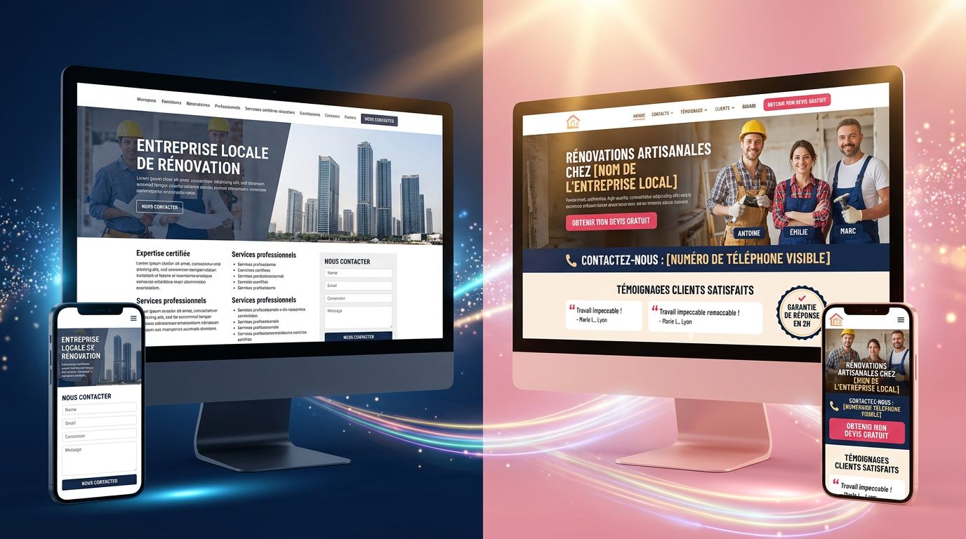
What we concretely observe with our clients: pages with a single form as the only contact point systematically lose leads. Not because the form is badly made. Because part of their audience feels friction at filling out a form without first having a trust signal — a phone number, a team photo, a visible client testimonial.
“Users don’t remember what they saw on your site. They remember how they felt.” — Aarron Walter, Designing for Emotion
What your clients really think
This level is the most counterintuitive. It’s about the beliefs and mental models that your visitors bring with them before even arriving on your site.
A concrete example: a plumber craftsman in Caen whose site we redesigned. His potential clients arrived with a preconceived belief — “plumbers never call back.” It’s not said. It’s an ingrained assumption.
His old site didn’t address this bias. The new one did: callback delay displayed in bold, testimonials explicitly mentioning responsiveness, form with immediate SMS confirmation.
Result: +34% in quote requests in two months. Not because we changed colors or fonts. Because we designed against a mental model no one had verbalized.
Your site doesn’t speak to a neutral user. It speaks to someone who arrives with doubts, past experiences, preconceptions.
What your clients actually do
The hardest layer to deny. Behavioral data: heatmaps, session recordings, analytics.
This is where reality catches up with intentions. A client who tells you “I always read product descriptions” may never scroll below the fold. Someone who says “your menu is intuitive” may click in the wrong place three times before finding what they’re looking for.
On a PrestaShop e-commerce project for a Norman craftsman, session recordings showed that 60% of mobile visitors abandoned when entering their address. Not due to a bug. Due to a mandatory “additional address” field that no one had ever questioned.
Removed the mandatory field. Abandonment rate reduced by 40%. This type of micro-friction is precisely what we track in our guide to optimizing conversion on an online store.
What people do is the truth. What they say they do is their interpretation.
How to apply this concretely to your site

This framework is useless if you don’t operationalize it. Here’s how we integrate it into our audits and redesigns.
Map emotional frictions, not just functional ones
A classic audit looks for bugs, broken links, loading times. That’s necessary. Insufficient.
We systematically complement with an “emotional” reading of the journey: at what point might the visitor feel uncertainty? Where is a reassurance signal missing? Does the payment page clearly announce what will happen next?
These questions have no answer in Google Analytics. They require putting yourself in the shoes of someone who doesn’t yet know you.
Identify your audience’s pre-existing beliefs
For every project, we ask: what preconceptions does your ideal client bring before contacting you?
“Web agencies are too expensive for me.” “I’ll end up with a site I can’t manage.” “It’ll take six months for a disappointing result.”
If your site doesn’t address these implicit objections, it lets them win. Not because your prospect decided to leave. Because nothing convinced them to stay.
Cross declarative with behavioral
My advice for a small business with a limited budget: start with Hotjar (free version) on your key pages. Three weeks of session recordings will teach you more about your real users than ten qualitative interviews.
Only then, cross with what your clients tell you. The divergences are where your real improvement opportunities hide.
What this changes in site design
After 15 years of building sites and two years of industrializing our production with AI, I have one conviction: most sites fail not because they’re badly coded, but because they were designed for an imaginary user.
A user who reads everything, who understands the site structure on the first try, who doesn’t arrive with doubts, who isn’t in a hurry, who trusts by default.
This user doesn’t exist.
“The difference between a functional site and an effective site is the depth of understanding of the person who designed it.” — Steve Krug, Don’t Make Me Think
In Normandy and across France, small and medium businesses have an advantage that large companies don’t: they truly know their clients. They know what worries them, what motivates them, what makes them hesitate.
The problem is that this knowledge stays in the owner’s head. It’s never translated into the site’s structure, the copy, the displayed trust signals.
That’s where we come in. Not to “build a nice site.” To build a conversion tool that speaks to real people with real concerns.
Three points to remember before touching your site
1. What your clients say is not your design brief. It’s your starting point. The truth is in what they do, what they feel, and what they think without saying it.
2. Every page on your site either addresses (or doesn’t address) an implicit objection. List the five doubts your ideal prospect has before contacting you. Check whether your site handles them. Probably not all of them.
3. Behavioral data is available for free. Heatmaps, session recordings, exit rates by page — these tools exist. Not using them to drive your design decisions is driving with your eyes closed. It’s also the approach we apply to our visual identity services: feeling isn’t guessing.
Is your site really working for you?
Here’s the real question: how many prospects arrive on your site each month and leave without contacting you? Not because your offer is bad. Because your site failed to answer what they didn’t tell you.
At GDM-Pixel, we always start with an honest audit before talking redesign. We look at what your visitors actually do. We identify invisible frictions. And we tell you what deserves to be changed — and what’s not worth touching.
No overselling. No unnecessary redesign. Just field diagnosis and actionable recommendations.
If you’d like us to take a look at your site, contact us. We respond quickly — it’s in our DNA.
 Social networks
 Analyze with AI