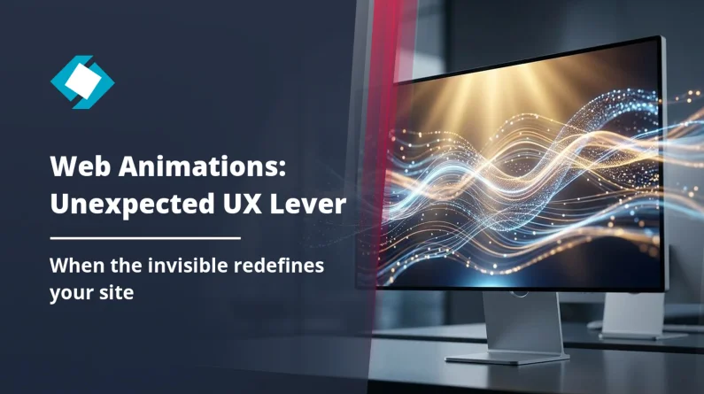
What your users feel without being able to explain it
A client called us a few months ago. His site was performing well, conversions were decent, the design had been redone two years earlier. But he had this vague feeling that “something was off”. Visitors were leaving too quickly. Forms were generating abandonment. Buttons felt inert.
We ran an audit. The problem wasn’t in the code, not in the SEO, not in the structure. It was in what you couldn’t see: the complete absence of visual feedback on the fundamental interactions of the site.
No animation on click. No transition on load. No visual confirmation on form submission. The site worked. But it didn’t communicate.
Here’s what 15 years of creating websites that actually convert has taught me about this topic: the animations nobody consciously notices are often the ones that make all the difference.
The classic confusion between decorative and functional animation
The majority of business owners — and honestly, many developers — confuse two radically different things.
Decorative animation is the parallax on the hero, particles floating in the background, titles that type themselves out. Visually impressive. Functionally neutral, or even counterproductive if it slows loading times.
Functional animation is something else entirely. It’s the micro-movement on a button that confirms the click was registered. It’s the smooth transition between two states of a multi-step form. It’s the progress indicator that reduces waiting anxiety. These are animations that work for the user, not in front of them.
Confusing the two is expensive. Animation budgets spent on decorative elements, while critical interactions remain mute and frustrating.
Let’s flip the question: does your site need an animated slider on its homepage more, or clear visual feedback when a prospect submits their quote online?
SVG and GSAP: the tools that turn the invisible into tangible
Let’s talk technical, but without detours.
SVG (Scalable Vector Graphics) is not just an image format. It’s a drawing language that can be animated directly via CSS or JavaScript. Every shape, every path, every element within an SVG can be manipulated independently — position, colour, opacity, stroke. This makes it the ideal tool for creating icons that react, loaders that communicate, illustrations that adapt to context.
GSAP (GreenSock Animation Platform) is the JavaScript library that orchestrates all of this with surgical precision. Millisecond-accurate timelines, customisable easing, optimised performance even on mobile. This is what we use at GDM-Pixel on projects that require complex animations.
The combination of the two allows us to build what I call animated feedback systems: a coherent set of visual responses to user actions, designed once, deployed across all critical site interactions.
What this looks like in practice
Take a classic contact form. Without functional animation: the user clicks “Send”, nothing happens for 2 seconds, then a message appears. High abandonment rate, frequent double submissions, sense of uncertainty.
With an animated feedback system: the button immediately transforms into a loading indicator (animated SVG), a subtle progress bar appears, then a confirmation animation — a checkmark drawing itself progressively — validates the submission. The user knows it worked. They don’t need to read text to understand it.
This isn’t aesthetics. It’s communication. The same principle applies to everything we call the invisible craftsmanship that separates a good site from a high-performing one: what you see attracts, what you don’t see converts.
The functional interactions your site probably treats as non-events
Here’s where it gets interesting. There’s a list of interactions on every site that are treated as technical events with no visual importance. And yet, each one is a moment of contact between your brand and your visitor.
Navigation and page transitions
Switching from one page to another is jarring on 90% of sites. A white flash, a reload, and the user has to reorient themselves. A 300ms transition — a simple fade or slide — is enough to maintain a sense of continuity. On sites built with Astro (our main stack), the View Transitions API allows this to be done natively, without an external library.
Loading states
Your site is loading data? A high-resolution image? A search result? If the user sees a blank screen during this time, their brain interprets it as an error. An animated skeleton screen — those grey blocks that pulse while waiting for content — measurably reduces perceived wait time. Repeated UX studies show a 20 to 40% reduction in abandonment on animated loading states compared to static ones.
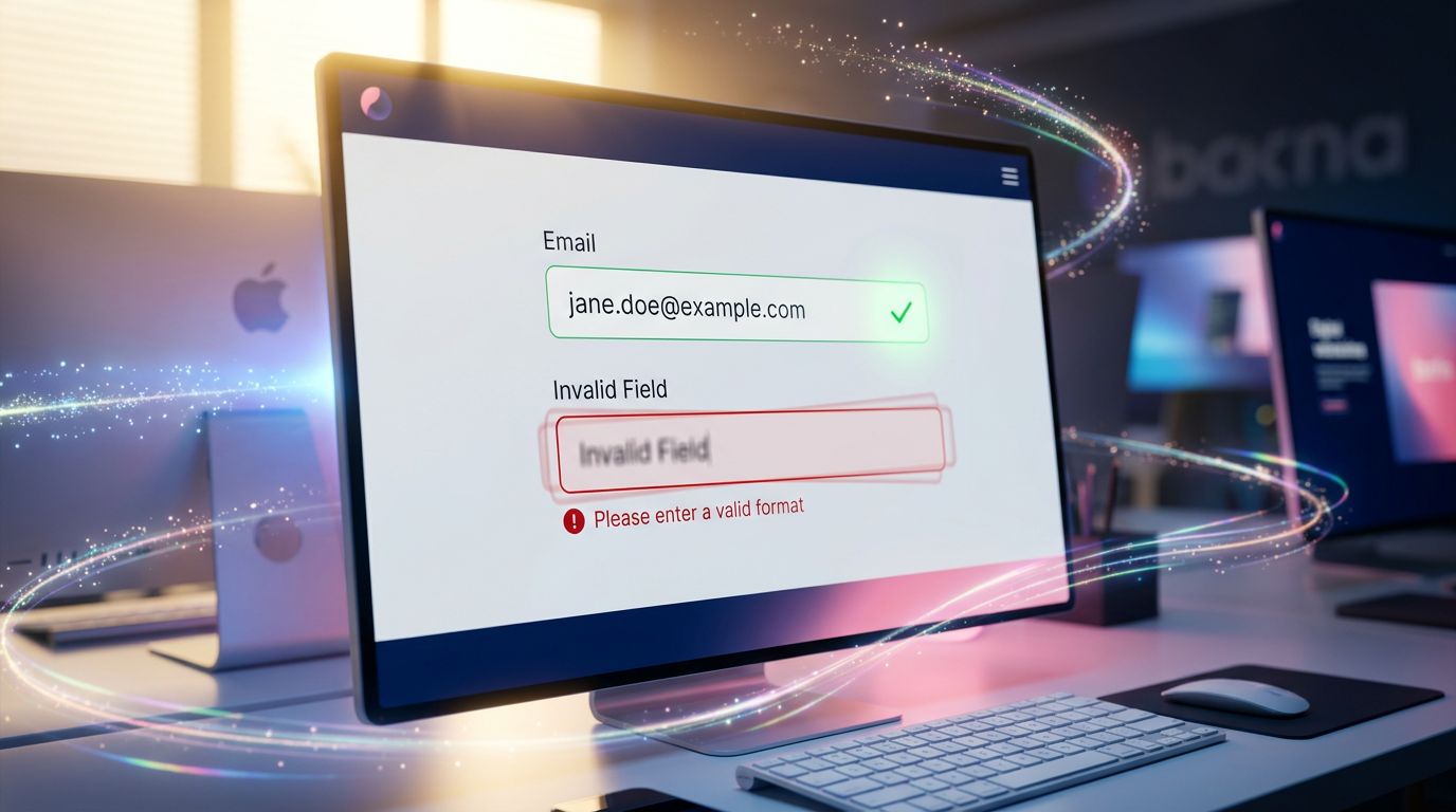
Real-time form validation
Is the email field incorrectly formatted? Is the password too short? If the feedback only arrives after submission, you’ve already broken the user’s input momentum. A functional animation — a border transitioning from red to green with a micro-transition, an icon changing state — communicates the information at the moment it’s useful.
Mobile menus and modals
Opening a hamburger menu is a strong interaction moment on mobile. If the three bars transform into a cross with a smooth rotation, if the menu slides in from the right side with a natural easing — the user instinctively understands how to close it. If the menu appears and disappears abruptly, they search. It’s not just aesthetics: it’s visual affordance.
What our audits consistently reveal
In our day-to-day work as an agency, when we audit a site that “isn’t performing well enough”, we almost always find the same pattern.
The design budget was concentrated on the homepage. Conversion pages — forms, contact pages, e-commerce funnels — were treated as secondary pages. And the functional interactions on these pages were delivered in their most basic state.
Result: a beautiful shopfront, and a functionally opaque back office.
“Design is not what it looks like. Design is how it works.” — Steve Jobs
This quote is repeated endlessly in agency presentations. It is rarely applied to system interactions.
On an e-commerce project we overhauled last year, we identified that 34% of cart abandonments occurred at the shipping address validation step. Not because the form was poorly designed visually. Because input errors appeared abruptly, without transition, without progressive visual guidance. Three days of work on the functional animations of that form. Result: abandonment reduced by 28% at that step.
This isn’t storytelling. It’s a number from our back office.
How to prioritise without blowing your budget
The good news: animating functional interactions does not require a Parisian agency budget.
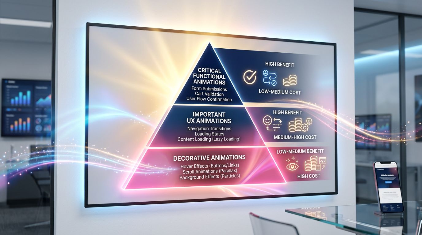
Priority must follow interaction criticality, not visibility. Here’s how we reason on our projects:
**Level 1 — Critical (to be addressed first)**Any interaction that leads to a conversion: form submission, add to cart, order confirmation, account creation. These moments must have clear, immediate, and reassuring visual feedback.
**Level 2 — Important (to be addressed next)**Main navigation, loading states on high-traffic pages, field validation on long forms. The UX gain is measurable, the development cost is moderate.
**Level 3 — Enhancing (if budget allows)**Page transitions, section entry animations, micro-interactions on secondary elements. Contributes to the overall perception of quality, but does not directly impact conversions.
My advice for a small business with a limited budget: concentrate 80% of animation effort on Level 1. You’ll get 80% of the benefit for a fraction of the cost of a full redesign.
The technical dimension we can’t ignore
A point that agencies often avoid addressing honestly: poorly implemented animations do more harm than no animation at all.
An animation that blocks the JavaScript main thread slows down your site. An animation that doesn’t respect prefers-reduced-motion excludes users sensitive to motion — and exposes you to accessibility issues. A GSAP animation loaded on a page that doesn’t need it unnecessarily increases the bundle size.
The rules we systematically apply at GDM-Pixel:
All CSS animations use transform and opacity only — the two properties that go through the GPU without triggering reflow. GSAP is loaded via lazy-loading only on pages that use it. Every animation is conditioned on checking prefers-reduced-motion. And we measure performance before/after with Lighthouse — if the score regresses, the animation is reworked or removed.
Effectiveness before aesthetics. ROI before buzzwords. If an animation costs 15 Lighthouse points for a marginal UX benefit, it doesn’t make the cut.
Conclusion: functional animation is not a luxury
Your site communicates with your visitors at every interaction. Every click, every submission, every transition is a micro-conversation between your interface and your potential client.
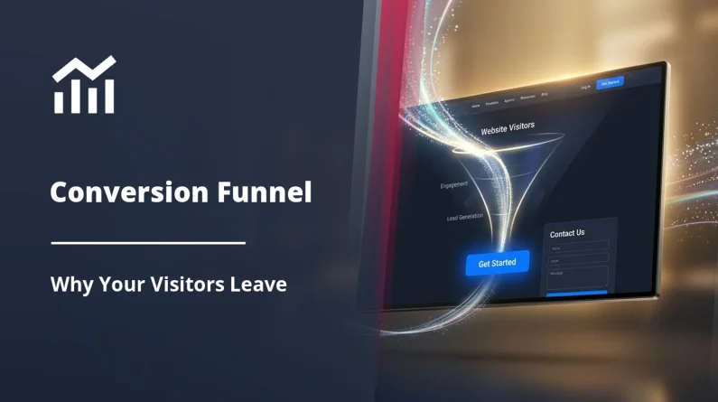
Leaving these moments without a visual response means leaving your client in uncertainty. And uncertainty, in conversion, costs real money — which is exactly what we dissect in our analysis of the conversion funnel and the reasons why your visitors leave without contacting you.
Mastering functional animations — SVG, GSAP, CSS transitions — is not reserved for major brands with six-figure UX budgets. It’s a technical skill that, applied in the right places, produces measurable results on SME budgets.
We’ve done it. We have the numbers to prove it.
Want to know if your critical interactions are communicating correctly? We offer a targeted technical UX audit focused on your site’s conversion points — forms, purchase funnels, mobile navigation. Honest diagnosis, prioritised recommendations, backed by data.
Request your audit at gdm-pixel.fr — we’ll tell you what’s costing you conversions, not what’s convenient for us to rebuild.