The calendar as a creative signal
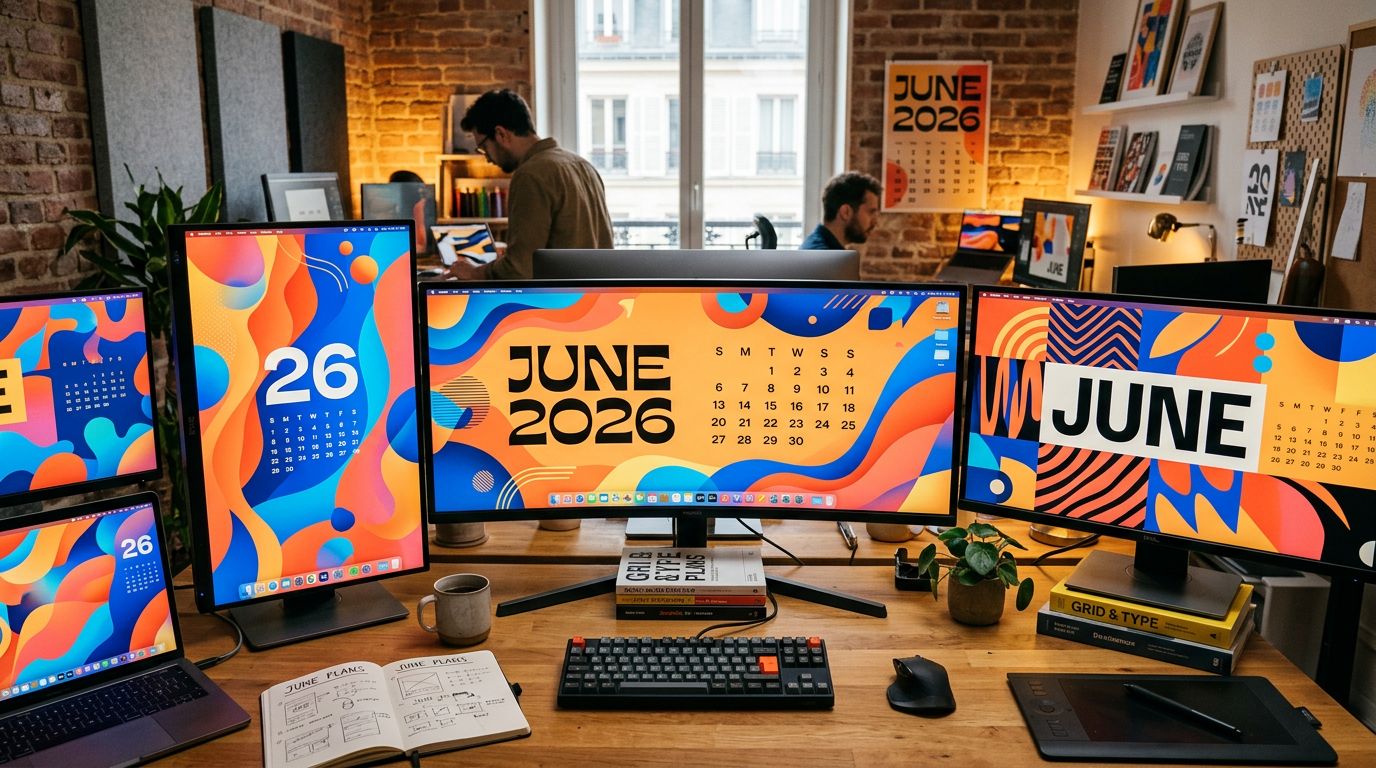
Every year, the designer community publishes its June wallpapers. A quiet tradition, free exercise, zero constraint. And yet, if you take the time to look at what creatives produce when nobody imposes a brief on them, you get something valuable: an honest preview of the trends that will shape webdesign for the next 12 months.
“June Is For Exploring” — it’s not just a poetic title. It’s a posture. And in 2026, this creative posture speaks directly to businesses that want sites that convert.
Here’s what these creations reveal, and how to concretely take advantage of them for your online presence.
What June 2026 wallpapers really show
Monthly wallpaper editions are a reliable barometer of the visual zeitgeist. Not the trends invented by agencies to justify redesigns. The real directions creatives take when they work for themselves.
In June 2026, several strong signals stand out.
Color takes back its rights. After years of desaturated minimalism — grays, off-white, “premium” beige — palettes are exploding. Warm oranges, deep greens, electric blues. Not visual aggression: confident presence. Brands that dare to use color in 2026 are no longer seeking to reassure. They’re seeking to make a mark.
Typography becomes architecture. Headlines no longer serve only to inform. They structure the visual space as a graphic element in their own right. Large sizes, extreme contrasts, overlay games. This movement — known as “expressive typography” — is gradually descending from artist portfolios to SME sites that want to stand out.
Organic versus geometric. Perfect shapes are losing ground. Irregular curves, natural textures, compositions that “breathe” — it’s the direct reaction to three years of sites cranked out with the same Elementor templates. When everyone is square, being round becomes a competitive advantage.
Why these trends are hitting your sites (whether you like it or not)
You may think these aesthetic considerations only concern creative agencies or artist portfolios. That’s a miscalculation.
Visual trends emerging in the design community take on average 18 to 24 months to reach SME sites. What’s experimental in June 2026 among creatives will be expected by your customers in 2027-2028.
What we see concretely with our clients: a site that looked modern in 2021 — white background, gray text, blue buttons — starts generating negative comments in sales meetings. “Your site looks a bit old.” It’s not a question of taste. It’s a question of trust signal.
“An aged website doesn’t say you’re an old company. It says you don’t pay attention to details. And if you don’t pay attention to the details of your own storefront, why would you pay attention to those of your client?”
That’s the real subject. Aesthetics aren’t a frill — they’re a commercial argument.
Three concrete directions for your site in 2026
No abstract trend list. Here are three actionable decisions you can take now, with a controlled budget.
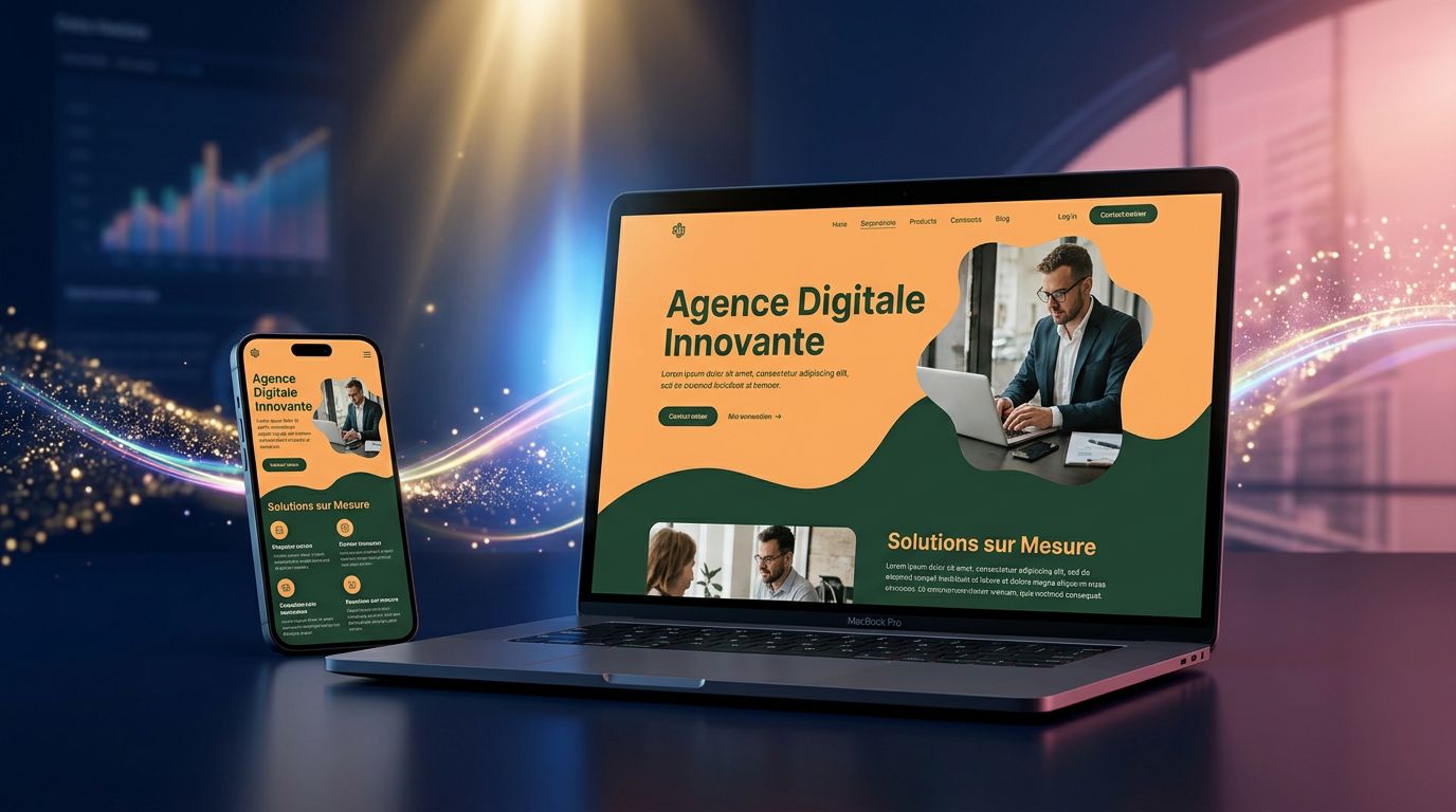
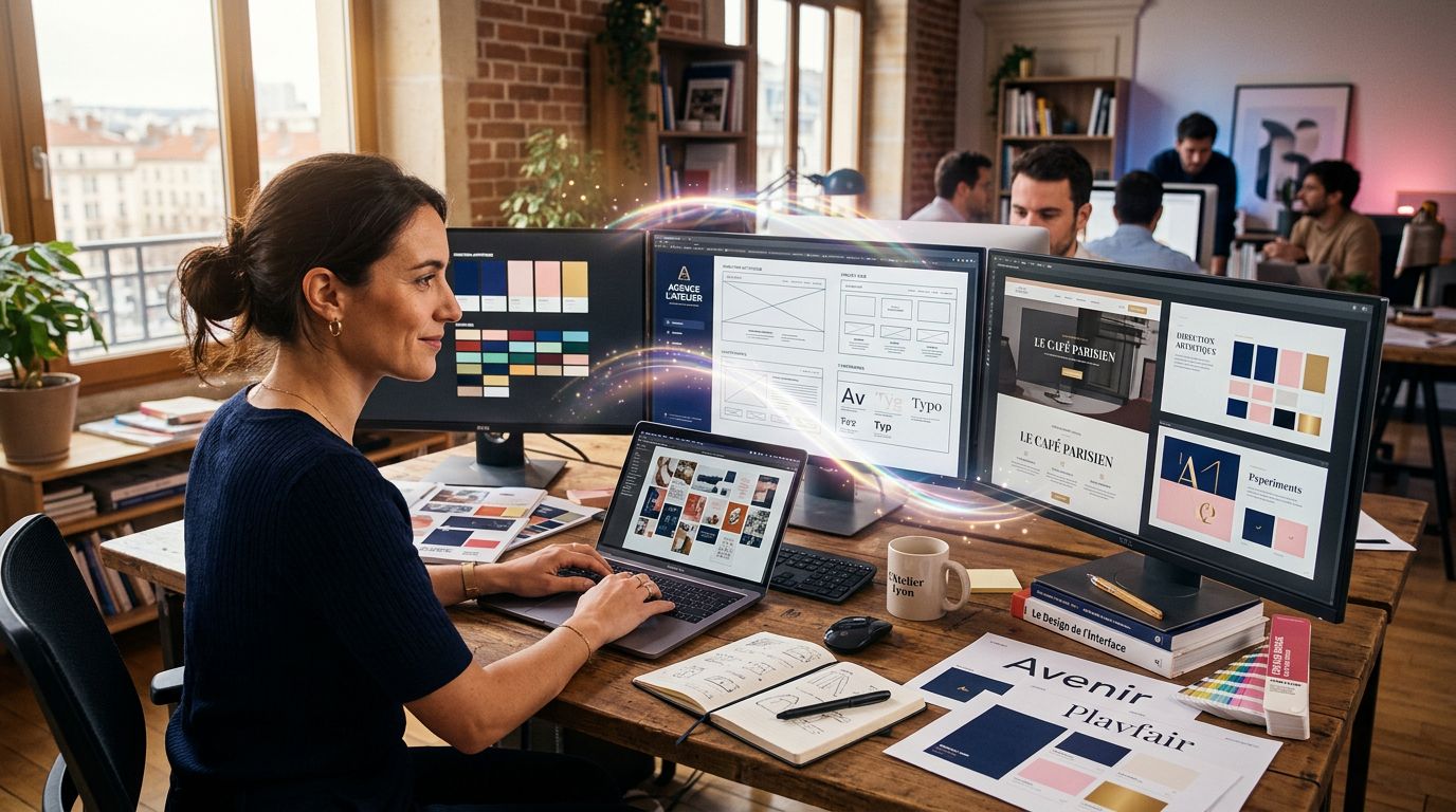
Dare to use a strong primary color in your web identity
Most Normandy SME sites use “safe” palettes: institutional blue, forest green, classic burgundy. The problem? Everyone does the same. Choosing an assertive primary color — and owning it in your CTAs, your headlines, your spotlight sections — immediately differentiates you in a sector where all your competitors have the same template.
It’s not a full redesign investment. On an Astro or Tailwind base, changing a palette takes 2 hours. The visual ROI is immediate.
Invest in typography, not in images
Many businesses think that “looking good” = buying premium photos on Unsplash or Adobe Stock. In 2026, impact comes from elsewhere. Good typography — two fonts maximum, clear hierarchy, confident sizes — does more for your site’s credibility than 10 generic photos of people smiling in an office.
On our recent projects, we tested pages with standard photo budget against pages with worked typography and minimalist images. Result: engagement rate goes up, time on page too. The numbers confirm what the June 2026 creatives show in their wallpapers: well-composed text is a visual element in its own right.
Break the grid (a little, not everywhere)
The perfect grid reassures. But it also bores. A misaligned element, an asymmetric section, a headline that slightly overflows — these micro-ruptures create dynamism without breaking legibility. It’s exactly what designers explore in their June creations: not visual anarchy, but controlled tension.
The trap of trend for trend’s sake
Here’s where it gets interesting — and where many businesses get it wrong.
Following creative trends doesn’t mean redoing your site every 18 months. It means building a solid technical base that allows evolution without starting from scratch.
That’s precisely why our Astro + Tailwind stack is designed with this logic. Tailwind CSS lets you change an entire palette by editing one configuration file. A partial visual redesign takes a day instead of a week. You stay agile without blowing your budget.
The real cost of a site frozen in its years of creation is rarely the cost of the redesign itself. It’s the cost of leads lost for 3 years because your site was sending a degraded trust signal.
How much does a site that generates no leads cost you? If you can’t answer that question with a number, that might be the first audit to do.
Exploring is also a working method
“June Is For Exploring” resonates differently when you run a web agency. Creative exploration isn’t a luxury reserved for artists with free time. It’s an operational necessity.
In our daily work at GDM-Pixel, we devote time to testing visual approaches outside of client projects. Not to look pretty. To maintain an execution capability that stays relevant. A developer or a designer who doesn’t explore fossilizes. And a fossilized provider delivers fossilized sites.
What June wallpapers represent in the creative community is exactly that: a deliberate practice of exploration without commercial constraint. The result then feeds work under constraint.
“The best ideas we applied on client projects in 2025 came from tests we ran without a client in 2024.”
It’s true for agencies. It’s also true for businesses managing their digital presence in-house.
What you should take away (and do)
Three actionable points, no detours:
1. Audit your color palette. Open your site. Do your colors differentiate you from your three direct competitors, or do you all have the same interchangeable “serious company” chart? If you can’t answer in 5 seconds, the answer is no.
2. Look at your headlines as visual elements. Do they have weight? Presence? Or do they float timidly above your content? Typography is the cheapest and most impactful lever for modernizing a site without a full redesign.
3. Plan an evolution, not a revolution. A modern site in 2026 isn’t a site redone from scratch. It’s a site built on an evolutionary technical base, updated regularly in small touches. Visual agility is worth more than frozen perfection.
The next step
June 2026, it’s made for exploring. But exploration without execution is still procrastination.
If your site is starting to feel dated — or worse, if your clients are pointing it out — it’s the right time to take stock. Not necessarily a €15,000 redesign. Sometimes, a 3-day audit is enough to identify the 20% of changes that produce 80% of the visual impact.
At GDM-Pixel, we do this diagnosis regularly for Normandy SMEs and businesses outside the region. Concrete result: we identify what’s slowing conversion, we quantify the cost of doing nothing, and we propose a realistic action plan — not a redesign if a redesign isn’t needed.
Want to know where your site stands against 2026 visual standards? Contact us for an audit — we’ll tell you what works, what’s stuck, and what’s really worth changing.