+33-9-7266-3068
 contact@gdm-pixel.fr







 TL;DR - Key Takeaways at a Glance
For a long time, an SME WordPress site had a simple job: exist. Logo, three case studies, a Contact page, and everyone moved on.
That model is dead. It still hangs around everywhere.
On the audits we run from Caen and around Normandy, we still open WordPress sites delivered in 2018, never touched since, that haven’t generated a single enquiry in months. Not because the business is bad. Because the site behaves like a brochure left in a waiting room — while the visitor is comparing three competitors with their thumb.
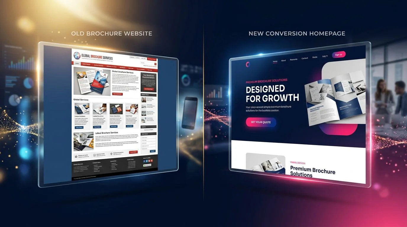
A brochure site no longer has the right to be merely “pretty”. It has to convince, remove doubt, and push one action. In other words: become a salesperson available 24 hours a day.
Here’s how we reverse that, on an existing WordPress site, without throwing everything away.
A salesperson never starts by talking about themselves
The SME reflex is to open the homepage with:
“A family business for 20 years…” “Our know-how…” “Our teams take pride in…”
It’s true. It isn’t what the visitor is looking for.
They arrive with a precise question. A quote. A deadline. A risk to avoid. The first thing they must read is not your story — it’s the answer to “can you solve my problem, yes or no?”
In five seconds, the home page has to land four facts:
- what you do;
- for whom;
- what sets you apart;
- why they can trust you now.
A usable example: “Air conditioning installed at your place within 48 hours — or we refund the call-out.” Not “innovative HVAC solutions for professionals and individuals”.
If your visitor has to scroll to understand what you sell, your website generates no clients for a very simple reason: the conversation never started.
Objections, before they block the call
An experienced salesperson doesn’t wait for the awkward question. They handle it.
On a website, the doubts always come back to the same ones:
- is this company serious?
- is it too expensive for me?
- will they get back to me quickly?
- have they already worked with someone like me?
- what do I risk if it goes wrong?
If the answer isn’t written anywhere, the visitor doesn’t call “to find out more”. They close the tab.
What actually works on WordPress, without a factory of plugins:
- real Google reviews, with the client’s first name and trade;
- 3 to 5 case studies told properly (context, constraint, result) rather than a gallery of 40 uncaptioned photos;
- an FAQ that reuses the real questions from your quotes — not “What is SEO?”;
- your method in 4 steps, with a timeframe;
- a guarantee or commitment you actually keep (callback delay, free quote, free travel within X km).
The more the site reassures, the less the first call is used to “check you aren’t a scam”. It is used to move forward.
Proof sells. Superlatives never do
“Leader in our market.” “The best value for money.” Nobody believes it. Least of all a tradesperson or SME owner who has already been burned.
What lands:
- a case study with a number (timeframe, volume, before/after);
- a dated Google review, not an anonymous testimonial written by the agency;
- a photo of the job or the deliverable at the client’s, not a Photoshop mockup;
- a certification you can actually show;
- a number you stand behind: years in business, jobs completed, towns covered.
A service page with no proof is a salesperson making claims. A service page with two proofs above the fold is a salesperson showing their work.
One page, one action — not a buffet
The most common error on SME WordPress sites: offer everything, everywhere.
Phone. Email. Form. Newsletter. Blog. Catalogue. Facebook. LinkedIn. Instagram. “Click here”. “Learn more”.
The visitor doesn’t choose. They leave.
Each page must have one primary goal. Quote. Appointment. Call. Guide download. Audit. Everything else sits in the background.
Buttons must say the same thing, in the same place, on mobile and desktop. A CTA you have to hunt for is a CTA that doesn’t exist.
The combo that holds up, when it’s kept clean: a chatbot for simple questions, a short form (three fields, not eleven), an exit pop-up only if you have something worth offering. Not all three stacked at random.
If the path from “I’m interested” to “I’ll contact you” is too long, it is no longer a traffic problem. It is a broken conversion funnel.
Content that sells before the first call
Today, part of the sales work happens without you. The prospect reads. They compare. They search “how much does it cost”, “which mistakes to avoid”, “who to choose”.
That is the blog’s job — not publishing to “feed SEO”, answering a precise intent.
Examples that actually convert:
- How much does an energy renovation cost in Calvados?
- Which mistakes to avoid on a WordPress redesign?
- 10 questions to ask before choosing a WordPress SEO agency.
That last type of content is too rarely done well. Not a generic “10 criteria” list, a real filter: open CMS or lock-in, who owns the domain, who pays the hosting, how a quote is measured. That is exactly the kind of page www.netskipper.com documents on the WordPress side — an agency that chose to do only that, for fifteen years. When you work a WP brochure site, that reading stops you confusing a pretty integrator with a partner who will actually bring in enquiries.
A useful article is not a brochure in disguise. It removes a doubt. It prepares the quote. It holds the first meeting for you, at 11pm on a Sunday.

Speed: the salesperson who makes people wait loses the sale
A salesperson who leaves someone five minutes on the phone without saying a word — do you keep them? No.
On mobile, it is worse. A few extra seconds and bounce rate spikes. Google measures it. Your competitors benefit.
Before you redesign anything, run the site through PageSpeed Insights. Mobile score under 50: that is the priority. Not a new slider.
Beyond the score: clear navigation, readable text, mobile actually tested with a thumb, a form that really submits. We still see too many WordPress sites whose form has been broken since an Elementor update — and nobody knows.
Most brochure WP sites we open in audit run on Elementor. The builder is not the problem. Forty orphan sections, 4000 px images, zero cache: that is. An agency specialized in the WordPress Elementor plugin that lives in the builder every day spots those traps faster than a generalist team. At GDM-Pixel we are not “100% Elementor” — we pick the tool to fit the project. But when the site is already in Elementor and it has to become commercial without being thrown away, that specialisation matters.

AI on the first level, not instead of the salesperson
AI does not replace a quote. It can stop the visitor leaving with their question.
On WordPress, the uses that hold:
- an assistant that answers frequent questions (hours, area, callback delay);
- related content based on the page viewed;
- a welcome message that changes if the visitor arrives from a pricing page or an emergency page;
- help drafting articles — reviewed by a human who knows the trade.
The goal is not to automate the relationship. It is to hold the first floor: a fast answer, 24/7, while you are on a job or in a meeting. That is also how we approach website creation: a salesperson who holds the shop, not a gadget bolted on afterwards.
Run the site like a sales team
Nobody would run a team without knowing how many quotes go out, or which ones get signed.
The site is the same. Visit count says nothing. What matters:
- conversion rate (visit → form or call);
- forms sent, and those that never arrive (spam, 500 error, absurd required field);
- clicks on the phone number and the buttons;
- pages that convert, and pages that bounce;
- the path: where the quote comes from, through which page.
Two adjustments are often worth more than a redesign: shorten the form, put a CTA under every case study. We see it regularly. Without measurement, you redo the design. With measurement, you fix the real hole.
Email: the only asset Google cannot take back
Traffic is rented. Email is yours.
In practice, we first aim for a base: content, link building, local presence, until a regular flow — around 1,000 unique visitors a month is a threshold that starts to justify a real list. Not before, if you have nothing to send.
Then: an exit pop-up, once, with a real offer. A trade guide. A checklist. Not “subscribe to our newsletter” with no promise. If you have no value to give, don’t show the pop-up. It burns more trust than it creates.
What to remember
Building a pretty WordPress site is no longer enough. Every visit is a commercial opportunity. Losing it because the home talks about you, the form has eleven fields, or mobile takes eight seconds, is revenue that will not come back.
The levers fit in one sentence: readable value proposition, proof, one action per page, content that removes doubt, speed, measurement, email capture.
Companies that treat their site as a presentation leave competitors to pick up people who were already interested. Those who treat it as a salesperson have a colleague who works while they sleep.
If your WordPress is already live and brings in nothing, you don’t need a redesign for the sake of it. You need to know what is blocking: what we keep, what we rewrite, what we throw away.
Want us to look at yours? We tell you what we see. The good, and the rest.
 Social networks
 Analyze with AI