+33-9-7266-3068
 contact@gdm-pixel.fr








 TL;DR - Key Takeaways at a Glance
Does your website actually tell a story?
Ask yourself honestly. When a visitor lands on your homepage, do they feel something — or are they scanning text lined up on a 12-column grid identical to your 40 competitors’?
Most websites are technically fine. Clean. Responsive. Boring.
The problem isn’t the content. It’s the staging. For years, front-end developers ran into a real limitation: CSS couldn’t produce Masonry-style layouts — those irregular, dynamic grids that make content feel alive — without heavy JavaScript or third-party libraries that drag down performance.
That was before CSS Grid Lanes.
What CSS Grid Lanes actually changes
To understand what’s at stake, a bit of technical context — without the unnecessary jargon.
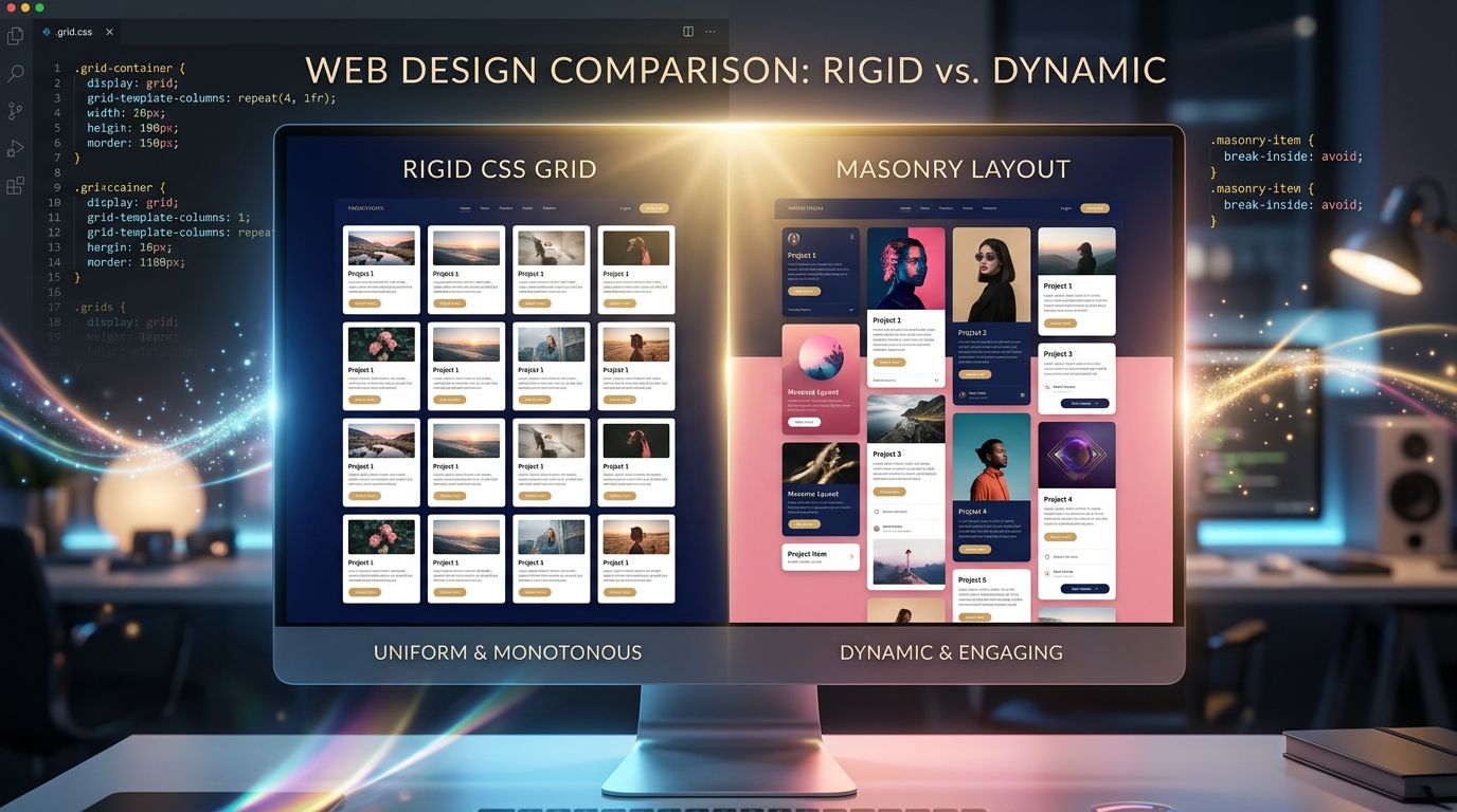
A Masonry layout is what you see on Pinterest: blocks of varying heights stacking organically, each column advancing independently based on the size of its content. The visual result is dynamic, alive, naturally hierarchical.
Until now, replicating this behavior in pure CSS was either impossible or a fragile workaround. The standard solution meant JavaScript — Masonry.js, Isotope, or custom positioning calculations. The result: extra code to load, layouts that “jump” on render, and Core Web Vitals scores that took a hit.
CSS Grid Lanes — a specification currently being rolled out in modern browsers — natively introduces grid-template-rows: masonry into the CSS Grid Level 3 spec. In practice, the browser handles the placement algorithm itself. You write:
.gallery {
  display: grid;
  grid-template-columns: repeat(3, 1fr);
  grid-template-rows: masonry;
}
And the browser does the math. No JavaScript. No library. No layout shift.
This isn’t just a technical win. It’s a narrative one.
Why layout is an editorial decision, not a technical one
Here’s what agencies never tell you: the choice of your grid is an editorial choice.
When all your content shares the same height, the same width, the same visual weight, you’re implicitly telling your visitor that everything is equivalent. Your flagship article carries as much weight as your routine news update. Your star product gets lost in the same row as the rest.
Masonry design, on the other hand, creates a natural hierarchy through volume. A bigger block draws the eye first. A vertical image creates a pause in the rhythm. A customer testimonial featured in a double-height cell carries more visual weight than a simple italicized quote.
That’s staging. And it works because that’s how the human brain processes visual information: through contrast, hierarchy, and motion.
“Users don’t read web pages. They scan them.” — Steve Krug, Don’t Make Me Think
That quote dates back to 2000. It’s still just as true. And CSS Grid Lanes is precisely the tool that lets you work with that natural behavior instead of against it.
From portfolios to brand sites: real-world use cases
Let’s take real examples, the kind of projects we encounter across Normandy as much as anywhere else in France.
A craftsman cabinetmaker who wants to showcase his skill
His pieces don’t all share the same dimensions. A full-length photo of a Norman wardrobe is vertical. A desktop is horizontal. A joinery detail is square, tight, almost abstract.
With a uniform grid, all these photos get cropped to the same format. You lose the object, the material, the craftsmanship.
With a Masonry layout, every photo keeps its natural proportions. The gallery breathes. The visitor sees the work. And the craftsman doesn’t need to write “exceptional quality” — it’s visible.
An SME that publishes content regularly
In-depth articles, short news updates, case studies, videos. All crammed onto the same rigid grid? An editorial disaster. Long-form content looks identical to short content. Nobody knows what to read first.
With Grid Lanes, you can let long articles naturally take up more space — not because you coded a special rule for each one, but because the layout adapts to the content. The blog becomes an editorial page, not an Excel spreadsheet.
A hotel or restaurant selling an experience
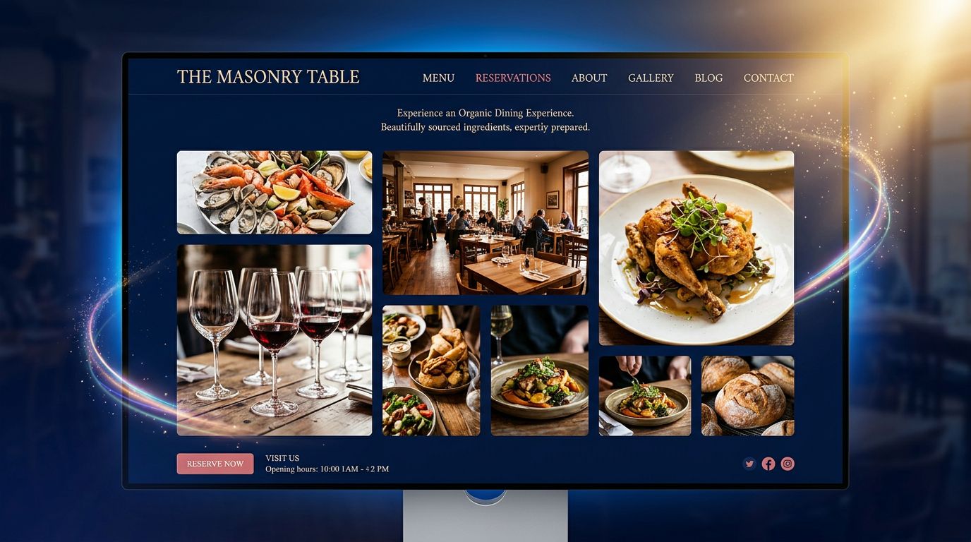
An experience doesn’t sell through bullet points. It sells through immersive images. A full-width photo of the dining room. A portrait-format shot of a dish. A landscape view of the terrace. All flowing organically, like the pages of a beautiful magazine.
With native CSS Masonry, this kind of layout is now achievable without JavaScript, without external dependencies, and without compromising load performance — which, for local SEO, counts double.
Performance and storytelling: no longer at odds
This is a false debate we still hear too often. “A beautiful site is a slow site.” “For performance, you have to go minimalist.”
Wrong. Or rather: that was true when we were using the wrong tools.
The strength of native CSS Grid Lanes is precisely that it shifts the computational load from JavaScript to the browser’s own CSS rendering engine. The browser is optimized for exactly this. It handles the layout during the render-building phase, before JavaScript has even finished loading.
In practice, on recent projects built with an Astro + Tailwind + native CSS Grid stack, we observe:
- Zero layout shift (CLS at 0) where JS-based solutions regularly showed scores of 0.1 to 0.3
- Initial render time reduced by 30 to 40% compared to an equivalent Masonry.js implementation
- Simplified maintenance: no dependency to update, no version conflicts
And a site that loads fast gets rewarded by Google. Which means your visual storytelling isn’t fighting your SEO performance — it’s reinforcing it.
How to bring this approach into your project
You don’t need a full rebuild. Here’s how to approach it pragmatically, depending on your situation.
You’re starting from scratch
This is the best-case scenario. Define your narrative architecture before your technical architecture. What are the 3 stories your site needs to tell? What’s the hierarchy of your content? Which elements deserve visual emphasis?
Only then do you code the grid to serve those answers.
You already have a site, but it lacks impact
An honest audit is in order. Not necessarily a full redesign — sometimes reworking one key page (home, portfolio, blog) with a more narrative layout is enough to transform how your brand is perceived. Three days of work can radically change the impression left on your visitors.
You manage your own content
The good news: a native Masonry layout requires no extra effort on your part to function. You add your photo, it fits naturally into the grid. No forced cropping, no imposed format. The layout adapts to you, not the other way around.
Three things to remember before taking action
This isn’t an academic summary. It’s what we’d actually apply if we audited your site tomorrow.
Your grid is an editorial choice. A uniform layout says “everything is the same.” A Masonry layout says “some things deserve more attention.” Which one matches your reality?
Performance and narrative design are no longer at odds. With native CSS Grid Lanes, you no longer have to choose between a beautiful site and a fast one. Both are now achievable with the right tools — and without unnecessary JavaScript.
Visual storytelling gets built before the code. The question “how am I going to code this?” comes second. The question “what story do I want my visitor to live?” comes first. If you haven’t answered the second one, the answer to the first won’t matter.
Your site deserves better than a generic grid
Fifteen years building websites for Norman SMEs, and the takeaway stays the same: the businesses that stand out online aren’t the ones with the biggest budget. They’re the ones who had the courage to tell something true, with tools that gave them the means to do it.
CSS Grid Lanes isn’t a revolution in itself. It’s a tool. But it’s the tool that was missing to finally align technical performance with narrative ambition — without compromise.
If your current site looks like an Excel grid dressed up as a webpage, maybe it’s time to ask yourself: what do you actually want to tell?
We can help you define it — and build it. Contact GDM-Pixel for an audit of your digital presence. Honest diagnosis, no commitment, no overselling. If your site just needs a layout tweak, we’ll tell you.
Sources: CSS Grid Level 3 — W3C Working Draft, MDN Web Docs — Masonry layout, Steve Krug, Don’t Make Me Think (2000)
 Social networks
 Analyze with AI