 +33-9-7266-3068
 contact@gdm-pixel.fr


 TL;DR - Key Takeaways at a Glance
Is your design system truly ready for AI?
A client called us a few weeks ago. Their previous agency had delivered a “modern” site with a well-documented design system, clean Figma components, and an impeccable brand guidelines. But when they tried to integrate an AI code generation tool, everything fell apart. The tokens weren’t named consistently, the spacing followed no systemic logic, and the vertical centering of blocks was done with hardcoded margin-top: 47px values.
Result: the AI generated unusable code. The integrator had to redo everything by hand. Three weeks wasted.
This is not an isolated case. It’s the norm.
Two seemingly distinct topics — making a design system compatible with AI tools, and mastering vertical centering in CSS — actually tell the same story: what we haven’t industrialized properly ends up costing us time, money, and headaches.
Here’s what we’ve learned on both fronts, and how we apply it at GDM-Pixel.
Why current design systems make AI fail
AI doesn’t read between the lines. It doesn’t “understand” that #1A2B3C is your primary color if you haven’t named it color-primary-600. It doesn’t guess that your 24px spacing corresponds to your grid base if you’ve hardcoded it in every component.
Code generation tools — whether Claude Code, Copilot, Cursor, or any agent connected to your codebase — work by pattern recognition. They look for consistency, predictability, explicit conventions.
An “AI-ready” design system is not a more complex design system. It’s a cleaner one. This is exactly what we explore when analyzing code quality as the invisible craftsmanship that separates a good site from a site that performs.
Here’s what this concretely changes in our workflow:
Semantic tokens, not raw values
The difference between --color-blue-500 and --color-action-primary is the difference between a value and an intent. AI understands intents. It doesn’t know what to do with an orphaned value.
At GDM-Pixel, we migrated all our tokens to a semantic naming convention in three layers:
- Primitive layer: raw values (
blue-500: #3B82F6) - Semantic layer: usage (
action-primary: blue-500) - Component layer: context (
button-background-default: action-primary)
When Claude Code generates a button in this context, it uses button-background-default without needing to be told. The token carries the information. That’s what a machine-consumable system looks like.
Documentation structured like an API
Your design system must be readable by a human AND parseable by AI. That’s not a contradiction — it’s rigor.
Concretely: token files in JSON or CSS custom properties, components documented with their variants explicitly named, states (default, hover, disabled, error) always present and consistent.
“A well-structured design system for AI is above all a well-structured design system for humans. The machine reveals your inconsistencies.”
What we see in our audits: systems where the primary button has 4 different names across the Figma file, Storybook, and the code. For a human, that’s annoying. For an AI, it’s a blocker.

Spacing based on a scale, not approximations
margin: 47px. We still see it. Too often.
An AI generating code looks for patterns. If your spacing follows a scale (4, 8, 12, 16, 24, 32, 48, 64), it can infer. If your values are random, it improvises — and an AI improvising on magic values produces throwaway code.
The rule we’ve applied for two years at GDM-Pixel: zero hardcoded spacing values outside of tokens. Everything goes through --spacing-4, --spacing-6, etc. It feels constraining at first. It saves hours in the end.
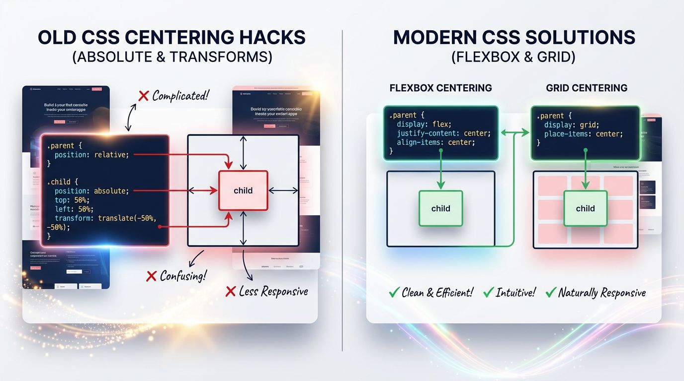
CSS vertical centering: the final episode (really)
Let’s talk about the topic that has tortured generations of integrators. Vertical centering in CSS.
It hasn’t been a problem since CSS Flexbox and Grid. But we keep seeing hacks in codebases delivered in 2024. line-height values equal to the container height. position: absolute with top: 50% and transform: translateY(-50%). HTML tables for centering content.
Why does it persist? Because teams have no shared rule. Each integrator has their preferred technique. And an AI generating code in this chaotic context will reproduce the chaos.
Here’s how we standardize it.
Flexbox: the solution for 90% of cases
For vertical centering in a container, Flexbox is the default answer in our stack:
.container {
  display: flex;
  align-items: center; /* vertical centering */
  justify-content: center; /* horizontal centering if needed */
}
Two lines. Readable. Predictable. Supported everywhere.
For cases where the container needs to occupy the full available height, we add min-height: 100dvh (using dvh rather than vh to avoid issues on mobile with navigation bars). This is a decision we’ve standardized in our design system — a --height-screen token pointing to 100dvh.
CSS Grid: when centering in both dimensions
For more complex layouts — a hero section, a modal, a splash screen — Grid is more expressive:
.container {
  display: grid;
  place-items: center; /* shorthand for align-items + justify-items */
}
place-items: center is probably the most underused CSS property in 2025. One word. Two axes. Perfect centering. This approach fits into the 2026 web design trends where modern CSS transforms the way we create sites.
Why standardize this in your design system
The question isn’t “which technique is best”. The question is: does your entire team (and your AI) use the same technique in the same contexts?
In our design system, we’ve documented three centering patterns:
Pattern center-flex — for centering content in a flow (navigation, cards, buttons) Pattern center-grid — for centering in a defined space (modals, heroes, overlays) Pattern center-text — for pure typographic centering (text-align: center + margin-inline: auto)
Each pattern has its CSS token, its utility class in Tailwind, and its documentation in Storybook. When we ask Claude Code to generate a component, it knows which pattern to use based on context. Zero ambiguity.
“Standardization is not a creative constraint. It’s what allows the machine to free you from repetitive tasks.”
What this actually changes in production
We industrialized these principles on Nova Mind — our SaaS in production. 21 pages delivered in 10 hours. That’s not magic. It’s the direct result of a design system that AI can consume without friction.
Concretely, here’s what changes:
Component generation: Claude Code generates a component consistent with our brand from the first attempt, without corrective iterations on colors or spacing. Savings: 45 minutes per component on a standard project.
Code review: The integrator no longer needs to clean up after the AI to fix hardcoded values or inconsistent centering techniques. Reviews focus on logic, not style.
Onboarding: A new developer (or an AI agent) understands the system by reading the tokens. No need for a 40-page document that will be obsolete in six months.
The gain is not hypothetical. Across the last three client projects integrating this workflow, we reduced front-end integration time by 60% on average.
Three concrete actions to get started
You don’t need to overhaul your design system in a week. Here’s where to begin, in order of priority:
1. Audit your hardcoded values. Search your codebase for all px values that aren’t tokens. That’s your most visible technical debt. On a medium-sized project, this work takes half a day and immediately reveals friction points.
2. Name your tokens by intent, not by value. Rename --blue-500 to --color-action-primary. This change alone improves readability for your team and comprehension for an AI.
3. Standardize your centering patterns. Choose Flexbox or Grid based on context, document the rule, create the corresponding utility classes. Ban hacks from your contribution guidelines.
These three actions require no budget. They require rigor and one hour of team alignment. If you’re starting a project from scratch, these principles integrate naturally from the professional website creation phase.
The slightly uncomfortable conclusion
Most agencies will keep delivering design systems that AI can’t exploit. Not from lack of skills — from lack of method.
Clients, meanwhile, will keep paying integration hours for tasks that a well-configured AI would handle in minutes. And when they discover that another way is possible, they’ll switch agencies.
At GDM-Pixel, we made the opposite choice: industrialize our method, document it, expose it publicly. Because an AI-ready design system isn’t a competitive advantage we keep secret — it’s a standard that will be imposed on everyone within the next two years.
Better to be ahead.
Want us to audit your design system or front-end stack? We do it in 3 days. Honest diagnosis, actionable recommendations, no jargon. Contact GDM-Pixel — we’ll tell you what’s actually blocking you, not what you want to hear.
Sources and references: CSS Tricks — A Complete Guide to Flexbox, Smashing Magazine — Design Tokens, MDN Web Docs documentation on Grid and Flexbox properties.
 Social networks
 Analyze with AI
