+33-9-7266-3068
 contact@gdm-pixel.fr







 TL;DR - Key Takeaways at a Glance
What you don’t see behind a site that leaves a mark
A website you can’t forget doesn’t come from a well-filled client brief. It doesn’t come from a template generator or an hour spent on Figma either. It comes from a harder-to-document place: confrontation with other practitioners, exposure to approaches you’d never have tested alone, and the courage to experiment without guaranteed results.
That’s what we call a digital signature. Not a well-placed logo. Not a consistent colour palette. An interface identity that makes a user recognise your world before they’ve read a single word.
The question is: how do you build it? And above all, why is the web community — events, peer exchanges, raw experience sharing — often the trigger you never see coming?
What is a digital signature, concretely?
You often hear “visual identity” used to describe this concept. That’s too reductive.
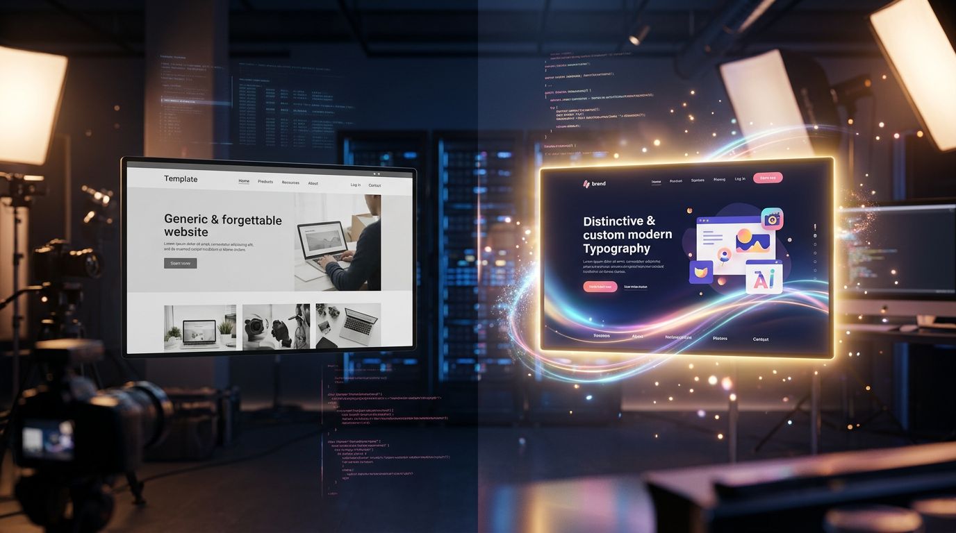
A digital signature is the set of micro interface decisions that create a recognisable experience. The way a button reacts on hover. Typography that breathes differently from everything else. An entrance animation that says something about the care given to detail. A scroll that becomes a narrative in itself.
It’s not cosmetic. It’s communication.
“Design is not what it looks like. Design is how it works.” — Steve Jobs
In our agency practice, we long confused the two. We delivered clean, well-structured, accessible, fast sites. But interchangeable ones. The client was satisfied. The user passed through and forgot. That’s exactly what we move beyond with true bespoke interface engineering.
The difference between a functional site and a memorable one is precisely that: the signature. And that signature isn’t invented in a vacuum.
What the web community provides that no tutorial can replace
There are things you don’t learn on YouTube.
Not because content creators lack talent. But because certain knowledge is only transmitted in real situations, between people with their hands in the same grease.
Events like Kiwiparty — an Alsatian web conference that has been bringing together front-end, design, and accessibility professionals for years — are experimentation accelerators. Not because you learn revolutionary techniques there. But because you see how other practitioners solve problems you thought were unsolvable.
Concretely, what these gatherings produce:
- Useful challenges. Seeing someone present a radically different approach to a problem you thought you mastered — it’s unsettling. And that’s exactly what’s needed.
- Unexpected technical connections. An informal conversation between two talks can unblock a problem you’ve been stuck on for weeks.
- Peer validation. Submitting your approach to the scrutiny of other experts — not to be right, but to test whether your reasoning holds up.
This isn’t networking in the marketing sense. It’s productive confrontation between practitioners.
After 15 years in the field, I can say that some of my best technical decisions — choices that directly impacted the quality of the interfaces we deliver — were born from informal discussions at this kind of event. Not in a meeting room, not in front of a brief.
Experimentation as method, not accident
The problem with experimentation in an agency is time. We have projects, deadlines, clients waiting. Space to “try things” doesn’t exist naturally in a production schedule.
And yet, that’s exactly what allows you to build a signature.
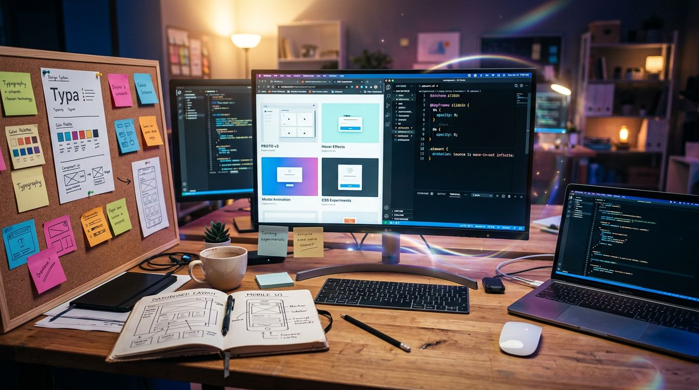
The solution we found at GDM-Pixel is to separate contexts. We don’t experiment on client projects. We experiment alongside them, on internal prototypes, side projects, components tested in isolation. When something truly works — in terms of visual impact, performance, accessibility — we integrate it into our production stack.
That’s how our approach with Astro + Tailwind evolved. Not because we read an article saying it was better. Because we tested, broke things, optimised, and finally validated on real projects.
The web community accelerates this cycle. When you see a technique presented at a conference, you already have context: why this person explored it, what problems it solves, what its limitations are. You don’t start from scratch. You start from a hypothesis validated by someone who did the work before you.
That doesn’t replace your own experimentation. It makes it 10 times more efficient.
Iterating without losing coherence: the real challenge
Here is the trap many agencies and freelancers fall into when exposing themselves to many external influences: stylistic incoherence.
You see an elegant CSS animation at a conference and integrate it. You test a typographic approach inspired by a talk on readability and apply it. You adopt a grid system seen in a reference article. And you end up with a site that looks like a patchwork of influences without unity.
A signature is the opposite of a patchwork.
Coherence doesn’t come from limiting sources of inspiration. It comes from a clear editorial filter: what are we trying to communicate, and to whom? Every interface decision must answer that question before being validated.
“Creativity is knowing how to hide your sources.” — This often misattributed quote hides an operational truth: inspiration must be digested, not copied.
In practice, this means you can draw from a dozen different sources and produce something unified — provided you have a clear vision of the final intent. It’s this synthesis work that distinguishes a digital signature from a mere collection of visual effects, and it’s also why timeless design principles remain the best defence against AI-driven drift.
For the Norman businesses we work with — craftspeople, SMEs, liberal professions — this coherence is particularly critical. Their audience isn’t composed of designers who appreciate subtle references. It’s an audience that judges in 3 seconds whether to trust or not. The signature must therefore be both distinctive and immediately readable.
From collective inspiration to memorable interface: the concrete process
Here’s how we concretely translate this approach into production.
Phase 1: active and selective monitoring
We don’t consume web content passively. We document what catches attention, and above all why it catches attention. Awwwards and Screenlane are useful sources for observing interface trends, but analysis of community events like Kiwiparty provides what these platforms don’t: the manufacturing context.
Phase 2: isolated prototyping
Each interesting idea becomes an isolated component tested outside any client project. We measure: visual impact, performance (Core Web Vitals), accessibility (WCAG 2.1 minimum). If all three criteria are met, the component enters our library.
Phase 3: contextual integration
A component that works in a prototype doesn’t necessarily work in all contexts. Integration into a real project requires adaptation to the brand’s tone, the target audience, and the technical constraints of the hosting. That’s where the signature is truly built — not in the prototype, but in the adaptation.
Phase 4: external validation
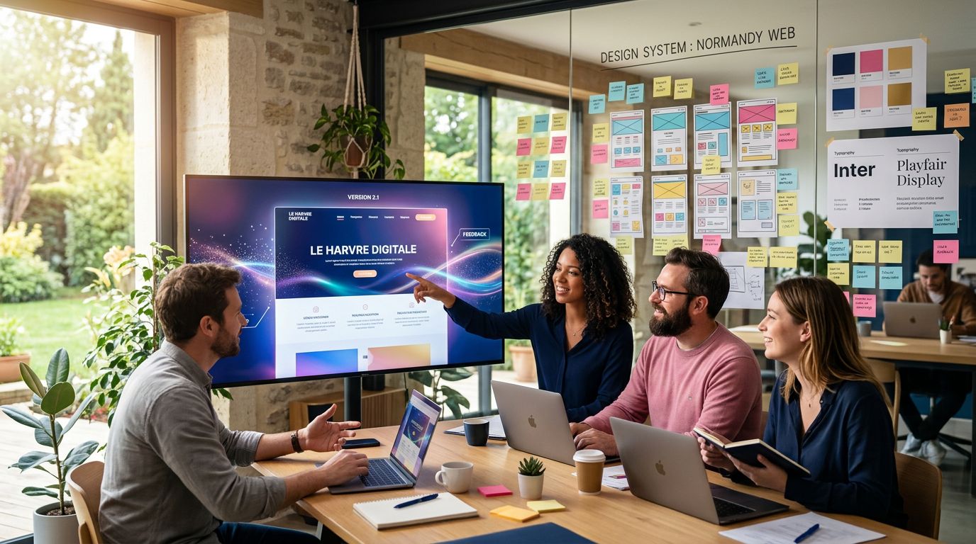
We submit interfaces to external feedback — not clients, but peers. Designers, front-end developers, accessibility experts. The web community, again. The external eye reveals blind spots you can no longer see when you’re too close to the project.
Three principles to build your signature
After all this, here are the operational principles I take away — not theory, but lived agency experience.
Expose yourself, but filter. The web community is an irreplaceable source of inspiration. But unfiltered exposure produces incoherence. Define your editorial intent before consuming inspiration.
Experiment outside production. Never on an ongoing client project. Build a library of tested, validated components ready to be adapted. That’s your creative capital.
Measure impact, not aesthetics. A memorable interface is one that achieves its objectives. Conversion rate, time on page, bounce rate — these figures tell you whether your signature works or merely decorates.
Conclusion: your interface must tell a story
A website that doesn’t leave a mark is a website that isn’t working for you.
The digital signature is not a luxury reserved for major brands with substantial design budgets. It’s an approach accessible to any organisation willing to step outside its comfort zone — to see what others are doing, to test, to iterate, to confront its choices with external eyes.
The web community, professional events, exchanges between practitioners — none of this is networking for pleasure. It’s investment in the quality of what we deliver.
At GDM-Pixel, that’s exactly the approach that has evolved our way of building interfaces. Not overnight. Through an accumulation of small experiments, integrated feedback, tested and refined components — the same method we apply to our website creation services.
If your current site doesn’t represent you — if you can’t explain in one sentence what it communicates to a user who doesn’t know you — it’s probably because it lacks a signature.
We can help you build that. Not with templates. With genuine reflection on what your interface needs to say, and the tools to say it with precision.
Let’s talk about your project.
This article is part of our series on the industrialisation of web creation and the practices that truly make a difference to the quality of deliverables.
 Social networks
 Analyze with AI