The visual web has changed its rules — and most agencies never saw it coming
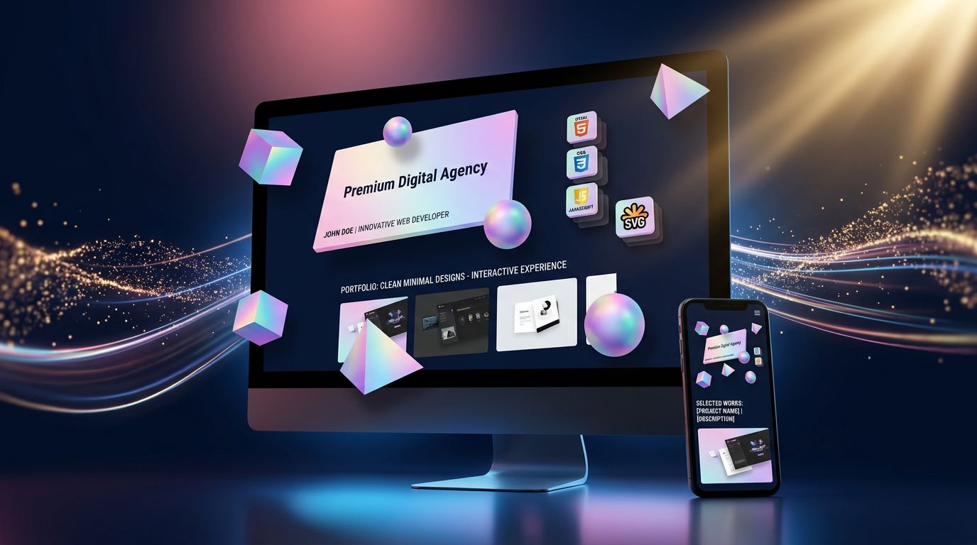
A portfolio that gives the illusion of three-dimensional space. Objects that rotate, shadows that react to the mouse, a depth of field that fools the visitor. And behind all of that: zero .glb files, zero Three.js, zero GPU overload.
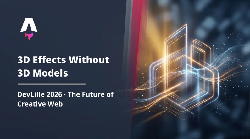
That’s exactly what the Sketching the Impossible project presented at DevLille 2026 — and honestly, it challenges quite a few assumptions about how we build web experiences in 2025.
The real question isn’t “is it impressive?” It’s: what does this actually change for you, if you have a website to build or redesign?
What “Sketching the Impossible” actually proved
The original pitch was simple, almost provocative: build a visually 3D portfolio without using a single native 3D asset. No WebGL, no models imported from Blender, no heavyweight libraries like Three.js or Babylon.js.
The result? A site that loads in under two seconds, runs flawlessly on mobile, and creates the illusion of depth through a combination of advanced CSS techniques, SVG transformations, and lightweight JavaScript animations.
What agencies rarely tell you is that “real” 3D on the web has a genuine cost. Load times multiplied by 3 to 5. Degraded mobile compatibility. GPU consumption that overheats low-end phones. And a development budget that balloons the moment you step outside templates — a trade-off that comes up on every custom website creation project.
The approach presented at DevLille 2026 sidesteps all of that. It leverages what modern browsers already do very well natively: transform: perspective(), translateZ(), backdrop-filter, radial gradients that simulate lighting — the same logic described in our analysis of 2026 webdesign trends driven by modern CSS. Combined intelligently, these tools create a visual perception that the brain reads as 3D — without the browser having to calculate a single polygon.
Measurable result: performance preserved, visual impact multiplied.
Why DevLille 2026 is a strong signal for French web developers
DevLille is one of the most followed tech events in northern France. It’s not a marketing conference. It’s a practitioners’ conference — developers, software architects, integrators — who come to share what they’ve actually built.
The fact that this kind of presentation found its place there in 2026 is telling.
The underlying message is clear: creative optimisation is reclaiming ground from technological one-upmanship. For years, the industry chased more power — more WebGL, more shaders, more augmented reality in the browser. DevLille 2026 shows that some of the best French developers are moving in the opposite direction. Fewer dependencies. More ingenuity.
“Constraint is the mother of creativity. When you forbid yourself the obvious tool, you often discover a better solution.” — a philosophy that runs through the entire Sketching the Impossible presentation
It’s also a signal for web agencies. Clients don’t ask for 3D for the sake of 3D. They want a site that leaves a mark, loads fast, and converts. If you can deliver all three without blowing the budget — you have a real competitive advantage.
The concrete techniques behind the illusion
No magic. Just solid technique. Here’s what forms the core of the “fake 3D” approach presented at DevLille.
Native CSS perspective, finally used correctly
The perspective property has existed in CSS for years. Most developers use it for basic rotations on cards or menus. Sketching the Impossible exploits it at a full-page scale — defining a perspective context on the body or a root container, then varying the translateZ values of each element to create distinct visual planes.
The result: when the user moves their mouse, elements move at different speeds according to their simulated “depth.” The brain reads this as 3D parallax. The browser, meanwhile, is simply doing 2D GPU-accelerated computation — exactly what it already does for any CSS animation.
Cast shadows as a tool for volume
A flat object becomes three-dimensional the moment you add a shadow consistent with a fictional light source. The technique used here combines multi-layer box-shadow and drop-shadow on SVGs to simulate directional lighting. When the shadow subtly follows the mouse movement — via a few lines of JavaScript calculating the cursor’s relative position — the illusion becomes nearly perfect.
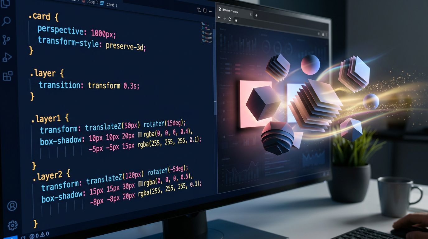
SVGs as “sculptable” vector geometry
Where developers typically use PNGs or exported 3D models, Sketching the Impossible uses dynamically manipulated SVGs. Vector paths are deformed in real time via JavaScript — stretching, partial rotations, control point transformations. This gives the impression of objects that “breathe” or react to interaction, without ever loading a single heavy asset.
Final stack: HTML + CSS + SVG + ~50 lines of vanilla JS. Zero external dependencies.
What this means for a professional website in 2025
Let’s be practical. You’re probably not building an experimental designer portfolio. You have a business site to create or redesign. Does any of this apply to you?
Yes. Here’s why.
The techniques from Sketching the Impossible apply directly to elements you’ll find on any professional site:
The hero section that needs to hook visitors in under 3 seconds. With well-calibrated CSS parallax and dynamic shadows, you can create a strong visual hook without adding a single millisecond to page load.
Product or service presentations. Rather than a flat carousel, a staging with depth effect gives the impression that the product “comes out” of the screen. On mobile, it stays fluid because it’s native CSS.
Loading and transition animations. A well-designed SVG micro-animation easily replaces a generic spinner and reinforces the perceived quality of your brand.
“A slow website loses 53% of its mobile visitors before the page even finishes loading.” — Google Web Vitals data, confirmed by the field audits we run at GDM-Pixel.
On the projects we’ve led, the trade-off between visual impact and performance is consistently the number one friction point with clients. They want beautiful AND fast. The classic agency answer: “it’s one or the other.” The answer that DevLille 2026 confirms: no, if you master the right techniques.
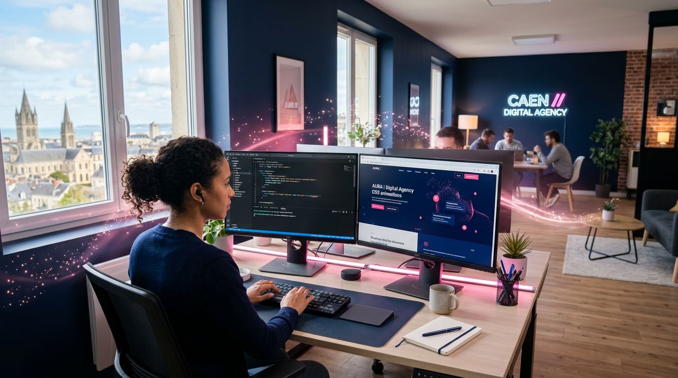
Our take from Caen: technical ingenuity as a competitive advantage
After 15 years of building websites, I’ve watched every technology trend come and go. Flash in its day. Then jQuery. Bootstrap. Then the JavaScript framework wars. Now WebGL everywhere.
Each time, the pattern is the same: a technology impresses, agencies adopt it en masse, performance collapses, clients complain, and the best developers find a smarter alternative.
What Sketching the Impossible presents at DevLille 2026 is exactly that smarter alternative. And it fits perfectly with how we work at GDM-Pixel: deliver measurable results, not technology showcases.
Our current stack — Astro, Tailwind, React components used precisely where they’re relevant — is already performance-oriented. Astro in particular is designed to ship only the JavaScript that’s needed, and nothing more. Advanced CSS/SVG techniques integrate seamlessly into this ecosystem. We can build visually rich experiences while keeping the Lighthouse score in the green.
What also changes with this approach is development time. A 3D WebGL animation easily takes 2 to 3 days of work, including optimisation. The same visual impression in smart CSS/SVG: 4 to 8 hours. On a budget-constrained project — which is the reality for the vast majority of small and medium businesses — this difference is decisive.
Three actionable takeaways
Whether you’re a developer, an integrator, or managing a web project, here’s what you can concretely take away from all of this.
1. Audit your dependencies before adding a new one. Before integrating Three.js or a heavy animation library, ask yourself whether the desired visual result can be achieved with native CSS + SVG. In 60 to 70% of cases, the answer is yes — and you’ll gain in performance and maintainability.
2. Test the CSS perspective property at page scale.
Not just on cards or isolated elements. Define a global perspective context and play with the translateZ values of your sections. The depth effect you get on scroll or hover can radically transform how your site is perceived.
3. Measure visual impact AND performance, consistently. A beautiful site that loads in 4 seconds is a bad site. Lighthouse, Core Web Vitals, tests on simulated 3G — these metrics should be part of your validation process, not optional. This is precisely the invisible craftsmanship of code and UX that separates a good site from a site that performs. The Sketching the Impossible approach proves you can aim for both simultaneously.
Constraint as an engine for innovation: the lesson of DevLille 2026
What’s striking about the Sketching the Impossible presentation isn’t the technical feat itself. It’s the philosophy behind it: imposing a radical constraint to find a better solution.
No native 3D. Therefore: figure out how to create the perception of 3D without the obvious tools. And in seeking that path, discover a solution that is more performant, more accessible, more maintainable than the initial “obvious” option.
That’s exactly the approach we took at GDM-Pixel when we industrialised our production with AI. The constraint was simple: deliver 5x faster without hiring. The obvious answer would have been to recruit. The real answer: automate repetitive tasks, standardise workflows, use Claude Code to generate specs and recurring components.
The creative web of 2025 and 2026 won’t be won by those who have access to the most powerful tools. It will be won by those who know how to do more with less — and who measure the result.
Want a website that leaves a mark without sacrificing performance? That’s exactly what we build at GDM-Pixel. Let’s talk about your project — a 30-minute audit is usually enough to identify what can genuinely transform your web presence.